Royal Canin Dog Food Premium Black Crown Illustration
Topics
Details
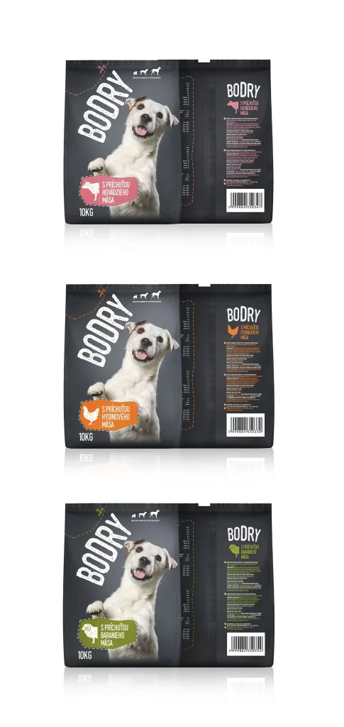
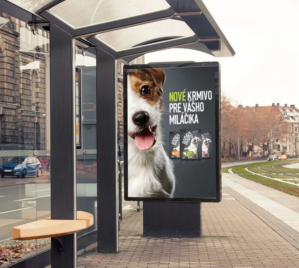
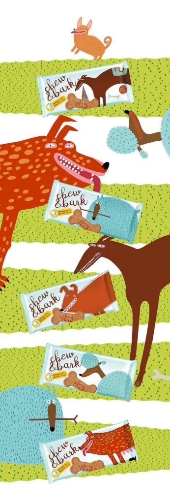
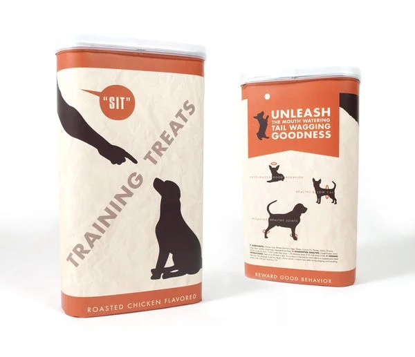
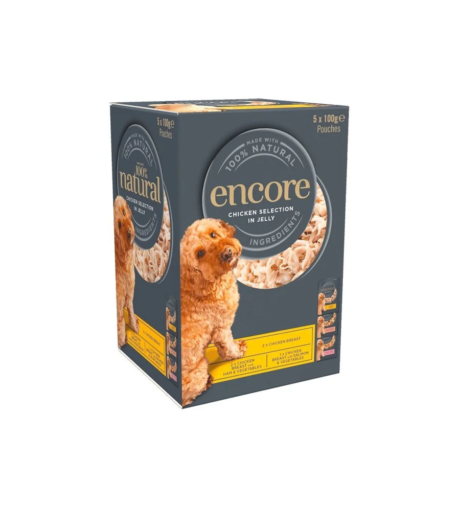
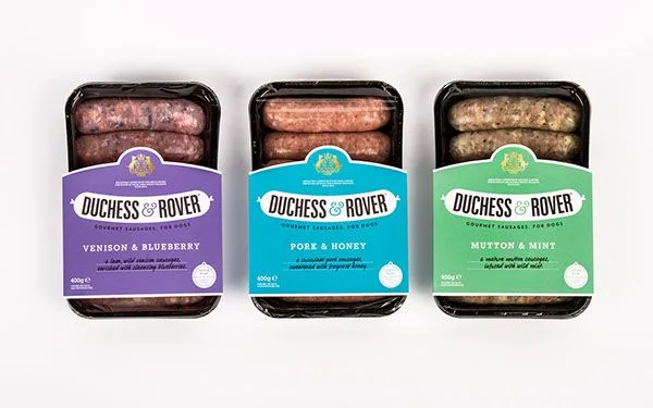
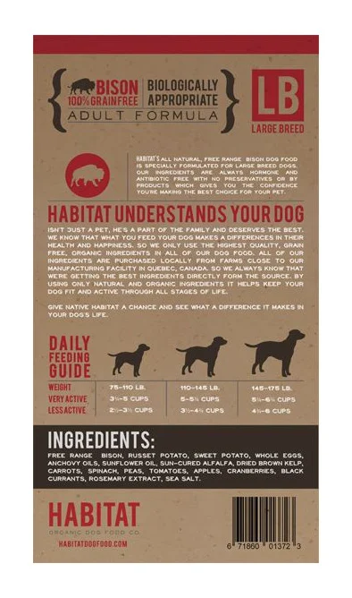
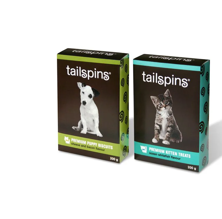
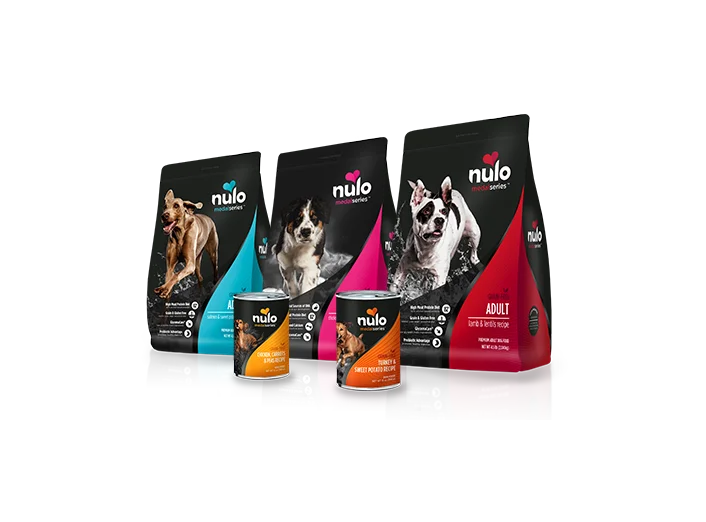
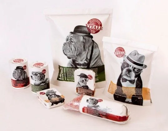
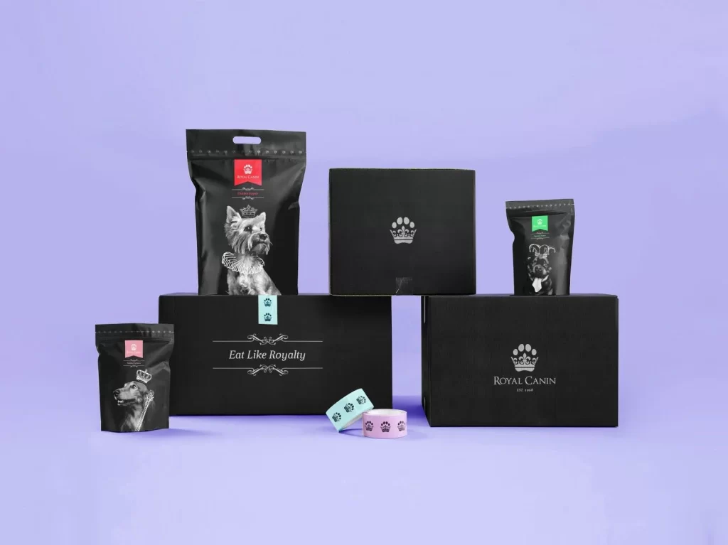
Matte black packaging dominates the composition, featuring three resealable pouches and three rigid boxes arranged in a tiered formation against a solid lavender backdrop. Each container displays monochrome canine illustrations—ranging from a crowned German Shepherd to a ruffled terrier and a bow-tied pug—accented by small colored tabs in red, mint, pink, and green. The typography includes 'Eat Like Royalty' in elegant serif lettering on the lower-left box, while the larger carton on the right bears the 'ROYAL CANIN' wordmark beneath a paw-print crown emblem. Soft studio lighting creates subtle shadows beneath the objects, with two pastel washi tape rolls resting in the foreground to add a tactile material contrast.
Visual distinction emerges from the sophisticated interplay between the somber black substrates and the whimsical regal iconography, where crowns transform standard pet nutrition into luxury commodities. The restricted color palette of charcoal, silver, and selective neon accents creates a high-contrast aesthetic that feels simultaneously modern and aristocratic. Notably, the crown motif integrated into the paw print logo serves as a clever visual pun that reinforces the premium positioning without relying on typical pet-food imagery like vibrant kibble or happy animals.
Brand strategists developing upscale pet product lines would examine this arrangement to understand how monochromatic illustration styles can elevate commodity packaging into lifestyle accessories. Packaging engineers might reference the structural variety shown here—from stand-up pouches with hang holes to magnetic-closure boxes—to compare how different formats communicate value tiers within a single product ecosystem. Retail merchandising teams could study the spatial relationships between the varied container sizes to plan cohesive shelf displays that maintain visual hierarchy across multiple SKUs.