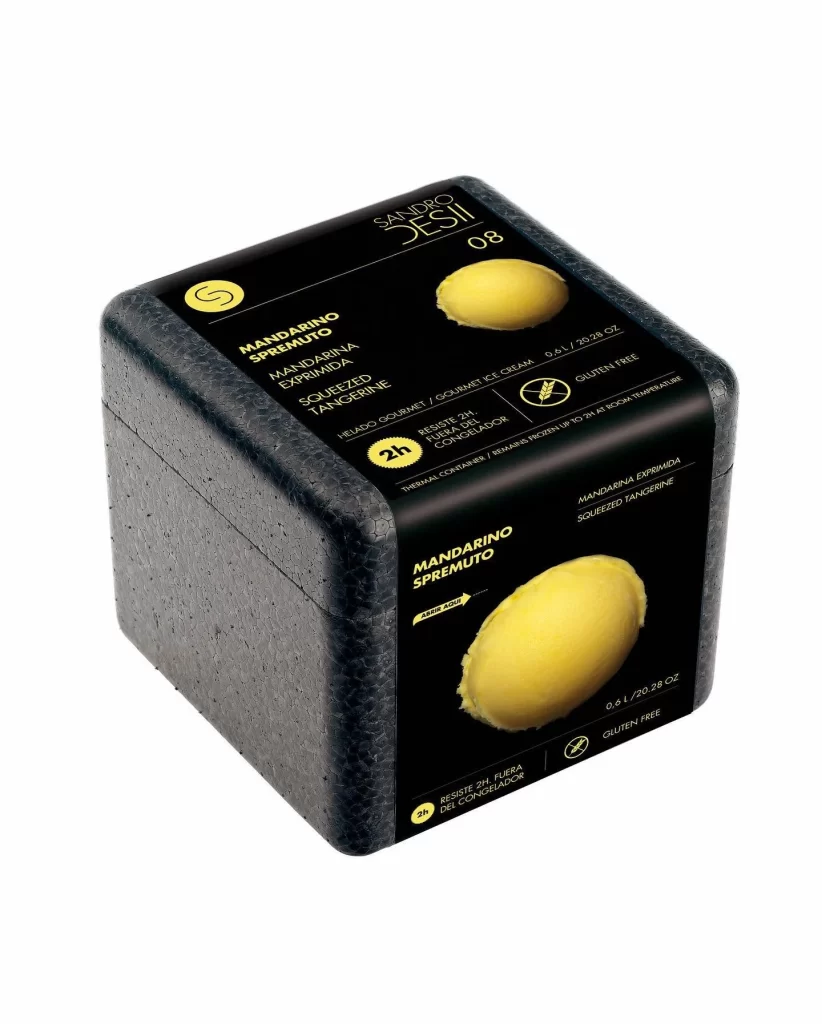
Sandro Jesi Gelato Box Design
Topics
Details
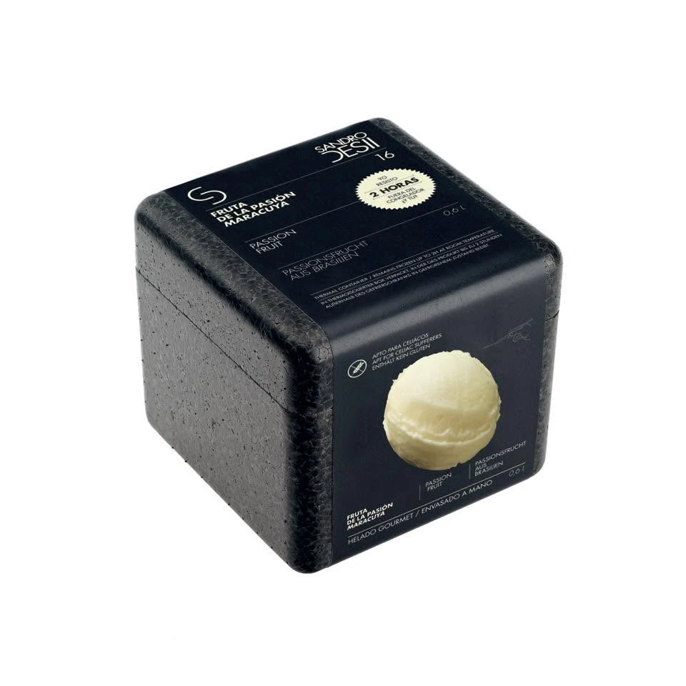
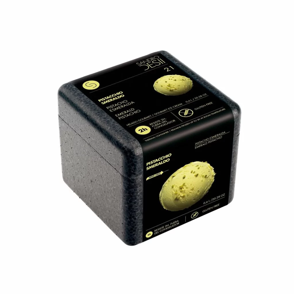
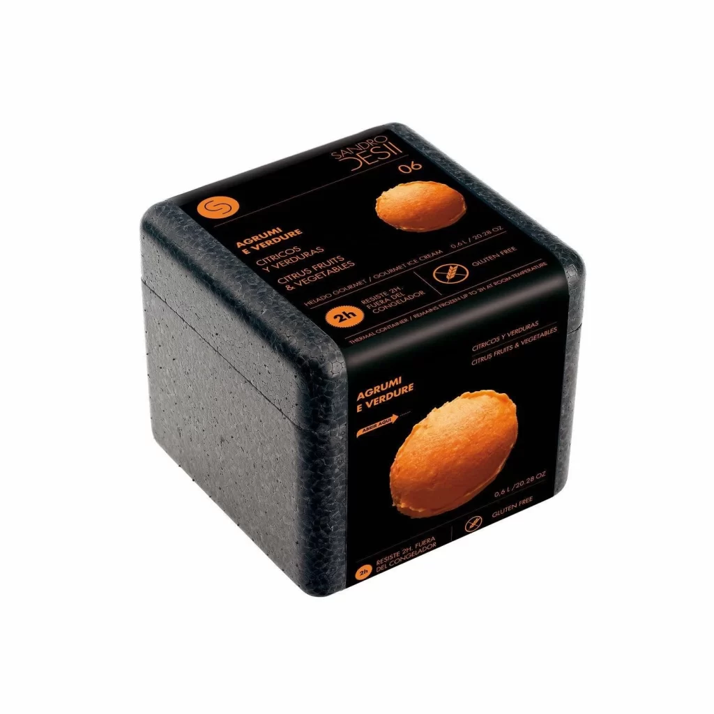
Black thermal foam forms a compact cube, its speckled surface wrapped in glossy black labels featuring bold yellow typography and photorealistic tangerine imagery. The packaging displays 'Sandro Desi' branding at the top, with 'Mandarino Spremuto' and multilingual flavor descriptions arranged in clean geometric layouts across the front and side panels. Soft directional lighting highlights the container's matte texture and rounded edges while making the vibrant citrus graphics and golden text pop against the dark background.
Visual interest is generated through the stark contrast between the matte, pebbled surface of the insulation material and the glossy, high-contrast graphic wrap. The use of a limited yellow and black palette creates a premium, industrial aesthetic that stands out from typical food packaging. Furthermore, the inclusion of multilingual text—Italian, Spanish, and English—alongside specific dietary icons like the gluten-free symbol suggests a design optimized for international gourmet markets.
Product photographers might study this composition to understand how to effectively showcase cylindrical or bulky items without losing detail on the labeling. Packaging engineers could utilize this as a case study for integrating thermal performance data directly into the consumer-facing design. Additionally, brand strategists examining luxury frozen goods will find the typographic hierarchy and color blocking useful for their own conceptual work.