Sandro Jesi Ice Cream Box
Topics
Details
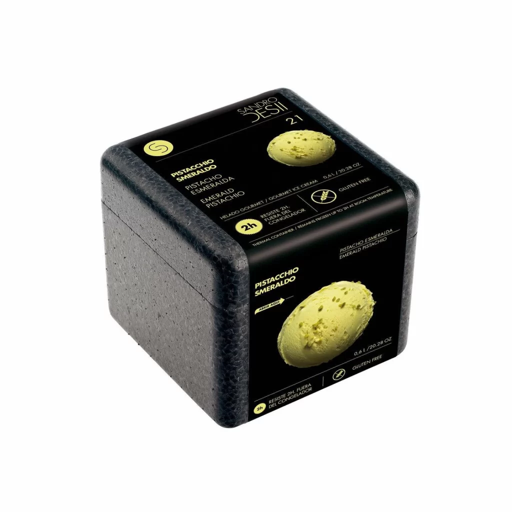
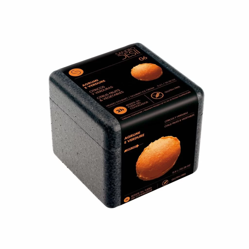
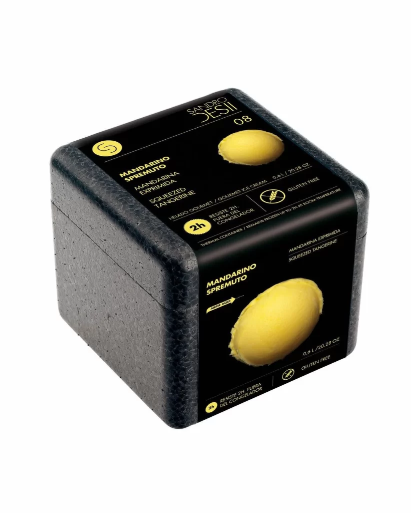
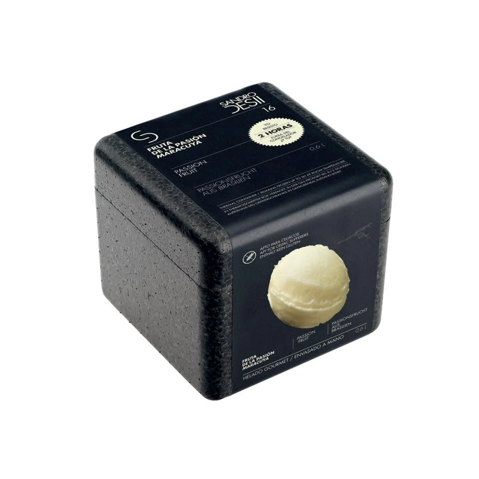
A matte black, cube-shaped foam container sits isolated against a pure white background, viewed from a three-quarter angle that reveals the top and front faces. The packaging features crisp white typography identifying the brand as Sandro Desi and the flavor as Esulta Pasión de la Maracuya (Passion Fruit), alongside a circular badge stating a 2-hour delivery window. A realistic photograph of a pale yellow scoop of ice cream anchors the lower right corner of the label, while the textured, pebbled surface of the insulated box contrasts with the smooth printed wrap.
Visual interest lies in the stark monochrome palette punctuated by the creamy product photography and the tactile quality of the expanded polystyrene material. The layout balances minimal sans-serif text in multiple languages with functional icons indicating that the item is gluten-free and contains no artificial colors. This specific version stands out due to its utilitarian shipping aesthetic combined with gourmet branding elements, creating a juxtaposition between premium food presentation and protective logistics packaging.
Product photographers might study this composition to understand how to effectively light dark, absorbent materials without losing surface detail. Packaging designers could reference the typographic hierarchy to see how multilingual information is organized within a confined square format. 3D artists modeling consumer goods would find the subtle shadows and soft gradients on the curved edges useful for rendering realistic foam textures.