Seven Potions Shaving Brush & Razor Label
Topics
Details
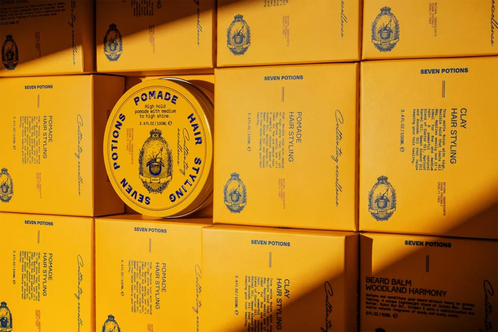
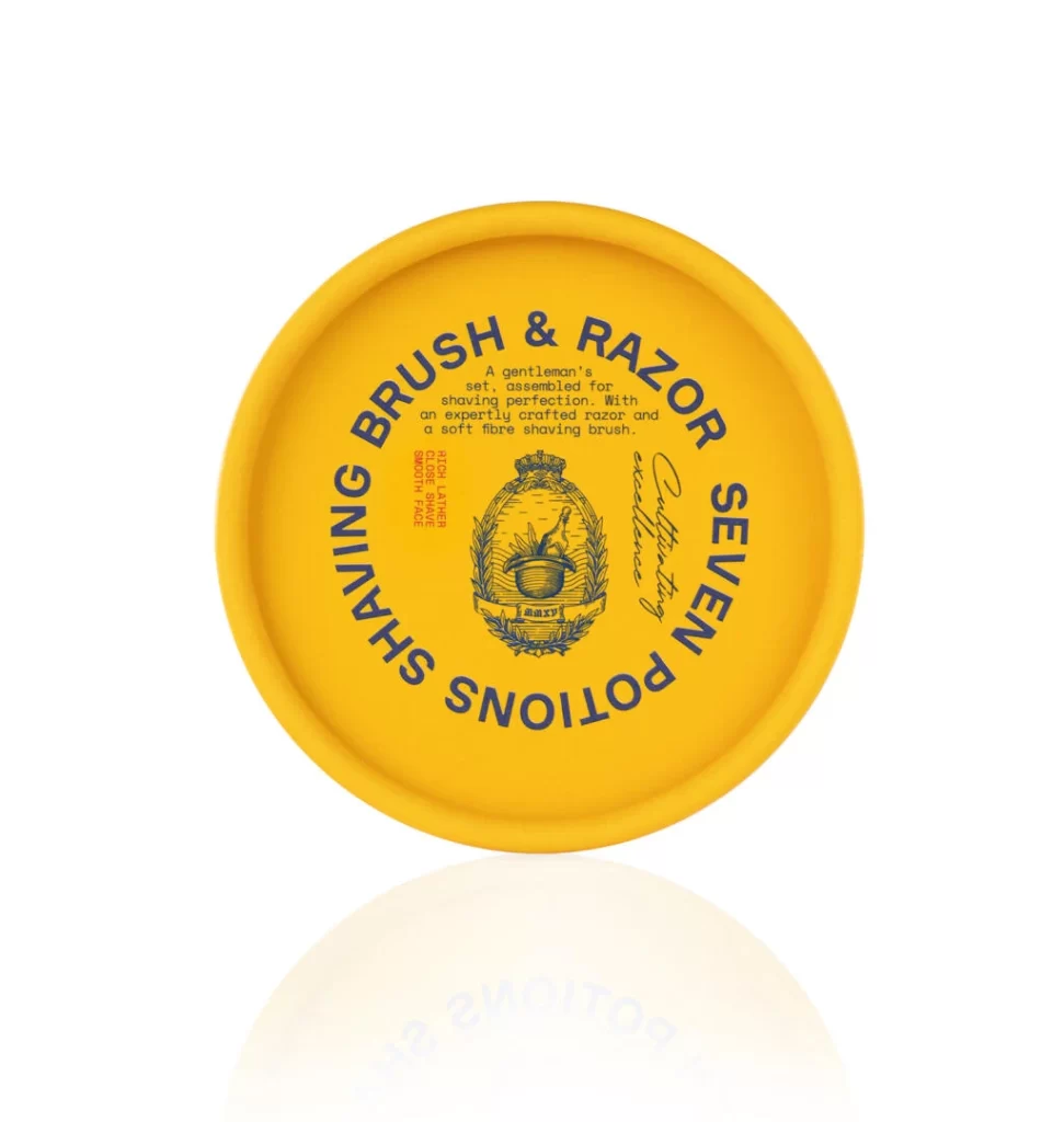
Radiating a warm, mustard-yellow hue, the circular label sits atop a matching convex surface, its edges softly rounded to suggest a tactile, perhaps rubberized, material. Deep navy typography arcs along the perimeter, spelling out 'SEVEN POTIONS SHAVING BRUSH & RAZOR' in a bold, sans-serif typeface that commands immediate attention. At the heart of this composition, an intricate line-art crest features a crowned vessel flanked by laurel wreaths, while smaller descriptive text and a cursive signature fill the remaining space with a sense of heritage. The entire object is captured from a direct overhead perspective against a pure white void, with a faint, ghostly reflection appearing beneath it to add a subtle sense of depth.
Visual interest here stems from the striking interplay between the vibrant, almost citrus-like background and the authoritative weight of the dark blue ink. This high-contrast palette ensures legibility while evoking a vintage apothecary aesthetic that feels both modern and timeless. Furthermore, the meticulous detail within the central emblem—complete with botanical motifs and classical framing—elevates a simple product identifier into a piece of narrative art, suggesting quality and tradition through its ornate execution.
Brand identity specialists might examine this layout to understand how circular constraints can be utilized for balanced typographic hierarchy. Packaging designers could draw upon the specific color combination and emblem placement when developing luxury grooming lines that require a masculine yet refined tone. Additionally, illustrators looking to master vintage engraving styles would find the central crest a perfect case study in line weight variation and decorative symmetry.