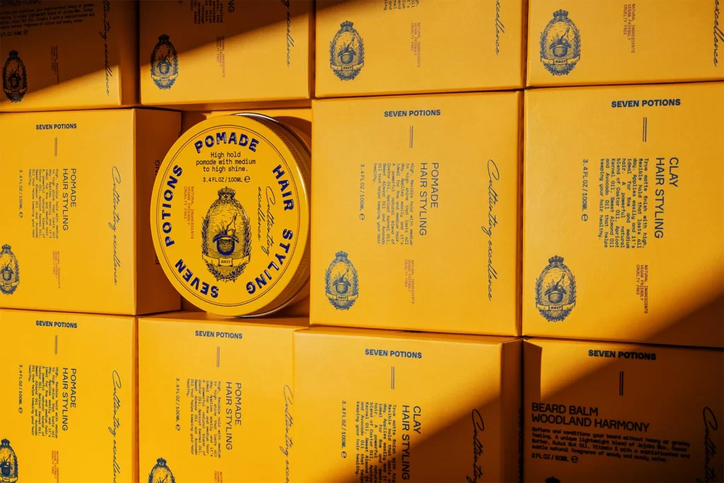
Seven Potions Hair Styling Pomade Can
Topics
Details
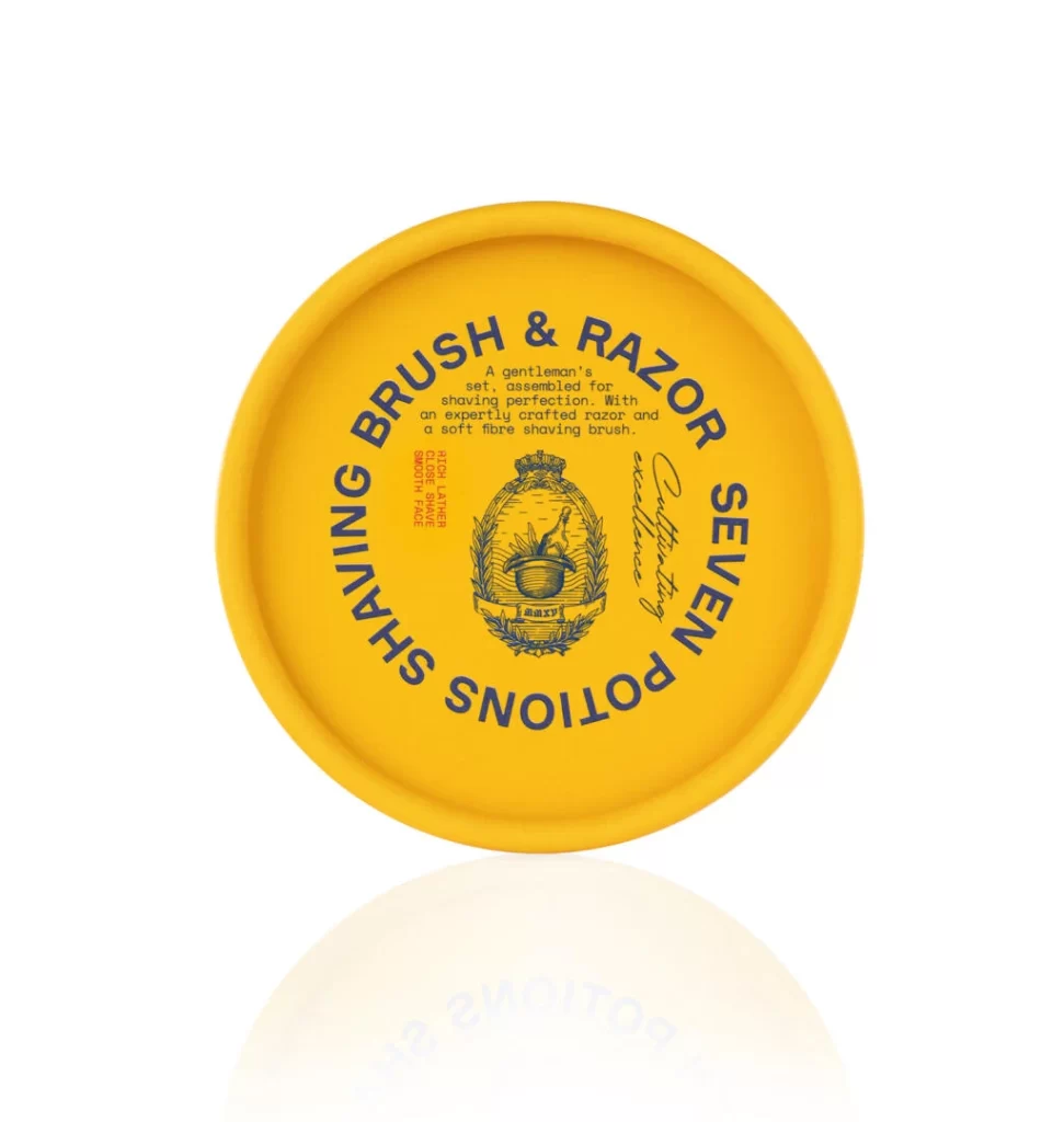
Bathed in warm, directional light that casts sharp diagonal shadows, a circular yellow tin of Seven Potions Pomade rests atop a grid of matching rectangular boxes. The tin features a vibrant golden-yellow surface with deep blue typography arranged in a ring around a central crest illustration, while the surrounding cartons display identical color blocking and text layouts for various hair styling products. Shot from a slightly elevated angle, the composition emphasizes the repetitive geometric pattern of the packaging against the high-contrast lighting.
Visual cohesion defines this product presentation through its strict monochromatic palette of mustard yellow and navy blue across all packaging formats. The circular container creates an intentional focal point by breaking the rigid orthogonal arrangement of the square boxes, while the vintage-style crest logo and serif typography establish a consistent brand identity. Strong chiaroscuro effects from the raking light accentuate the matte texture of the cardboard and the metallic sheen of the tin lid.
Packaging designers studying color theory applications in cosmetic branding would find value in analyzing how limited palettes create shelf presence across multiple SKUs. Photographers experimenting with artificial lighting setups could reference the shadow patterns to understand how single-source illumination interacts with reflective and absorbent surfaces. Art directors developing visual merchandising strategies might examine the spatial relationships between round and square forms within a structured grid layout.