Shiseido Skincare Composition Packaging
Topics
Details
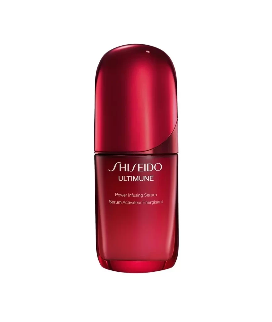
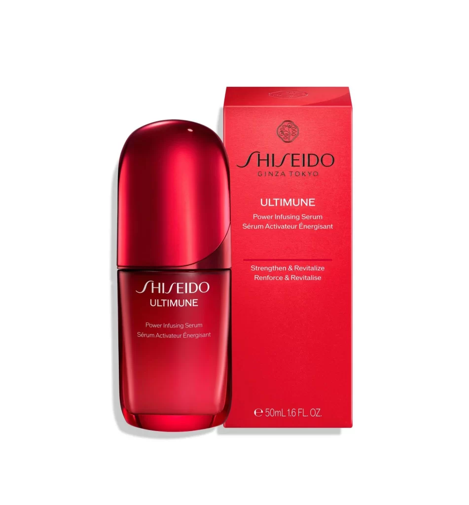
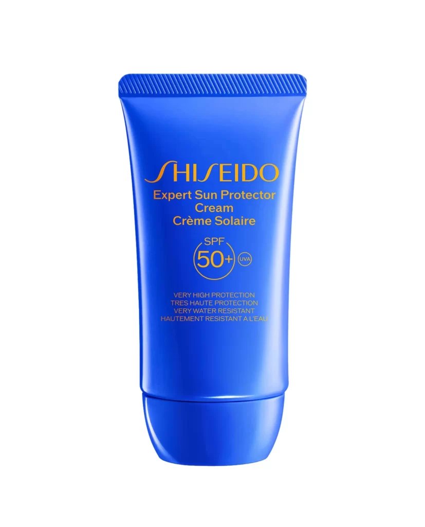
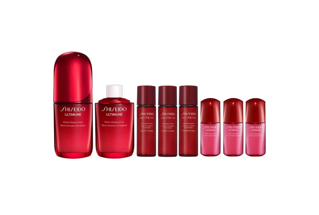
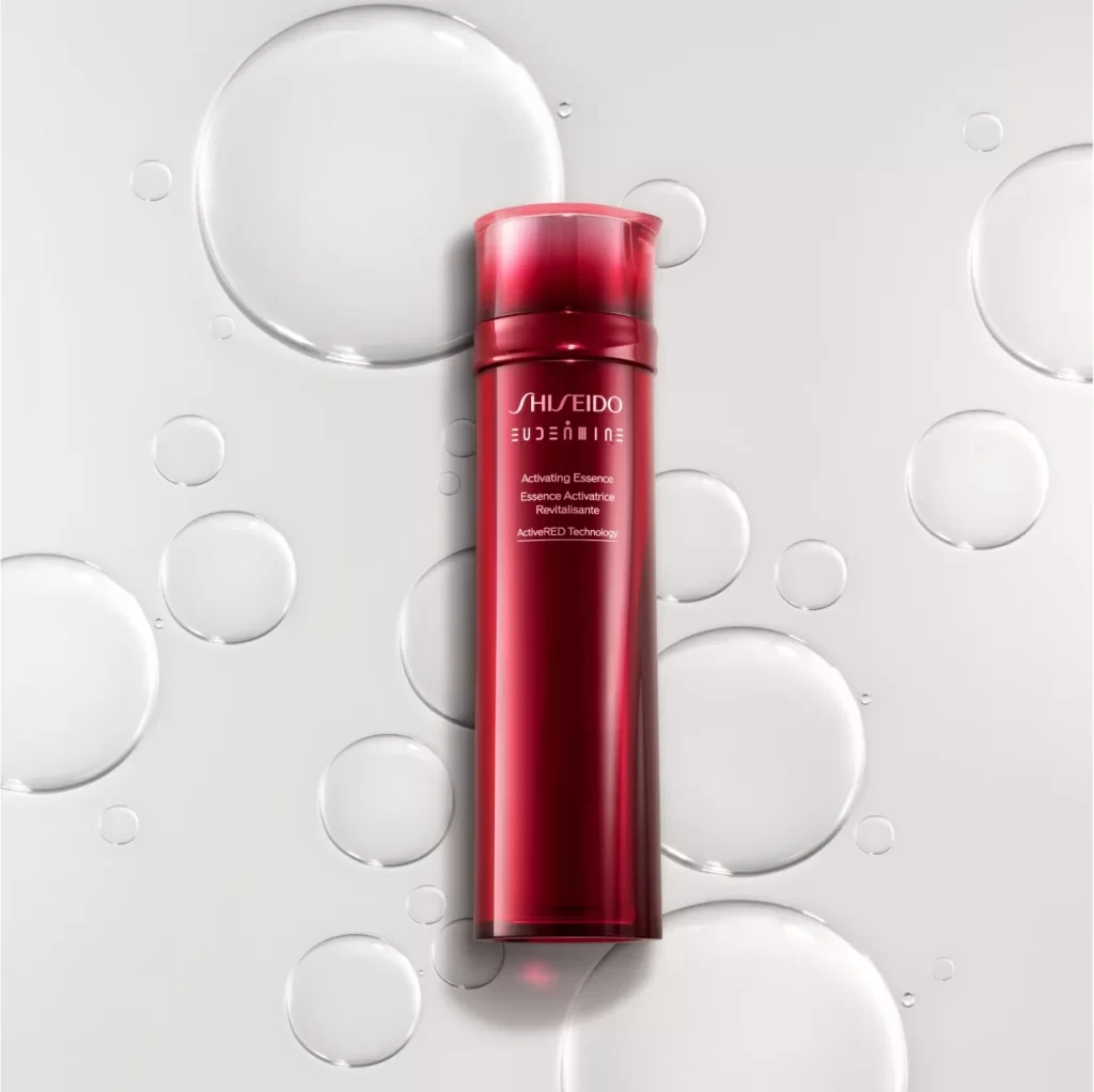
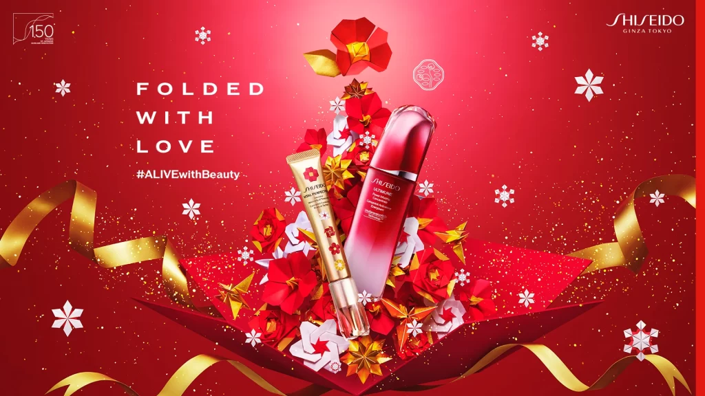
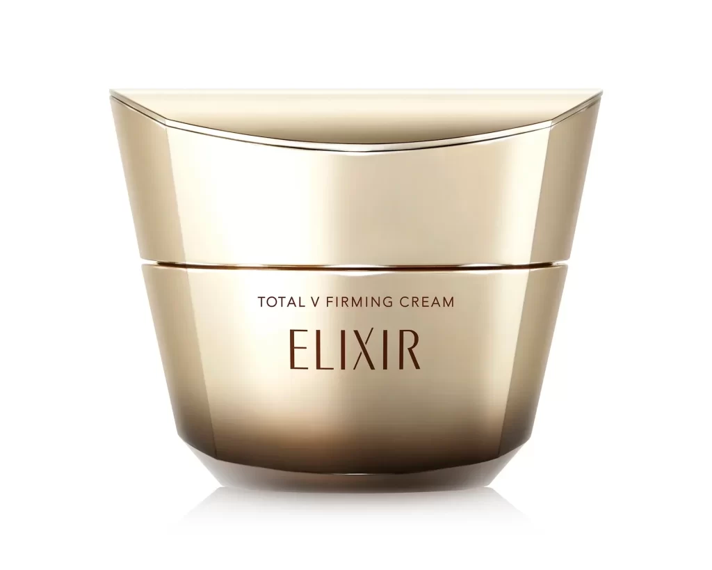
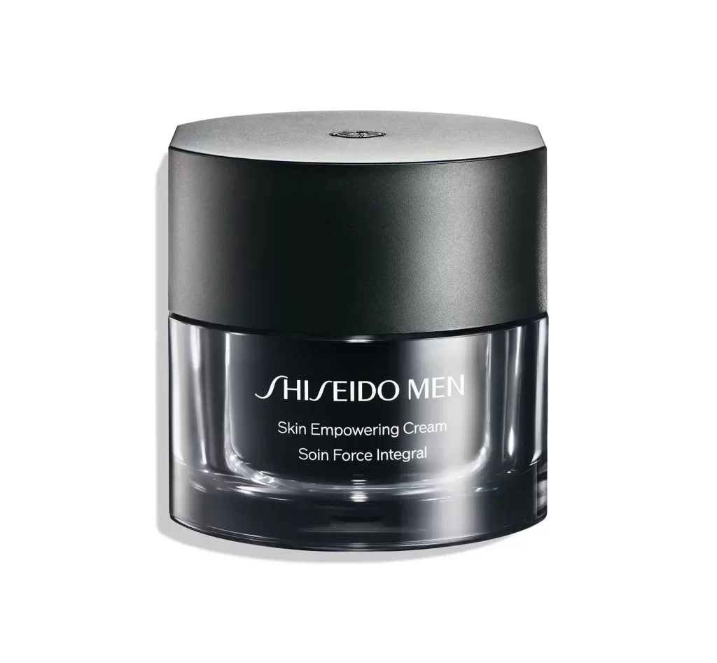
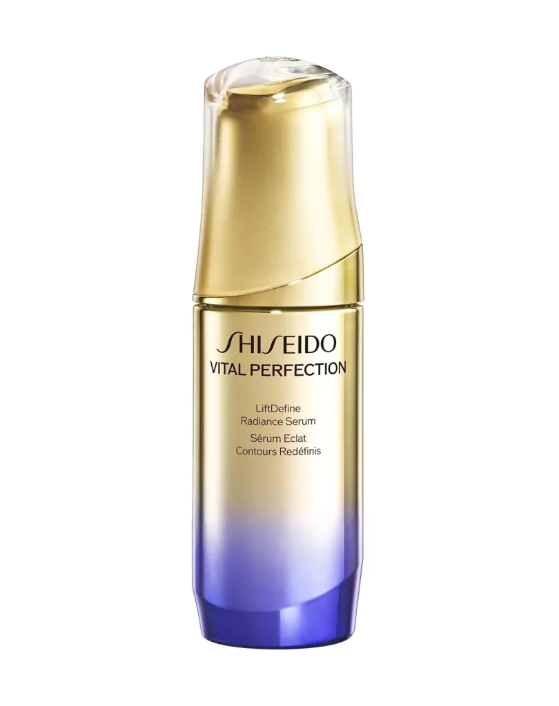
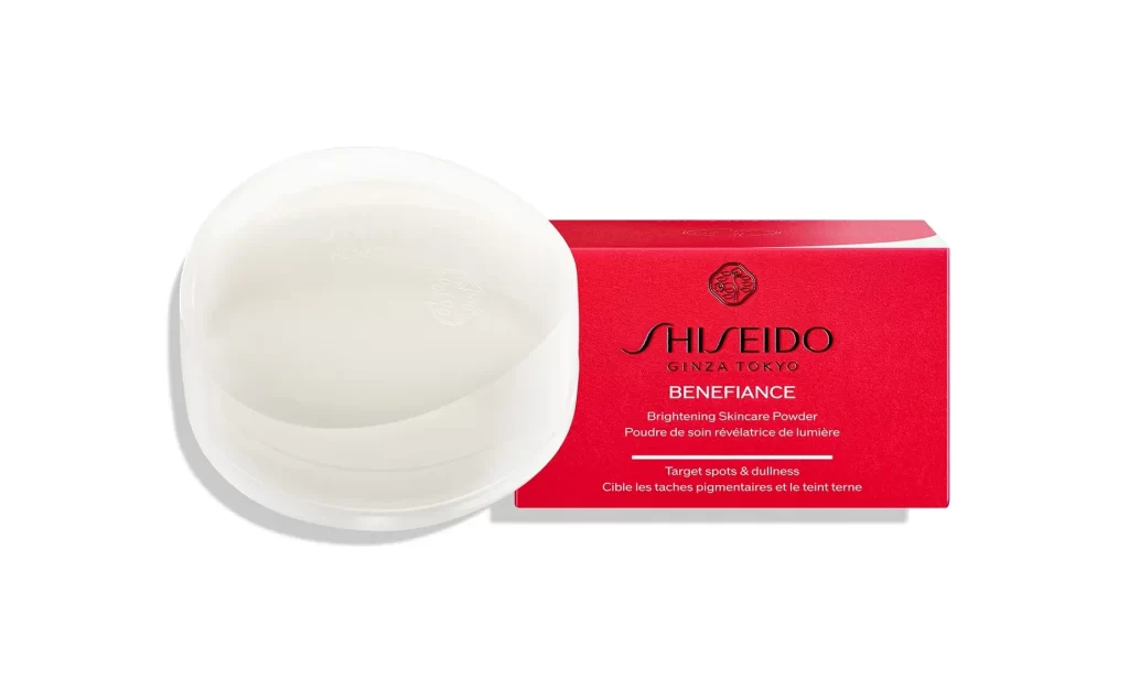
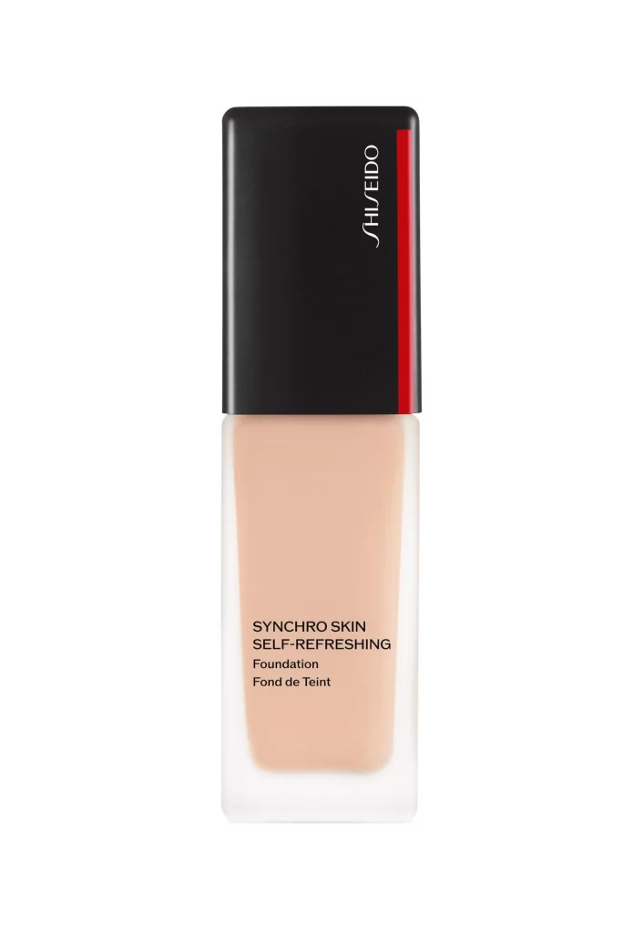
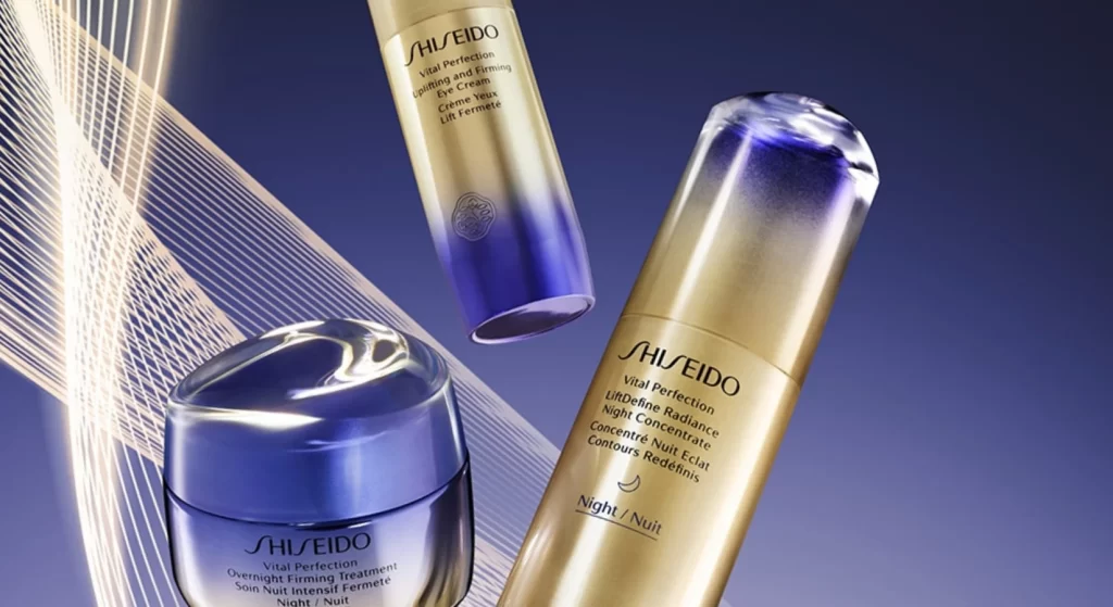
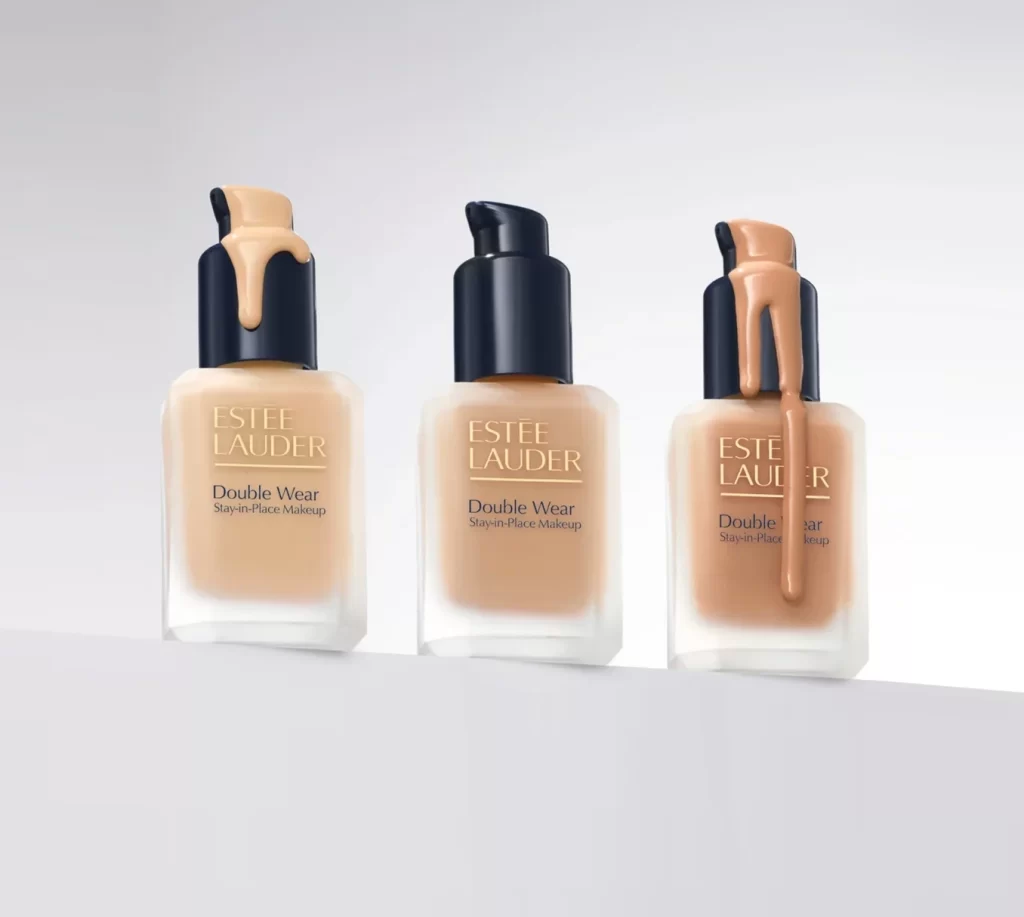
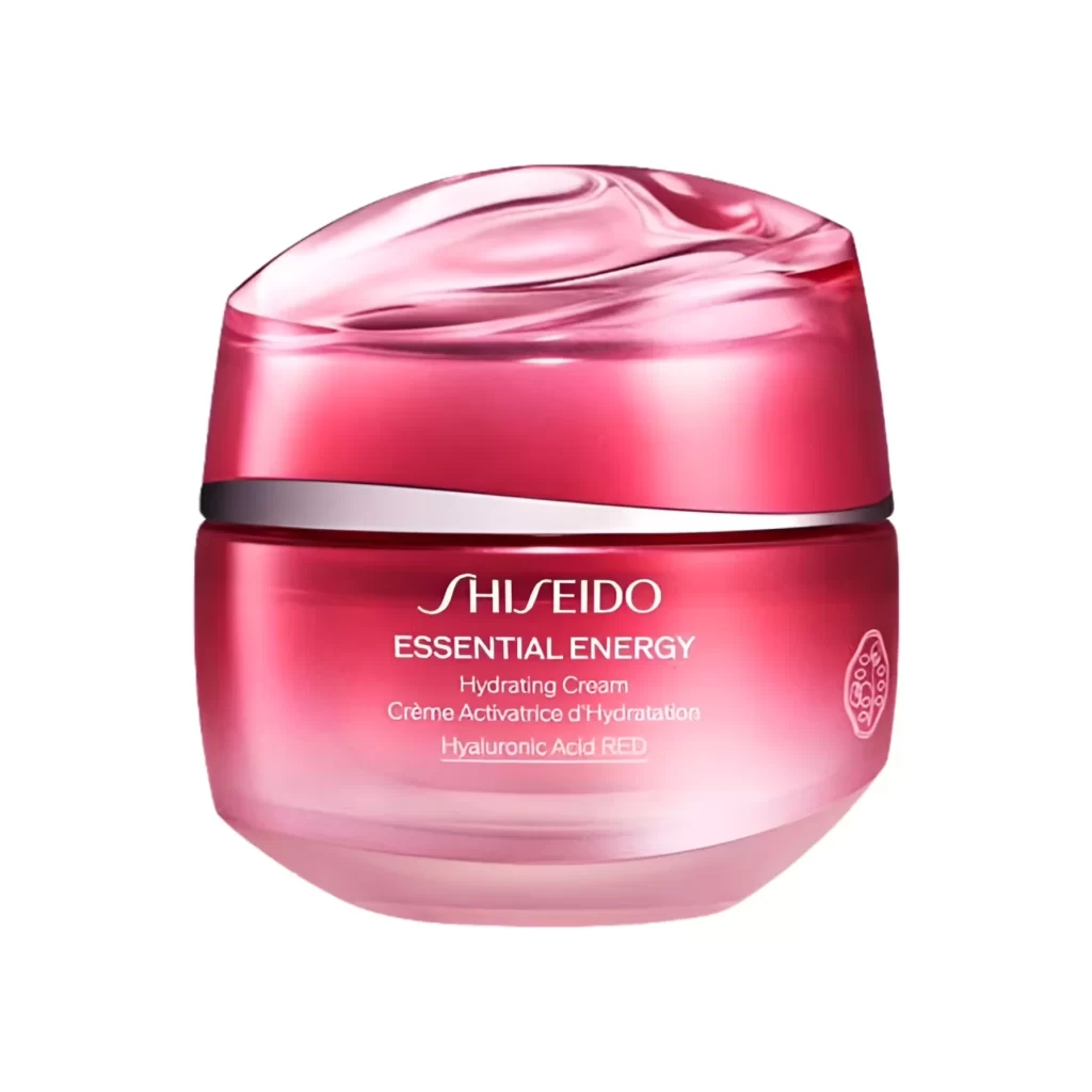
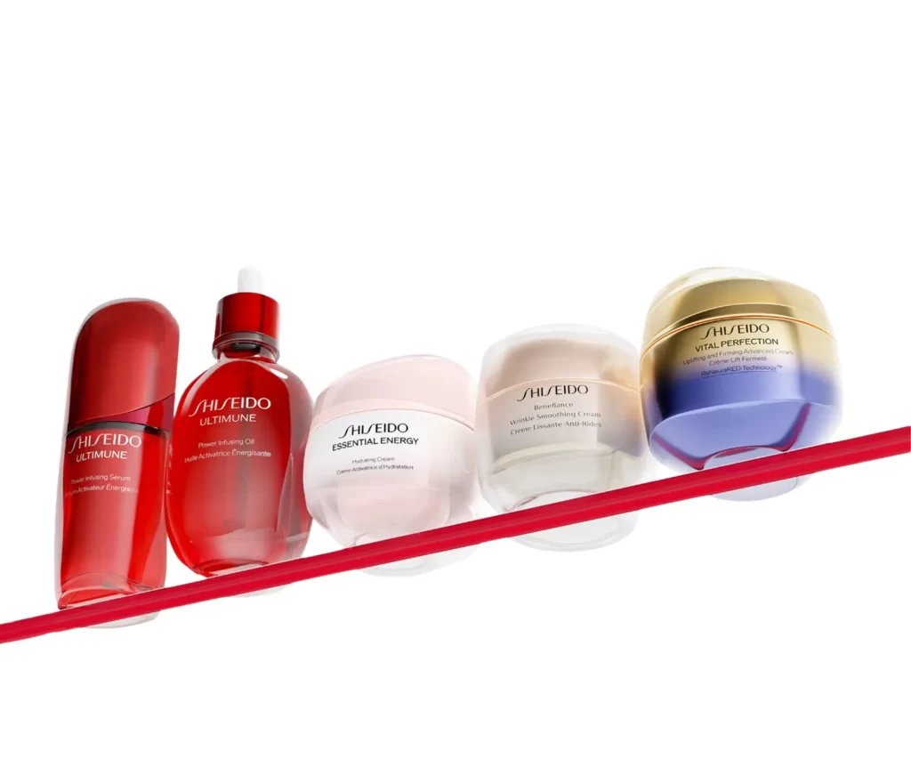
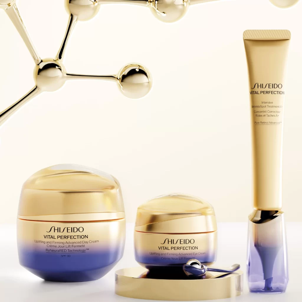
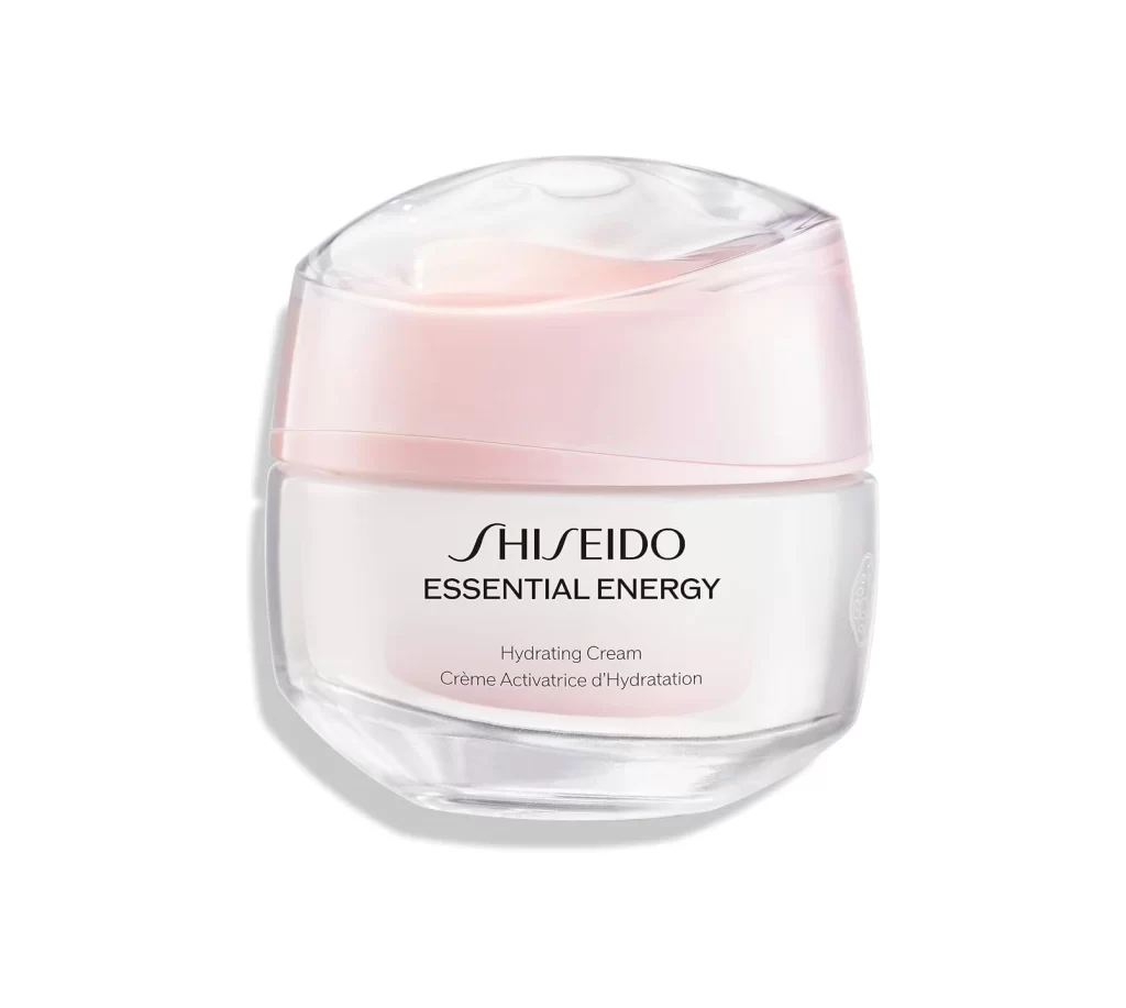
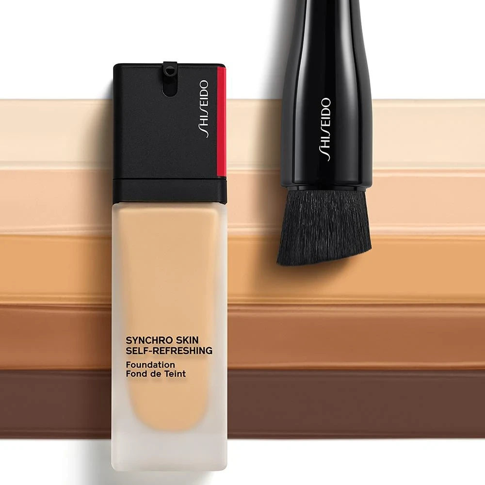
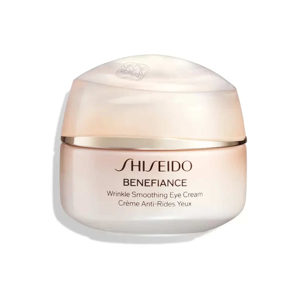
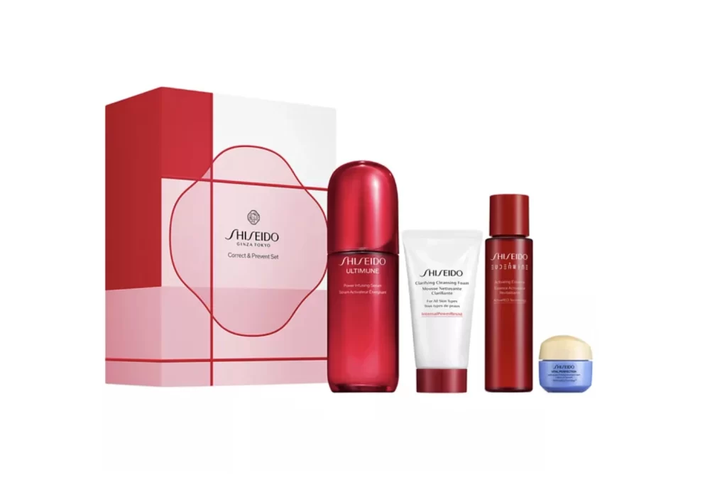
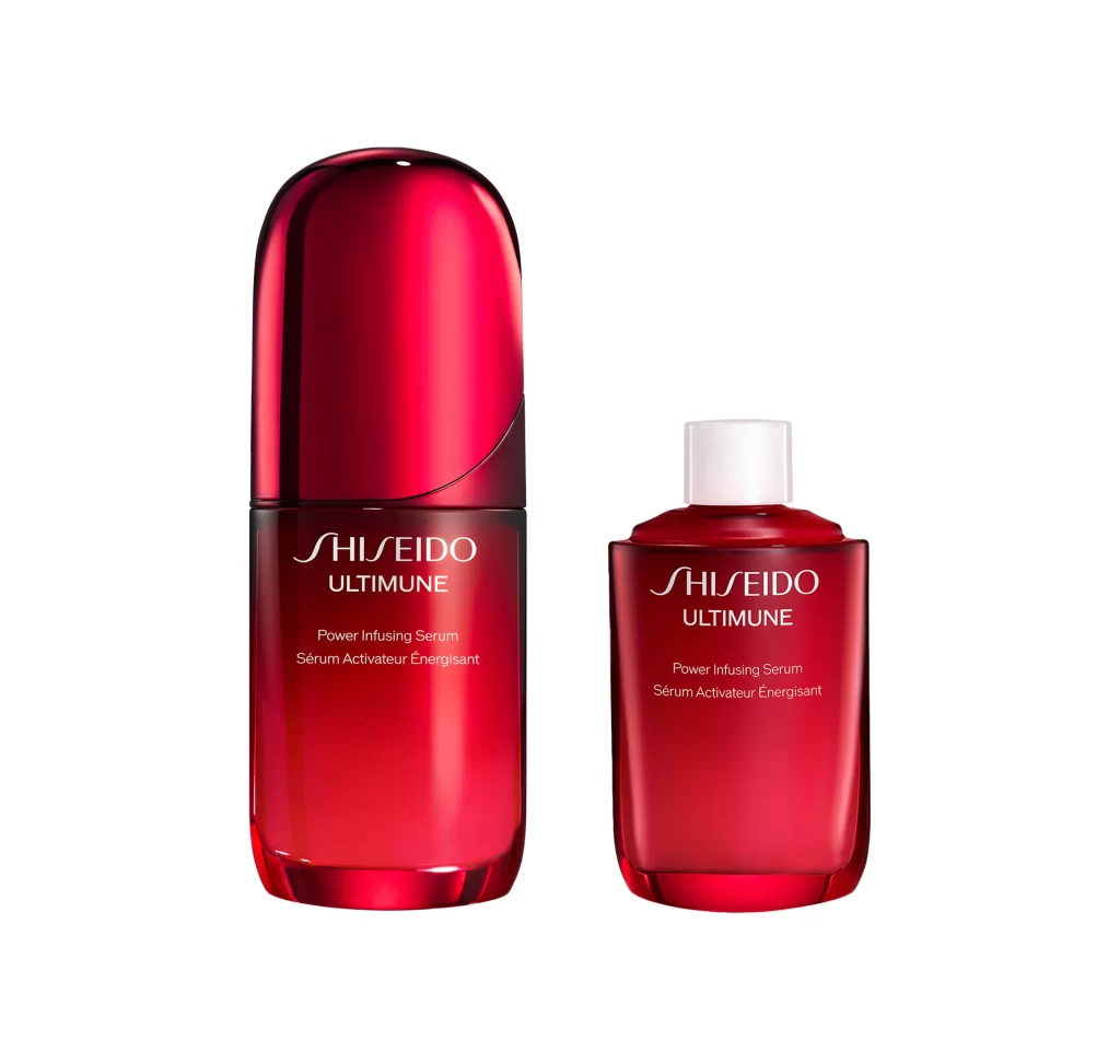
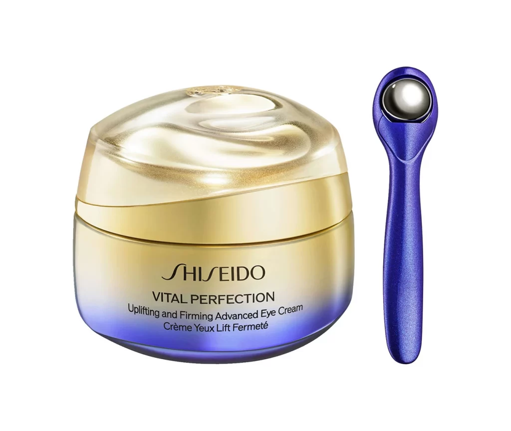
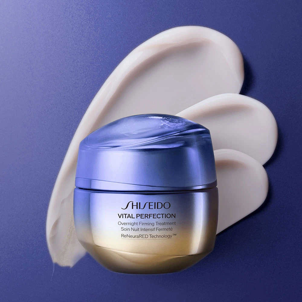
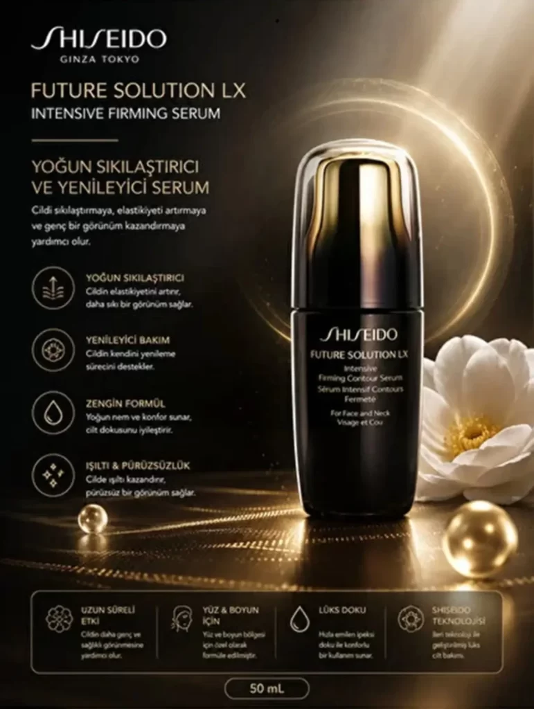
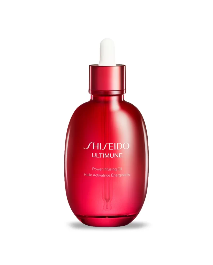
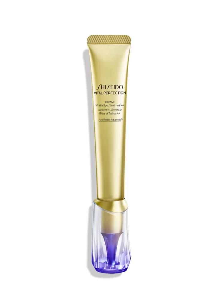
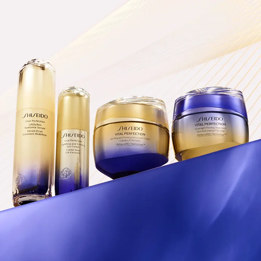
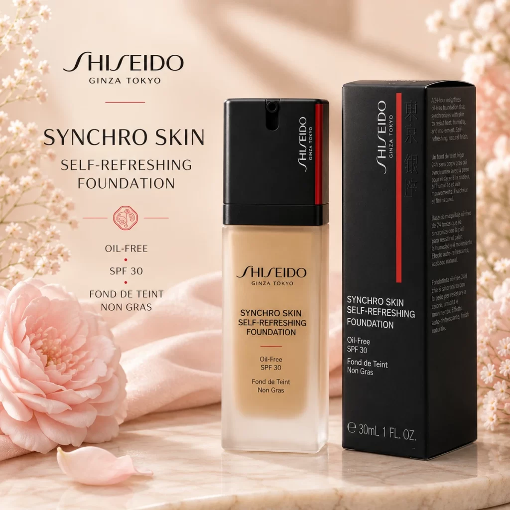
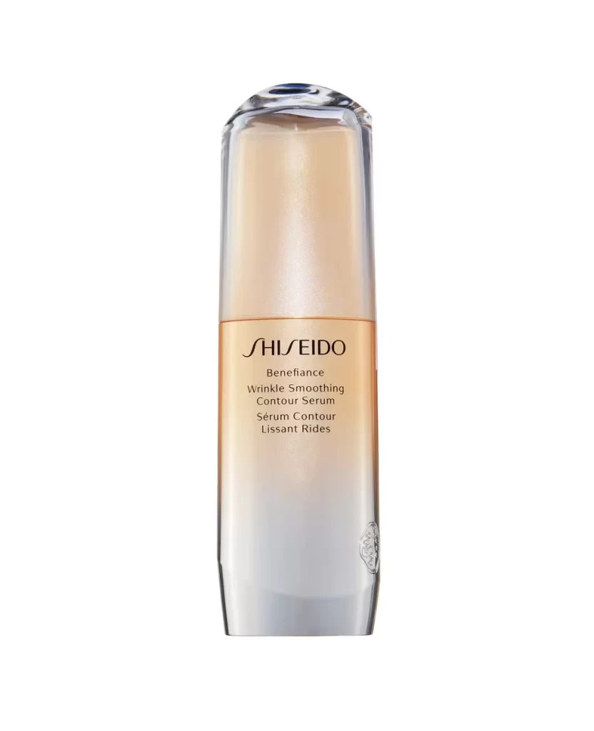
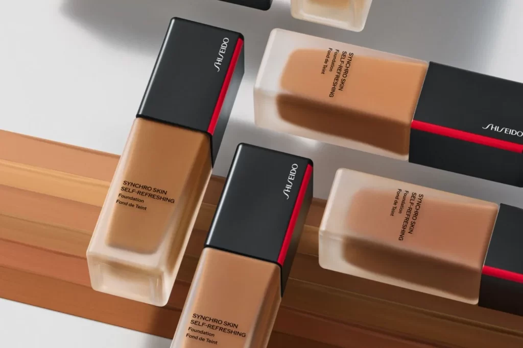
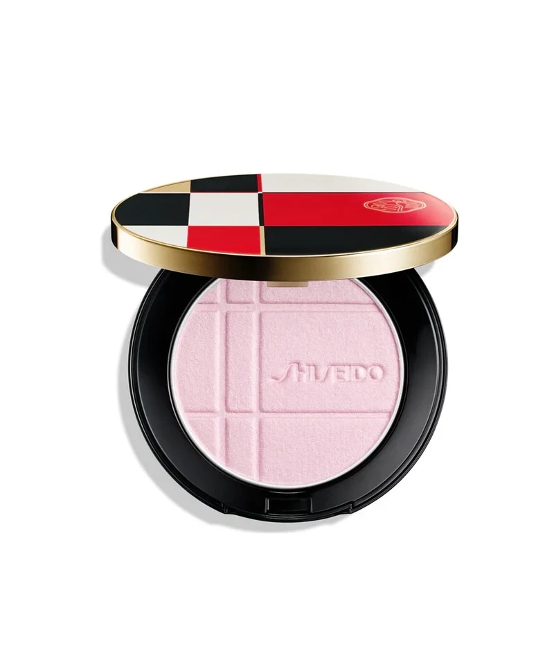
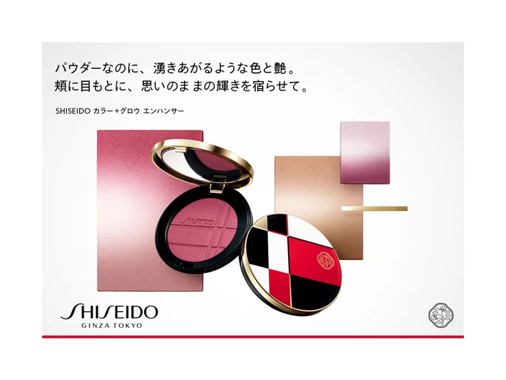
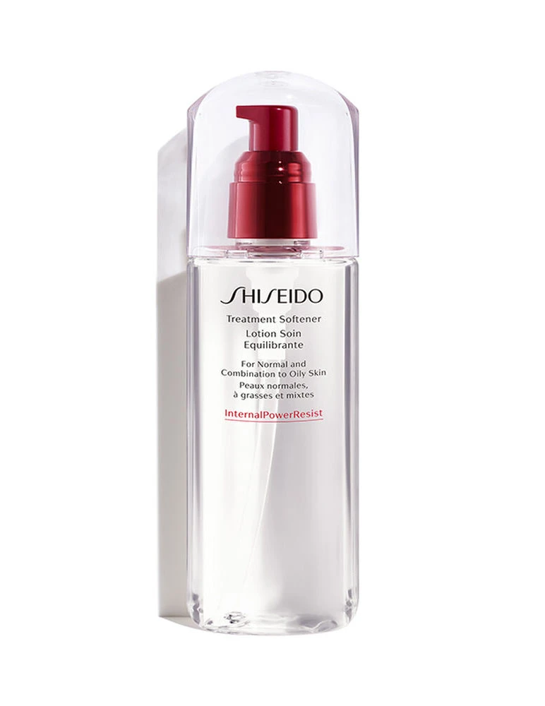
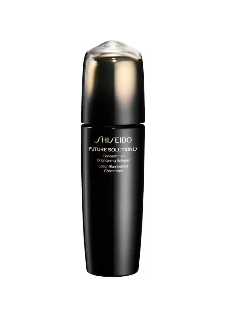
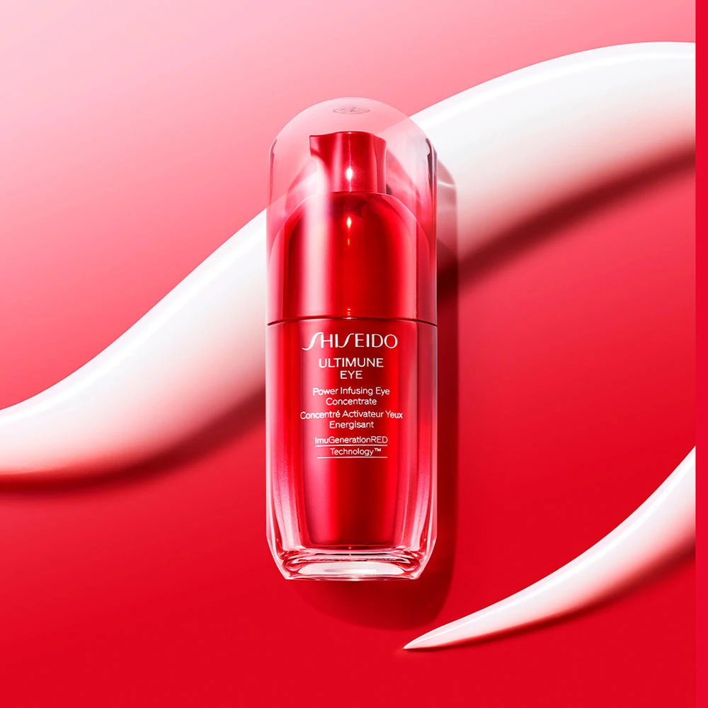
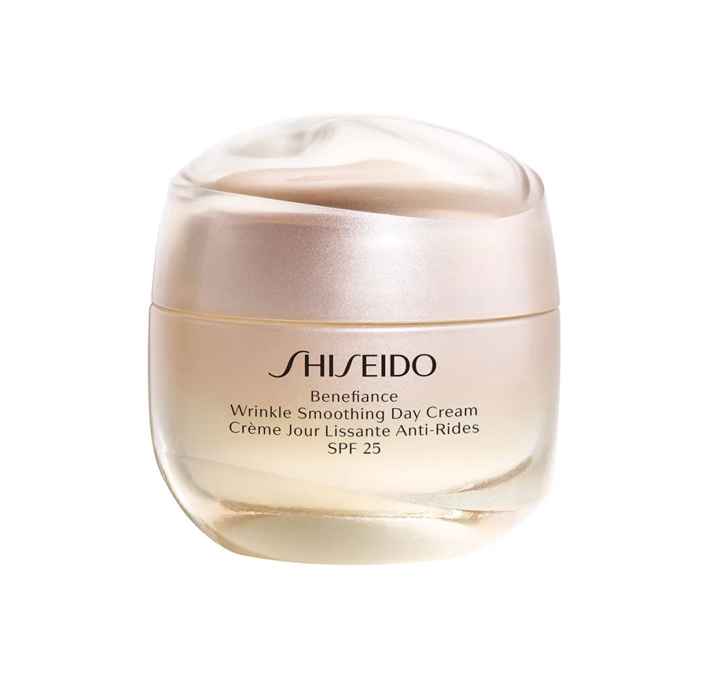
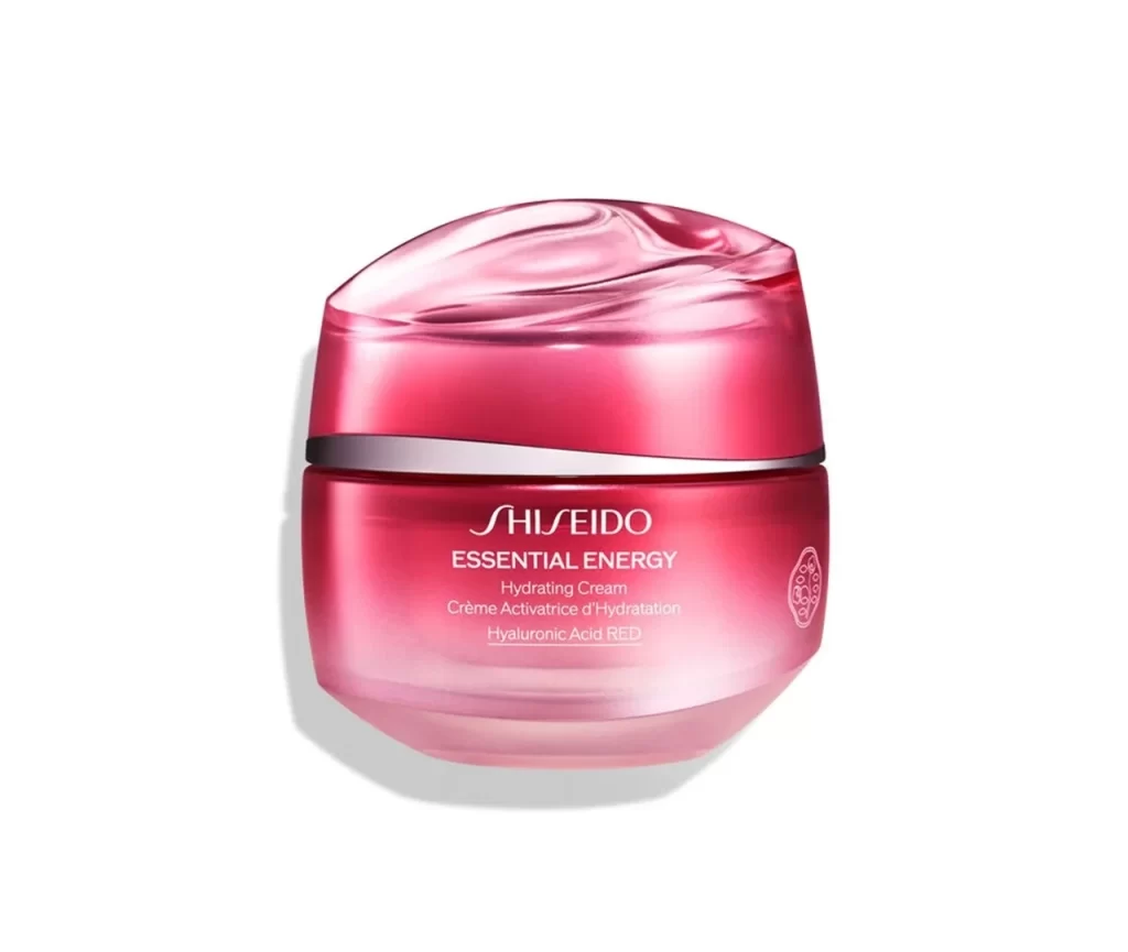
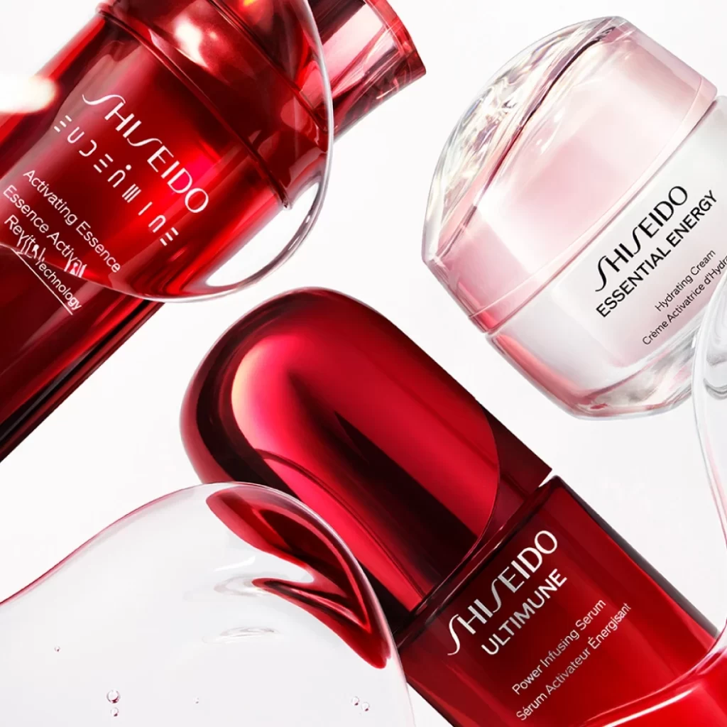
This post shows a styled composition of four Shiseido skincare products arranged in a dynamic overlapping layout on a plain white background. The arrangement includes one glossy red bottle printing ULTIMUNE Power Infusing Serum with a French line, and one white jar with a clear lid printing ESSENTIAL ENERGY Hydrating Cream with a French line. A red activating essence bottle with a reflective red liquid droplet detail beside it appears, though its line name is not clearly legible at this angle. A clear transparent bottle holding visible serum with no legible label text completes the set, with no people or props present.
The design language centers on a striking material contrast between glossy red glass and matte white plastic. Soft even studio lighting creates highlights on the glossy surfaces, enhancing the visual depth of the overlapping layout. The bilingual English-French typography on the labeled bottles adds a structured, international aesthetic to the clean composition. The plain white background keeps the focus entirely on the forms, colors, and textures of the skincare items.
Designers can study how the dynamic overlapping layout creates spatial relationships and visual hierarchy among multiple items. The interaction between glossy red glass and matte white plastic offers a clear lesson in using material contrast to draw attention. The soft even studio lighting demonstrates how to control highlights on glossy surfaces without losing detail. The neutral presentation of the red activating essence and the unlabeled clear transparent bottle shows how to handle items with incomplete or missing text.