Shiseido Ultimune Power Infusing Serum Packaging
Topics
Details
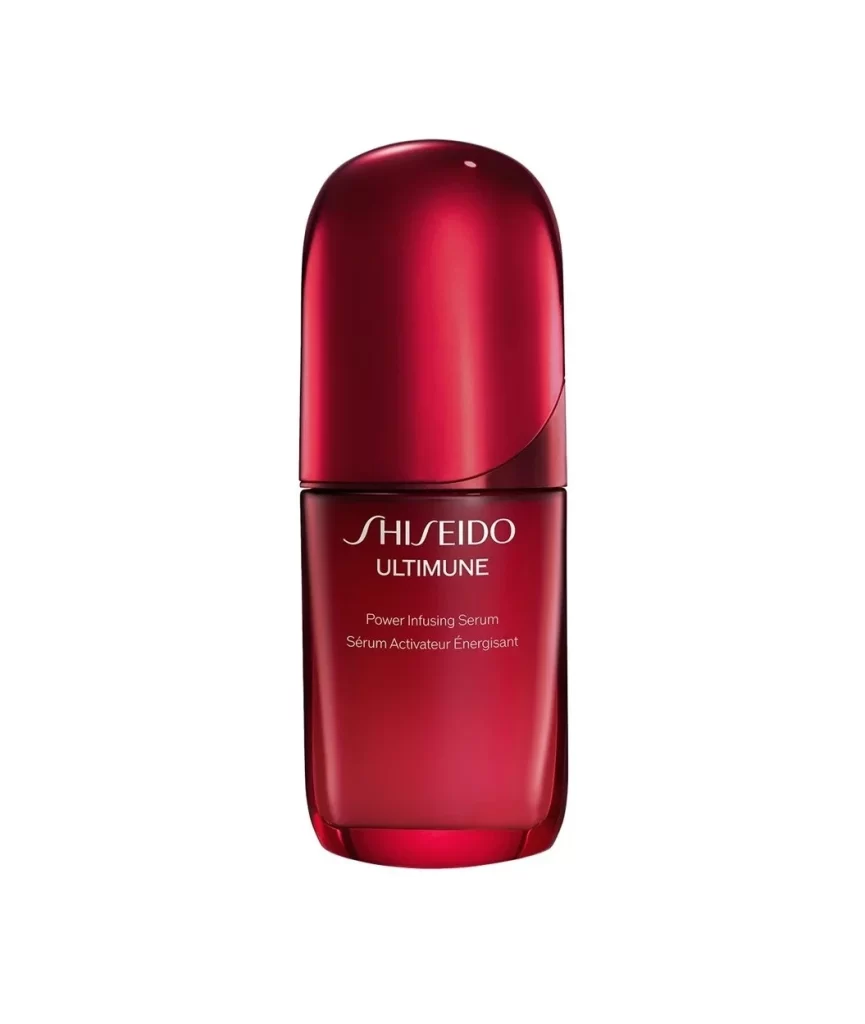
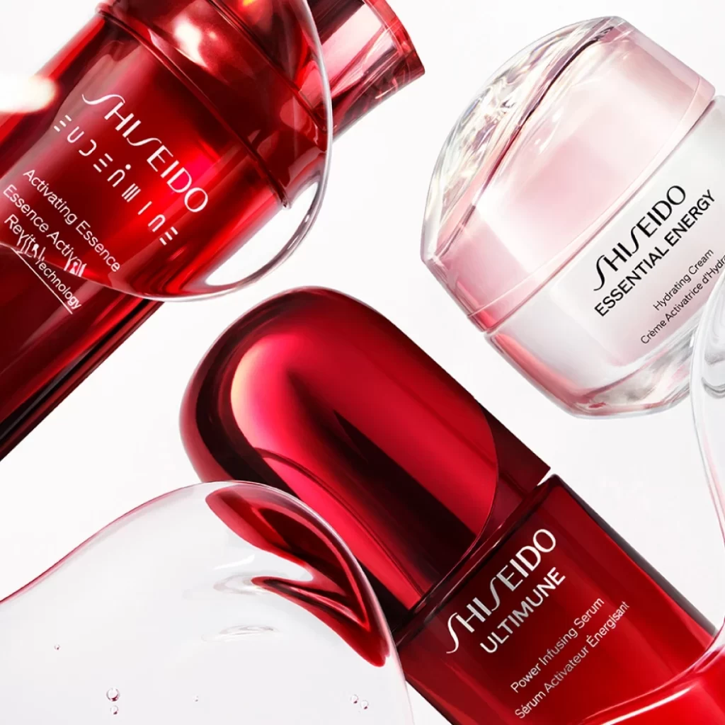
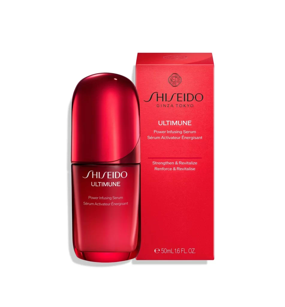
This post features a clean packshot presentation of a single Shiseido Ultimune bottle alongside its retail box, both set against a plain white studio background. Soft even lighting highlights the signature vibrant red color used consistently across both items, with no props or people present. The glossy deep red bottle bears a matching metallic red cap and prints the product name in English and French, while the matte red cardboard box displays the full bilingual branding and size details.
The design language centers on Shiseido's signature vibrant red, applied with deliberate material contrast between the glossy bottle and the matte cardboard box. Both items print the Shiseido and Ultimune names prominently, with the bottle showing Power Infusing Serum and Serum Activateur Energisant, and the box adding the Ginza Tokyo origin and the Strengthen and Revitalize claim in English and French. The consistent color and typographic system across distinct surfaces creates a unified brand identity that reads clearly in a plain studio setting.
Designers can study how material finishes, glossy versus matte, shift the perception of a single brand color under soft even lighting. The post also offers a close look at bilingual label hierarchy, showing how English and French text coexist on both a curved bottle surface and a flat carton face. The clean packshot presentation, free of props and advertising styling, makes it easy to analyze the structural typography, color blocking, and packaging geometry on their own merits.