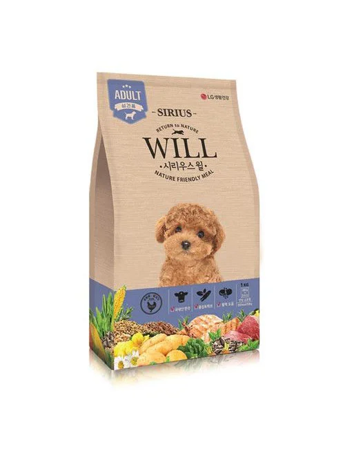
Sirius Dog Food Nature Friendly Meal Brown Illustration
Topics
Details
A kraft paper bag of Sirius brand dog food stands upright, its surface dominated by a warm tan hue and a subtle woven texture that suggests an eco-conscious material choice. The upper portion features a blue shield badge labeled "ADULT" alongside the word "SIRIUS" in a clean sans-serif font, while the central branding displays "WILL" in bold serif lettering above the Korean text "시리우스 윌" and the English tagline "NATURE FRIENDLY MEAL." A photorealistic illustration of a fluffy brown poodle with dark eyes occupies the middle section, and the lower band transitions into a vibrant collage of ingredients including corn, chicken breast, potatoes, and leafy greens against a deep blue backdrop.
Visual interest emerges from the deliberate contrast between the rustic, unbleached paper texture and the crisp, modern typography that signals premium quality without sacrificing an approachable, organic aesthetic. The inclusion of both English and Korean text creates a bilingual accessibility that broadens market appeal, while the detailed ingredient illustration at the base serves as immediate visual proof of the product's natural composition claims. Soft studio lighting casts gentle shadows along the right edge of the bag, lending three-dimensional depth to the otherwise flat product photography.
Packaging designers studying sustainable material applications would find this reference valuable for understanding how earthy textures can coexist with sophisticated branding elements. Marketing teams developing pet food campaigns could analyze the effective use of animal imagery to create emotional resonance with target consumers. Brand identity specialists might examine the typographic hierarchy to see how multiple languages are balanced within a cohesive visual system that maintains readability across different markets.