Six Wine With Unique Labels Bottle
Topics
Details
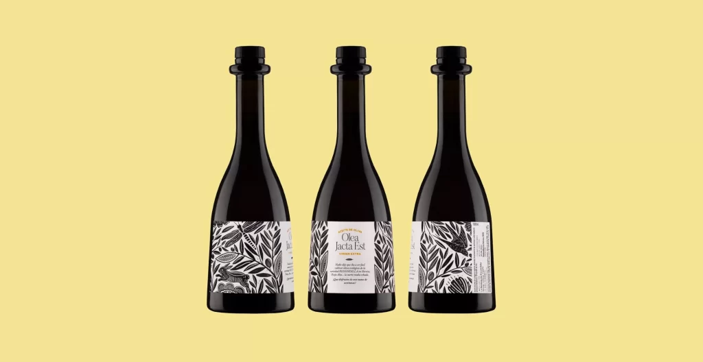
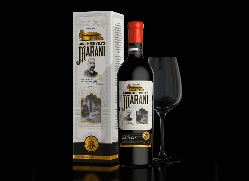
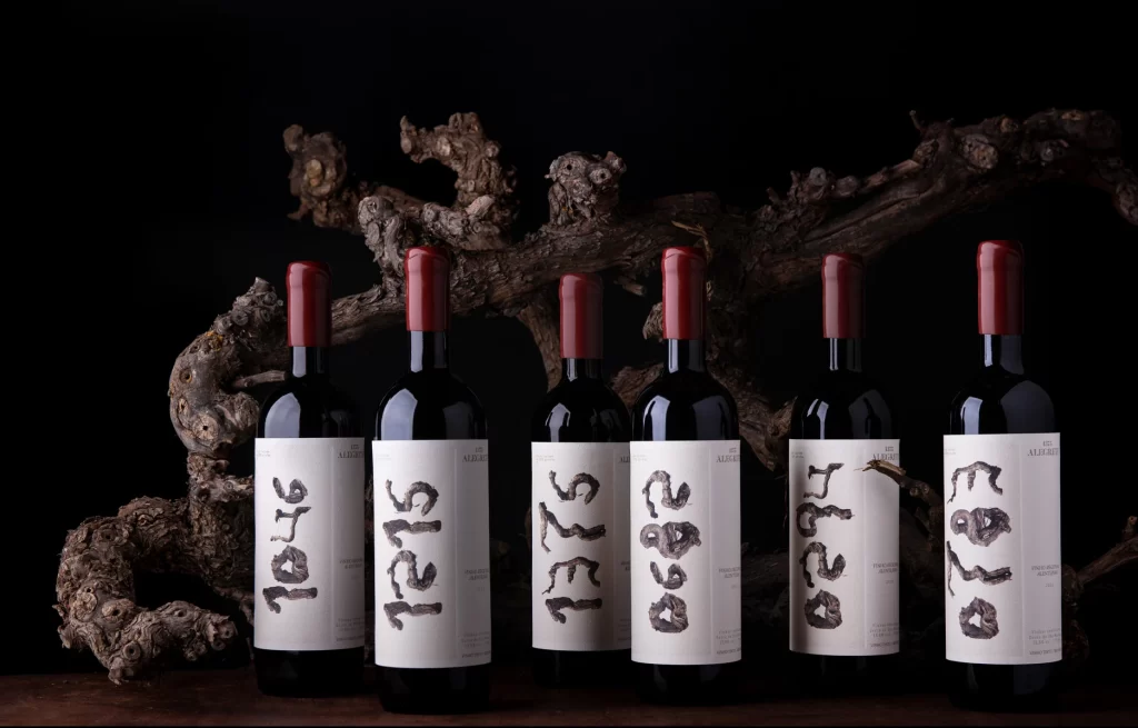
Against a pitch-black backdrop, six dark glass bottles stand in a loose row, each sealed with a matte crimson capsule. The labels are stark white rectangles featuring bold, hand-drawn numerals in a textured charcoal ink that mimics the gnarled, ancient wood vine resting behind them. Soft directional lighting from the left casts subtle shadows, emphasizing the rough organic texture of the driftwood and the glossy surfaces of the bottles.
What sets this collection apart is the deliberate imperfection of the typography, where each year—ranging from 1575 to 0780—is rendered with varying thickness and irregular edges. This raw, almost primitive script creates a striking contrast against the clean, minimalist layout of the rest of the label, suggesting a deep connection to history and terroir. The visual tension between the refined bottle shape and the rugged, earthy graphics gives the packaging a distinctively artisanal and timeless character.
Packaging designers studying the balance between minimalism and expressive typography will find this a valuable case study in how texture influences brand perception. Art directors working on luxury beverage branding could analyze the interplay between the organic background elements and the product to understand mood setting. Additionally, illustrators looking to experiment with hand-lettered fonts can examine how the weight of the strokes affects readability and emotional impact.