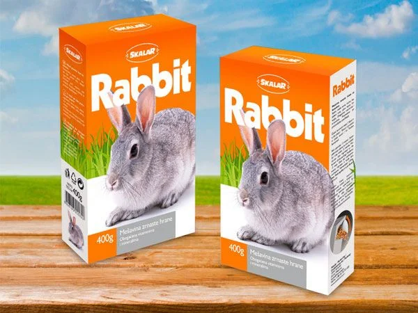
Skalar Rabbit Orange Box Rabbit Illustration
Topics
Details
Two rectangular cardboard cartons for Skalar brand rabbit food sit on a weathered wooden surface, displaying a vibrant orange upper half and white lower section. Each box features a large, realistic illustration of a gray rabbit with pink inner ears and dark eyes, positioned above a strip of green grass graphics. The word 'Rabbit' appears in bold white sans-serif lettering beneath the oval Skalar logo, while '400g' and 'Poedering straatje fraai' text occupy the bottom gray panel. Bright daylight illuminates the scene from the front, casting soft shadows across the wood grain, with a blurred blue sky and green field visible in the distance.
The packaging design employs a high-contrast color scheme that draws immediate attention to the product category through its saturated orange hue and oversized typography. Photographic realism in the animal illustration creates an emotional connection with pet owners, while the consistent branding elements across both visible faces ensure instant shelf recognition. Subtle details like the grass motif and weight specification integrate functional information without disrupting the clean visual hierarchy.
Product photographers and packaging designers might study this composition to understand how lighting affects printed materials and how three-dimensional objects are staged for commercial photography. Art directors working on pet industry campaigns could analyze the color psychology behind the orange-and-white palette when developing new brand identities. Students of visual merchandising may reference the spatial relationship between the two boxes to learn about depth perception in flat-lay arrangements.