SkinCeuticals A.G.E. Interrupter Ultra Serum Bottle Packaging
Topics
Details
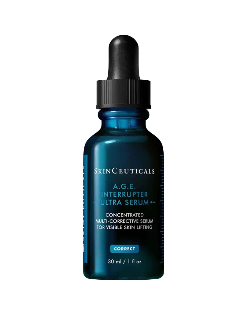
The SkinCeuticals A.G.E. Interrupter Ultra Serum arrives in a dark teal glass bottle sealed with a black dropper cap. On the front label, SkinCeuticals sits in white capitals above the product name, where A.G.E. prints in light blue and Interrupter Ultra Serum in deep blue to match the glass. Below it, a white line reads Concentrated Multi-Corrective Serum for Visible Skin Lifting, a CORRECT badge marks the correction stage of the brand’s care philosophy, and the 30 ml / 1 fl oz volume closes the layout. The bottle stands straight-on against a clean white studio backdrop.
The design translates the formula’s anti-glycation positioning into glass and type: the dense blue-green bottle protects an antioxidant-heavy serum while the two-tone wordmark keeps the clinical identity legible at shelf height. A dropper format signals precision dosing for a concentrated corrector, and the restrained white stage lets the bottle’s color do all the talking.
For designers, this is a reference in premium serum packaging: color-coded typography on tinted glass, a disciplined label hierarchy from brand to benefit to volume, and the classic contrast of black dropper hardware against colored glass. The free download provides the full-resolution file for branding and packaging studies.