Shiseido White Lucent Sakura Edition Bottle Packaging
Topics
Details
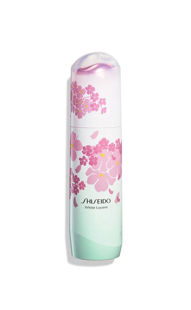
The SHISEIDO White Lucent Sakura Edition bottle packaging features a clean background that highlights a limited edition cherry blossom motif. Pink floral illustrations wrap the container, which displays an ombre gradient from white to pale mint green base. An iridescent pearlescent dome cap crowns the design, perfectly capturing a serene Japanese spring aesthetic. The bold text reading SHISEIDO White Lucent anchors the composition.
This packaging masterfully balances modern luxury with seasonal storytelling. The ombre gradient from white to pale mint green base evokes fresh mornings, while pink floral illustrations add softness. The iridescent pearlescent dome cap introduces a tactile, premium feel. Designers studying this campaign will note how the Japanese spring aesthetic is communicated through subtle color transitions rather than overwhelming graphics, keeping the clean background perfectly uncluttered.
Graphic designers and packaging specialists seeking inspiration for limited edition cosmetics will find this reference invaluable. Brands aiming to merge luxury skincare with seasonal motifs should study how the cherry blossom theme integrates seamlessly. The iridescent pearlescent dome cap and ombre gradient from white to pale mint green base offer brilliant techniques for creating premium, spring-themed product lines without sacrificing the clean background aesthetic.