Shiseido Vital Perfection Skincare Set Packaging
Topics
Details
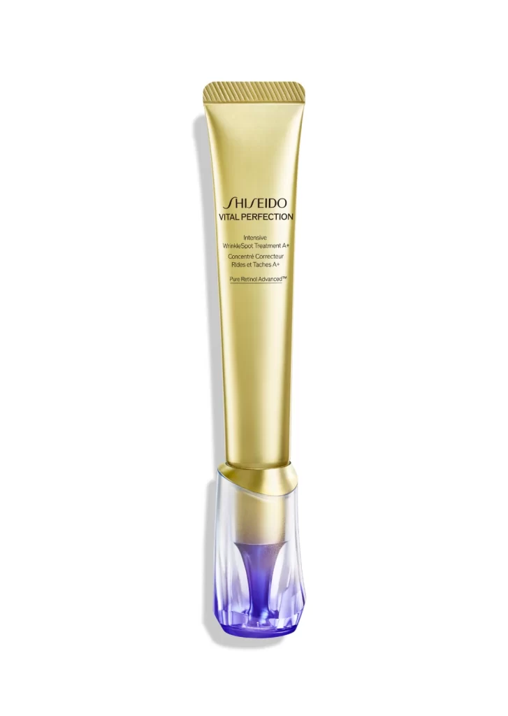
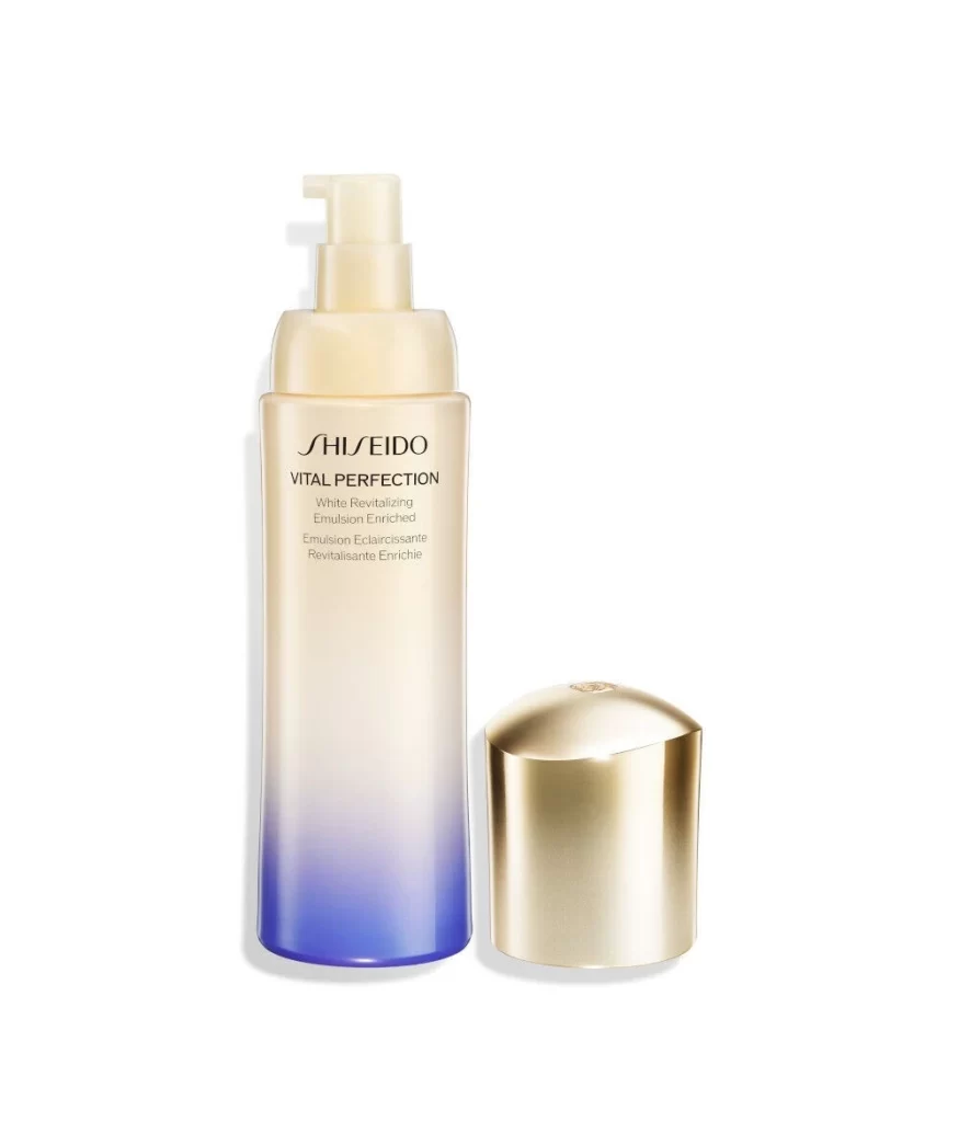
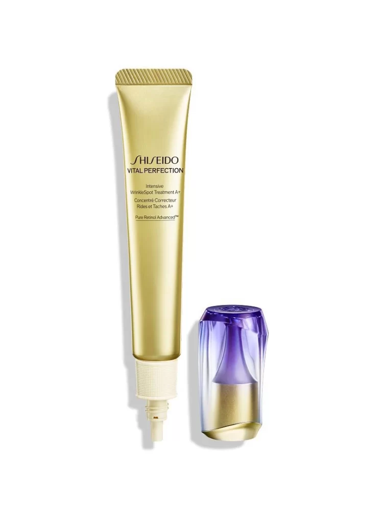
The image displays a single Shiseido Vital Perfection Intensive WrinkleSpot Treatment tube resting against a plain white studio background. The sleek white tube features elegant gold typography and is positioned horizontally. Beside it sits a detached purple gradient cap, presented as a separate element. This clean composition highlights the product's minimalist form and the distinct color contrast of its components.
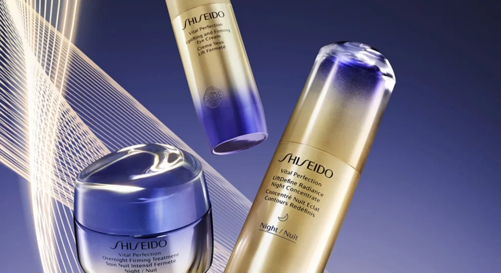
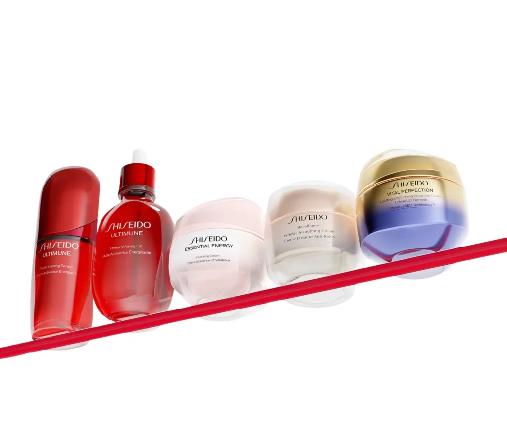
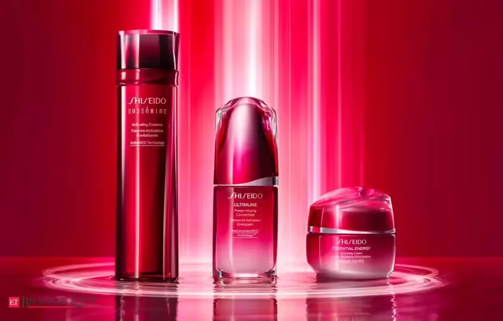
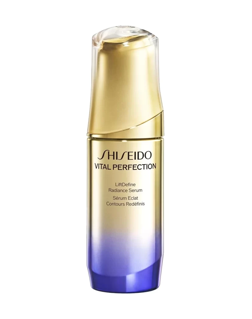
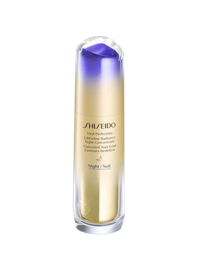
The packaging design leverages a sophisticated palette of white, gold, and purple to convey luxury and efficacy. White establishes a clinical purity, while gold accents signal premium skincare heritage. The detached gradient cap introduces a modern, vibrant visual anchor that contrasts sharply with the tube's stark body. This styling choice emphasizes the applicator's importance and creates a striking, balanced composition.
Graphic designers and packaging specialists will find this reference valuable for luxury cosmetic presentations. Art directors can study the effective use of negative space and detached component styling for e-commerce imagery. Branding agencies analyzing premium skincare visual identities may also use these shots to understand how minimalist backgrounds and targeted color accents communicate high-end product efficacy.