Slug Cream Barrier Repair Moisturizer Jar
Topics
Details
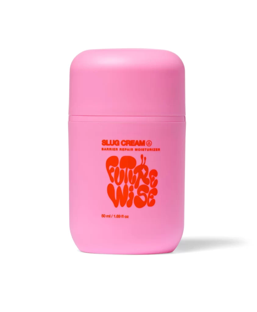
A matte bubblegum pink cylinder dominates the frame, featuring a softly rounded lid that sits flush against the main body. Bold coral-red typography spans the front, displaying 'SLUG CREAM' in a clean sans-serif above the product type, while a chunky, psychedelic-style font spells out 'FUTURE WISE' below. The container rests on a seamless white surface with subtle shadowing beneath it, captured from a straight-on perspective that emphasizes its symmetrical proportions and the 50 ml volume notation tucked near the bottom edge.
Visual interest stems from the deliberate clash between the utilitarian cylindrical form and the playful, organic lettering of the brand name. The high-contrast pairing of pastel pink against vivid orange-red creates immediate pop without relying on complex graphics or imagery. Such a minimalist yet bold approach demonstrates how typography alone can carry an entire product identity when paired with confident color choices and substantial physical presence.
Packaging designers studying contemporary skincare trends would examine this to understand how millennial and Gen Z aesthetics translate into three-dimensional forms. Brand identity specialists might analyze the font hierarchy to see how functional information balances with expressive branding. Anyone developing color palettes for youthful beauty products could pull specific hex values from this composition to inform their own material selections and print specifications.