Te Taiwan Packaging A
Topics
Details
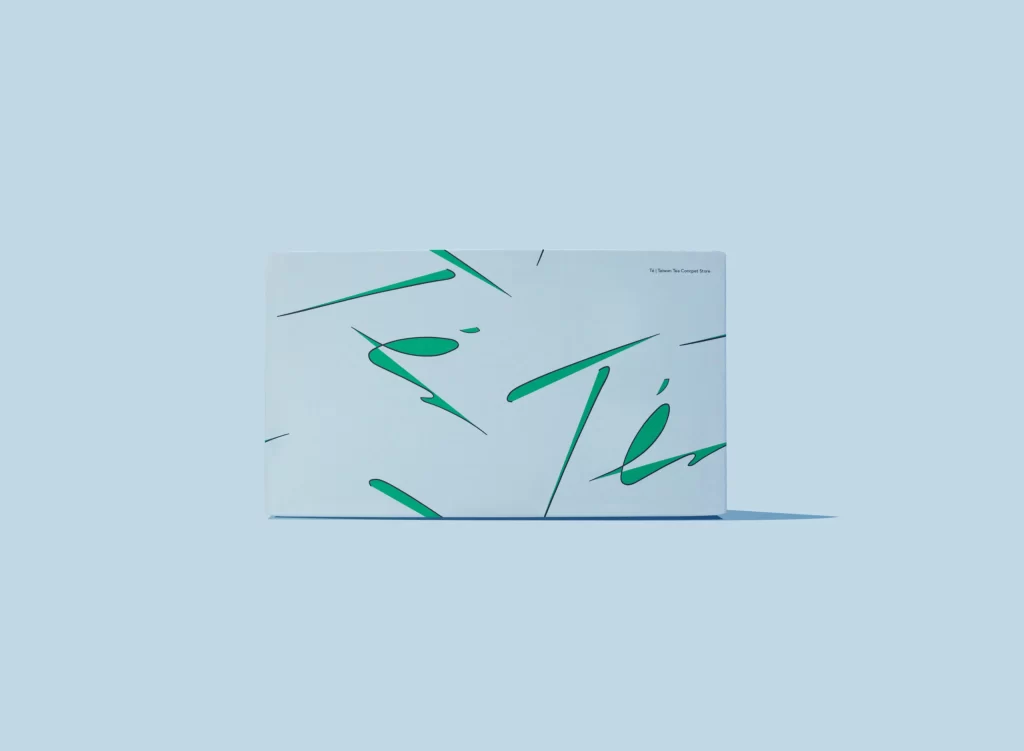
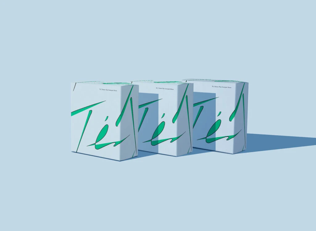
Two rectangular white cardboard boxes stack neatly, their surfaces animated by bold, emerald-green brushstrokes that slash across the material with energetic precision. A slight three-quarter camera angle reveals both the top and side panels of each container while subtle shadows anchor them to the soft, pale blue backdrop.
What distinguishes this particular arrangement is the confident interplay between minimalism and expressive mark-making, where the organic, almost calligraphic green lines disrupt the otherwise sterile white geometry. The strokes vary in weight and curvature—some tapering to fine points, others swelling into leaf-like shapes—creating a dynamic visual rhythm that suggests movement and spontaneity. This tension between rigid structural form and fluid decorative gesture gives the packaging a contemporary, artistic personality that feels both playful and sophisticated.
Brand strategists developing eco-conscious product lines might study this reference to understand how limited color palettes and hand-drawn aesthetics can convey freshness without overwhelming the consumer. Packaging engineers could analyze how the graphics navigate box seams and folds, ensuring design continuity across three-dimensional surfaces. Meanwhile, art directors planning e-commerce photography sessions would find this setup useful for visualizing how stacked products create depth and hierarchy within a clean, commercial frame.