Te Taiwan Packaging B
Topics
Details
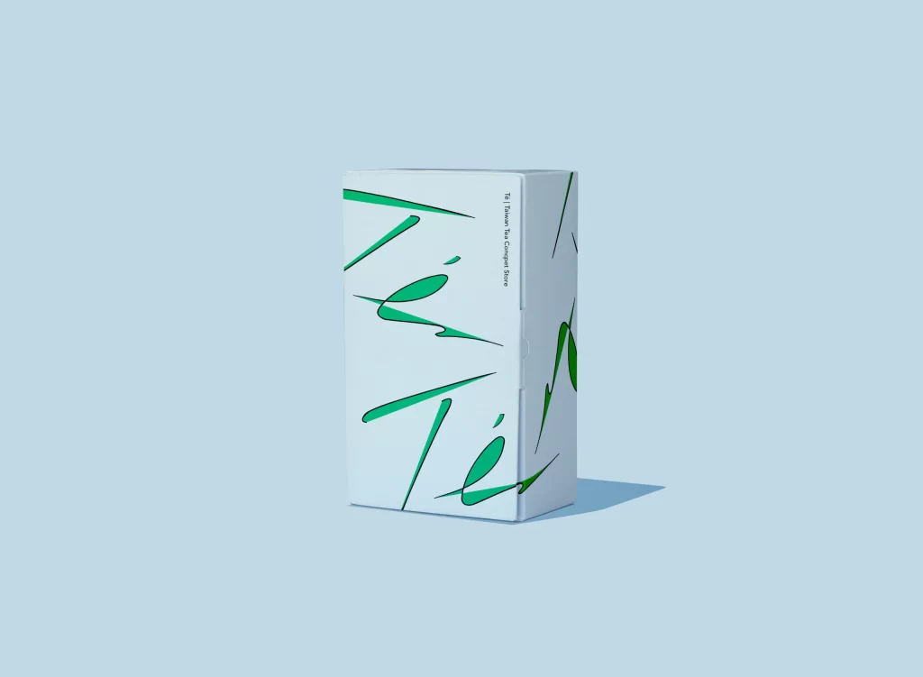
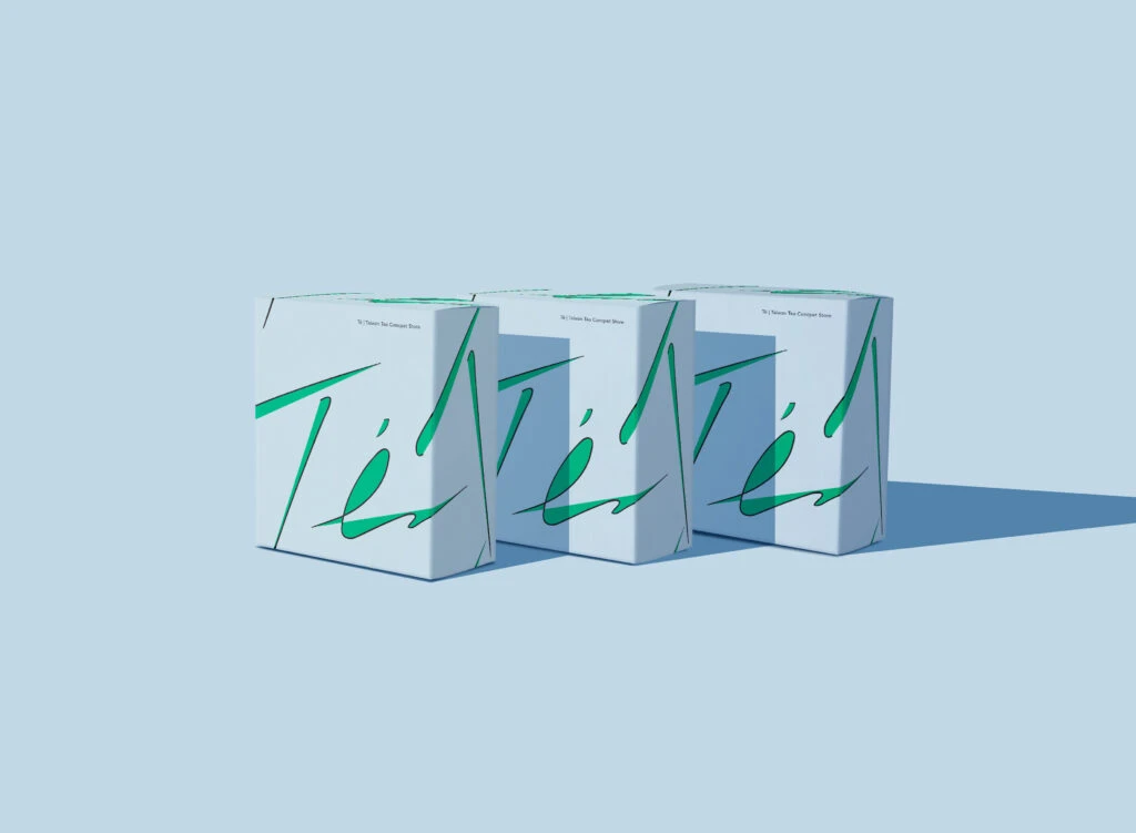
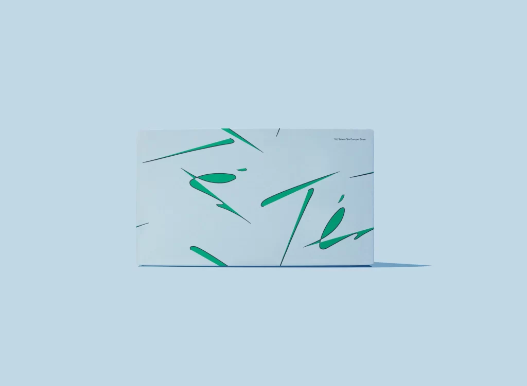
A rectangular white box sits centered in the frame, casting a soft, elongated shadow toward the lower right against a uniform pale cyan backdrop. Expressive, calligraphic strokes in vibrant emerald green form the word 'Té' across the container's surface amidst abstract linear flourishes, while small black typography appears in the upper right corner.
Visual interest here stems from the deliberate tension between the rigid rectangular substrate and the fluid, gestural quality of the green lettering. The brushwork exhibits varying line weights and dynamic angles that break the otherwise minimalist composition, creating a sense of movement across the static plane. Such an approach balances legibility with artistic expression, allowing the typography to function as both informational content and decorative pattern.
Brand strategists developing premium tea or wellness product lines could examine this execution to understand how minimal color palettes convey sophistication. Packaging engineers might study the spatial relationship between the oversized script and the compact format to optimize their own label layouts. Art directors seeking to modernize traditional beverage categories would find value in analyzing how calligraphic elements can refresh a classic product identity without overwhelming the consumer.