Teastan Tea Packaging A
Topics
Details
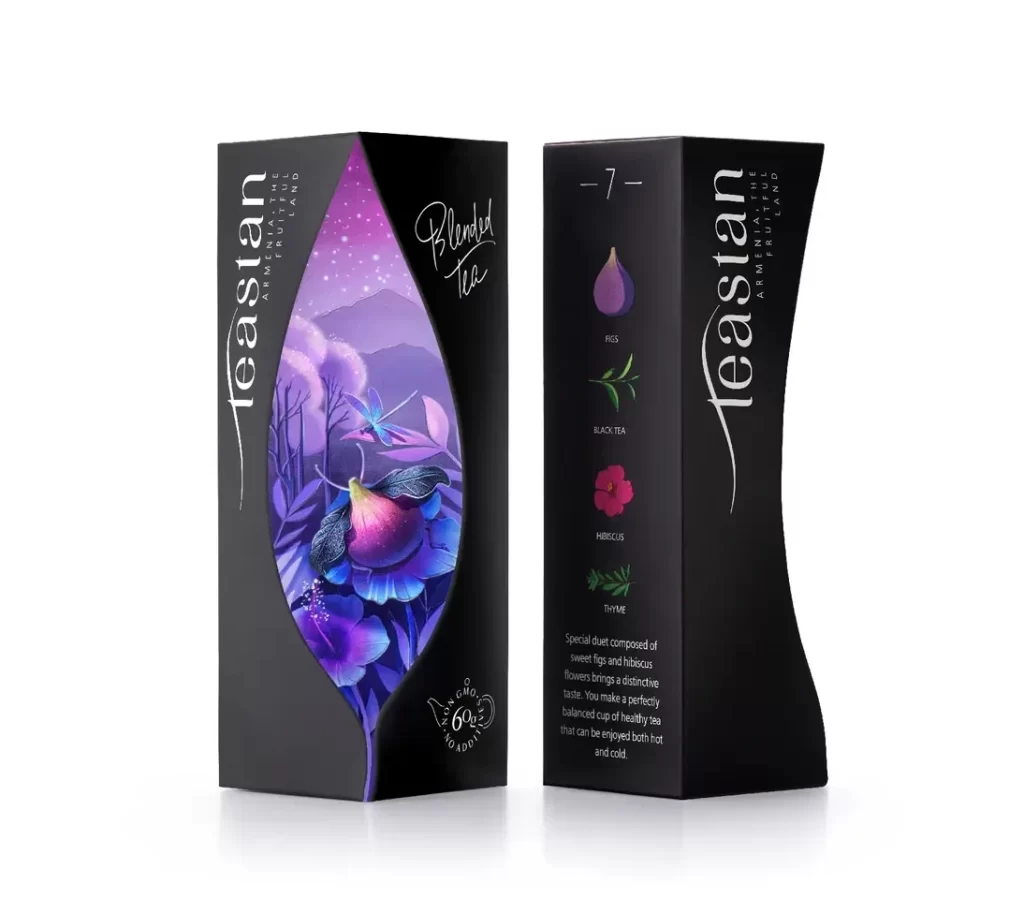
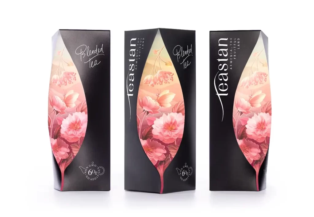
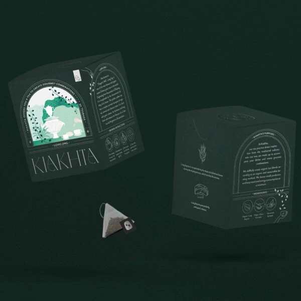
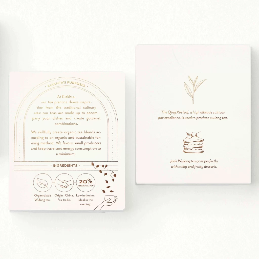
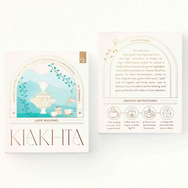
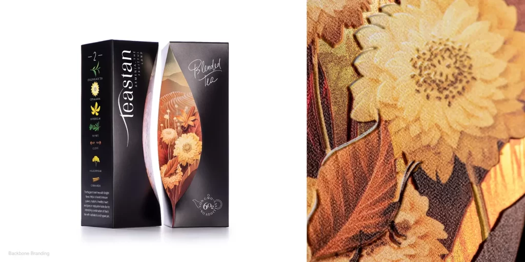
Two matte black rectangular boxes stand side by side on a white surface, their spines facing forward to reveal a sophisticated tea packaging concept. The left panel displays the brand name 'teastan' in a tall, elegant white serif font, positioned above a vertical column of botanical icons representing ingredients like chamomile and lemongrass. A distinctive curved cutout
Structural innovation defines this packaging through its asymmetrical window design, which transforms the container into a framing device for the internal artwork rather than merely displaying surface graphics. The contrast between the deep charcoal exterior and the luminous, painterly botanical illustration creates visual depth that draws the eye toward the product’s natural components. Typography choices balance the modern, minimal brand mark with organic, handwritten script elements, establishing a hierarchy that feels both contemporary and artisanal.
Packaging designers studying luxury beverage branding would examine this reference to understand how die-cut shapes can integrate illustrative elements into three-dimensional form factors. Art directors developing wellness or organic product lines might analyze the color palette transition from dark sophisticated exteriors to warm inviting interiors as a metaphor for flavor discovery. Students of structural design could trace how the curved aperture creates a dynamic silhouette while maintaining shelf presence and structural integrity for retail environments.