Teastan Tea Packaging B
Topics
Details
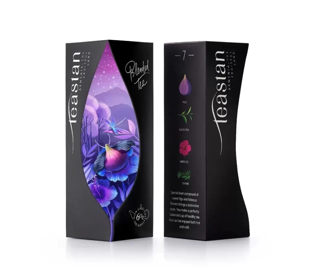
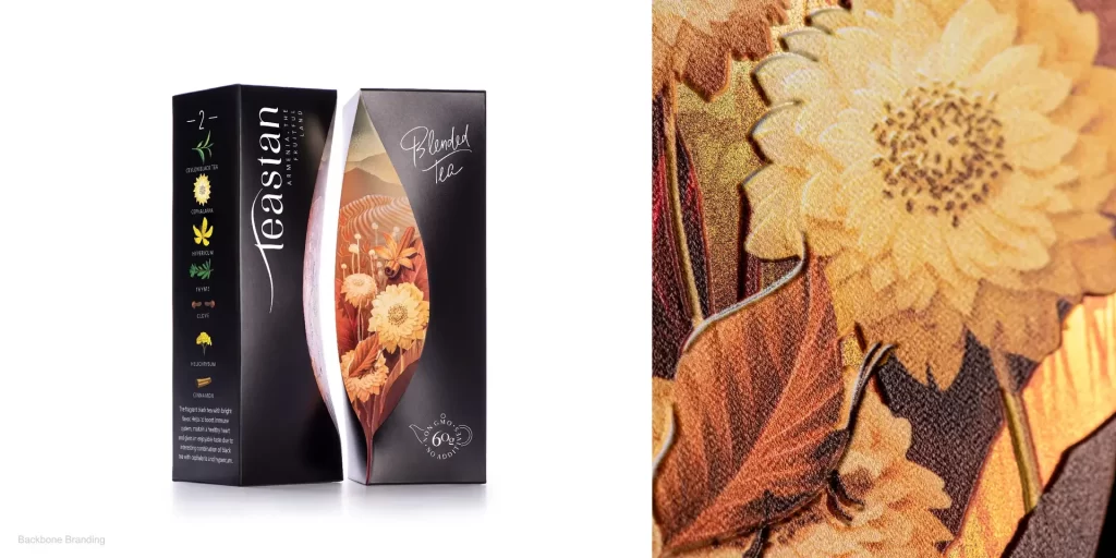
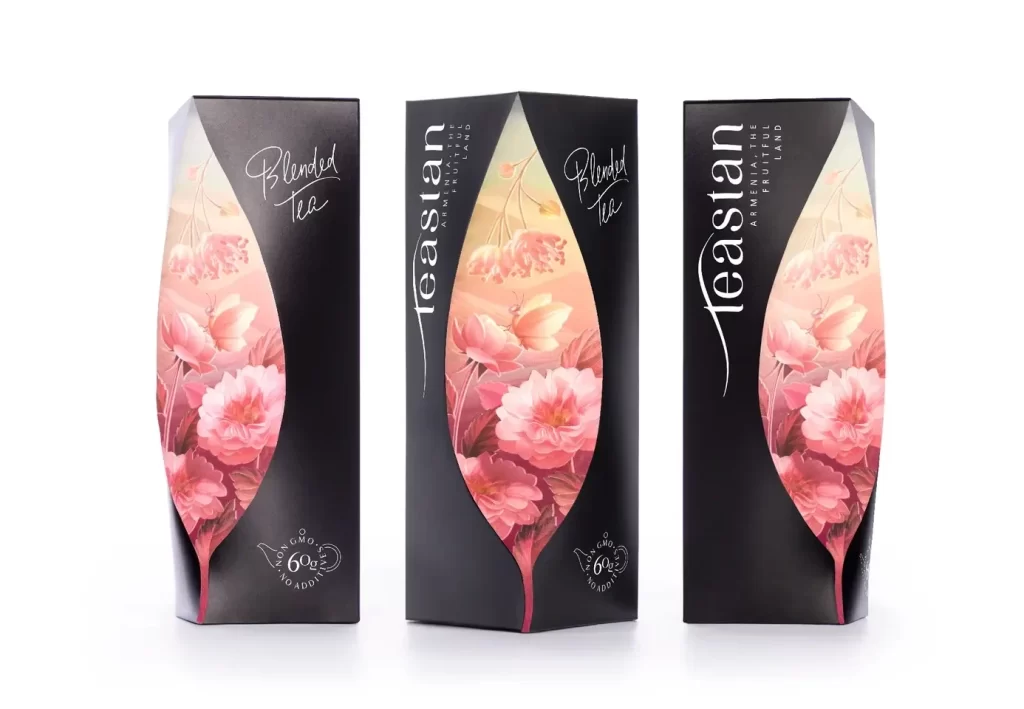
Three matte black cartons stand in a precise row, each featuring an asymmetrical die-cut window shaped like a stylized tea leaf that reveals delicate watercolor illustrations of pink blossoms and soft peach gradients within. Crisp white typography displays the brand name 'teastan' vertically alongside the cursive script 'Blended Tea', while the bottom of each package bears a circular seal indicating 60 grams and no additives. The packages rest on a white surface, their dark forms absorbing light to emphasize the vibrant floral artwork visible through the leaf-shaped apertures.
Structural innovation serves as the primary visual hook here, as the unconventional leaf-shaped aperture transforms a standard rectangular prism into something far more sculptural. By framing the botanical artwork through this organic cutout, the design creates a layered depth that plays with negative space, making the internal graphics feel like they are floating inside the dark shell. This interplay between the rigid geometric exterior and the soft, romantic interior imagery establishes a sophisticated tension between modern minimalism and traditional floral aesthetics.
Brand strategists examining structural packaging solutions would find this a prime example of how die-cutting can elevate a product’s shelf presence without relying solely on surface graphics. Art directors tasked with developing luxury beverage identities might study the balance between the bold black substrate and the translucent, ethereal art to understand how to convey premium quality through contrast. Furthermore, packaging engineers could utilize this specific form to explore the feasibility of custom window shapes in mass production for high-end retail environments.