Towel Packaging Green Fish Illustration Minimalist Design
Topics
Details
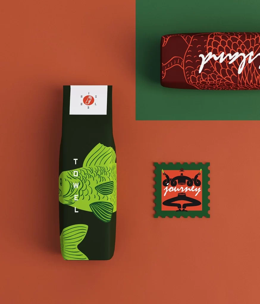
A dark forest-green towel package dominates the left side of the composition, featuring a bold lime-green koi fish illustration with detailed scale patterns and flowing fins. The word 'TOWEL' appears vertically in white sans-serif capital letters along the left edge of the packaging, while a white rectangular label at the top displays a small red circular emblem surrounded by tiny text. To the upper right, a maroon cylindrical object with red fish-scale textures and white cursive script sits on a deep green rectangular field, while a square stamp-like graphic with serrated edges occupies the lower right, showing the word 'journey' in white script over an orange background with black decorative motifs.
The visual tension between the organic, fluid lines of the koi illustration and the rigid geometric typography creates a compelling modern aesthetic that balances traditional Japanese imagery with contemporary minimalism. The limited color palette—restricted to forest green, lime, maroon, burnt orange, and crisp white—demonstrates sophisticated restraint, allowing the intricate fish scales to serve as the primary textural element without overwhelming the overall composition. This particular execution stands out for its confident use of negative space and the strategic placement of secondary branding elements that reinforce the aquatic theme without cluttering the primary product presentation.
Brand strategists developing hospitality or lifestyle product lines could analyze this composition to understand how cultural motifs translate into premium retail packaging aesthetics. Packaging engineers might study the dimensional proportions and label placement to inform their own structural design decisions for textile products. Art directors working on wellness or travel-related campaigns could reference the color harmonies and typographic hierarchy when creating cohesive visual systems that require both elegance and immediate product recognition.