typography show off
Topics
Details
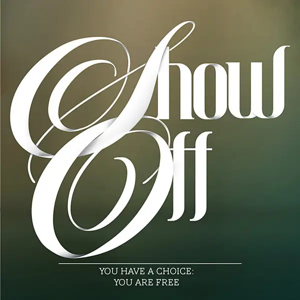
Elaborate, sweeping calligraphic flourishes on the initial 'S' and 'O' dominate the frame with dramatic loops, while the remaining letters 'how' and 'ff' adopt a more restrained, high-contrast white typeface. The phrase 'Show Off' sits atop a gradient background shifting from muted olive to deep forest green, with smaller text below reading 'YOU HAVE A CHOICE: YOU ARE FREE.'
Visual tension arises from the deliberate juxtaposition of ornate script against rigid geometric letterforms within a single wordmark. The oversized swashes of the capital letters create negative space that balances the dense weight of the subsequent characters, establishing a clear hierarchy between decorative and functional elements. Such interplay between fluid motion and static architecture challenges conventional typeface pairing by integrating conflicting styles into one cohesive unit.
Art directors developing luxury branding campaigns might study this layout to understand how scale variation commands viewer attention across different media. Typography instructors could employ this example when teaching students about the risks and rewards of mixing disparate font families in headline treatments. Editorial designers working on magazine feature openers would find the spatial relationship between the main display text and secondary caption particularly instructive for complex page layouts.