Vape Pen Modern Colorful Minimalist Design
Topics
Details
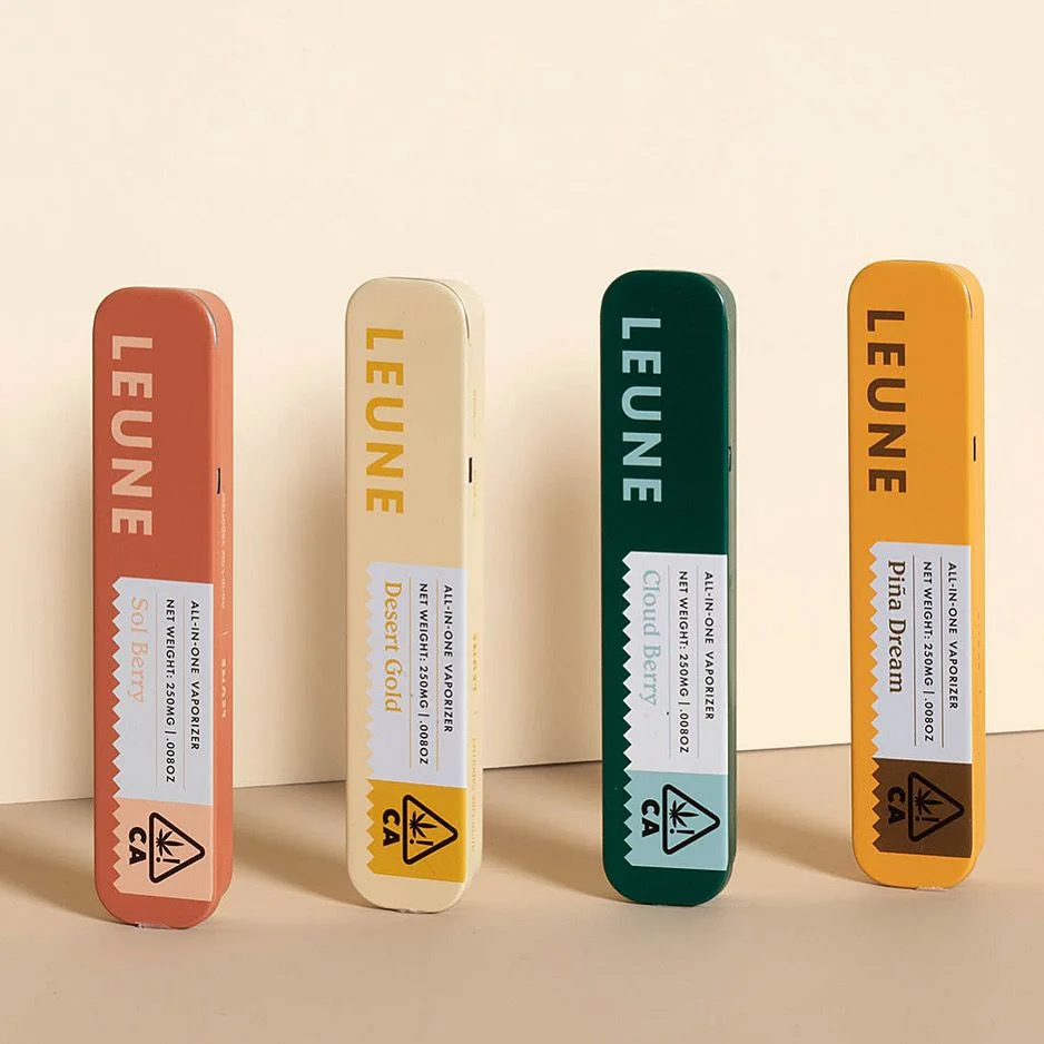
Four elongated cylindrical tins stand in a row, each finished in a distinct matte hue—terracotta red, pale cream, forest green, and mustard yellow. The brand name LEUNE appears vertically in bold sans-serif capitals along the upper portion of every unit, while flavor designations like Sol Berry, Desert Gold, Cloud Berry, and Piña Dream occupy diagonal white labels with serrated edges near the bottom. A triangular warning icon containing a cannabis leaf and the letters CA anchors each label's lower corner, accompanied by fine print specifying 'ALL-IN-ONE VAPORIZER' and net weight measurements.
Visual distinction emerges from the restrained chromatic palette and typographic hierarchy that balances industrial utility with lifestyle aesthetics. The uniform pill-shaped silhouette creates rhythmic repetition across the lineup, while the varied background colors allow for instant product differentiation without sacrificing brand cohesion. Subtle material textures and soft directional lighting emphasize the metallic edges and printed surfaces, suggesting premium positioning within the vaporizer category.
Packaging designers studying cannabis compliance labeling would find value in how regulatory icons integrate with decorative elements without disrupting visual flow. Brand strategists analyzing color-coded product families could reference this arrangement when developing SKU differentiation systems for retail environments. Industrial designers researching portable electronic device form factors might examine the proportions and ergonomic implications of this particular aspect ratio for handheld consumer electronics.