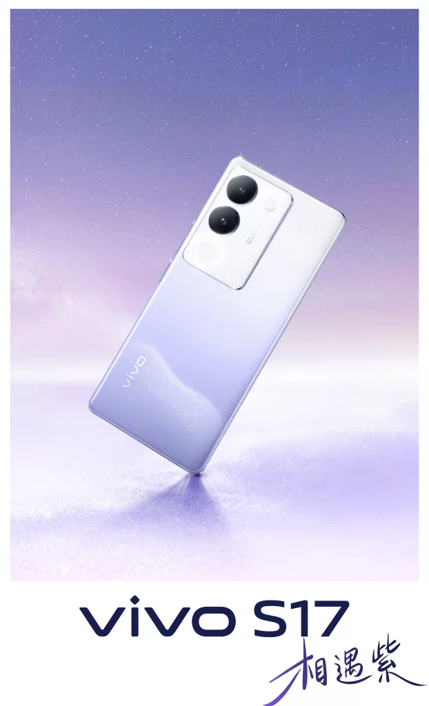
Vivo S17 Phone Advertisement
DownloadTopics
Details
Centered against a dreamy lavender and pale pink gradient background, a white-to-lilac gradient vivo S17 smartphone floats at a slight angle to showcase its dual-camera module and subtle logo. The composition features the product name in bold dark typography at the bottom, accompanied by the Chinese characters for "Meeting Purple" written in an elegant brush script. The overall aesthetic mimics a soft, ethereal sky with gentle light reflections beneath the device.
Marketing execution relies on a sophisticated pastel palette that transitions seamlessly from cool violet to warm blush tones, creating depth without overwhelming the product. Typography contrasts modern sans-serif branding with traditional calligraphic elements, bridging contemporary tech with cultural artistry. A full-resolution file of this promotional material is freely available for detailed examination of the lighting techniques and color grading used in the campaign.
Graphic designers frequently reference this layout when studying balanced product positioning and negative space utilization in luxury tech advertising. Marketing students analyze the color psychology behind the purple hues, which often symbolize creativity and premium quality in consumer electronics. Phone enthusiasts and collectors also utilize such high-quality renders to evaluate finish textures and camera module designs before purchase decisions.