Wine With Red Label Bottle
Topics
Details
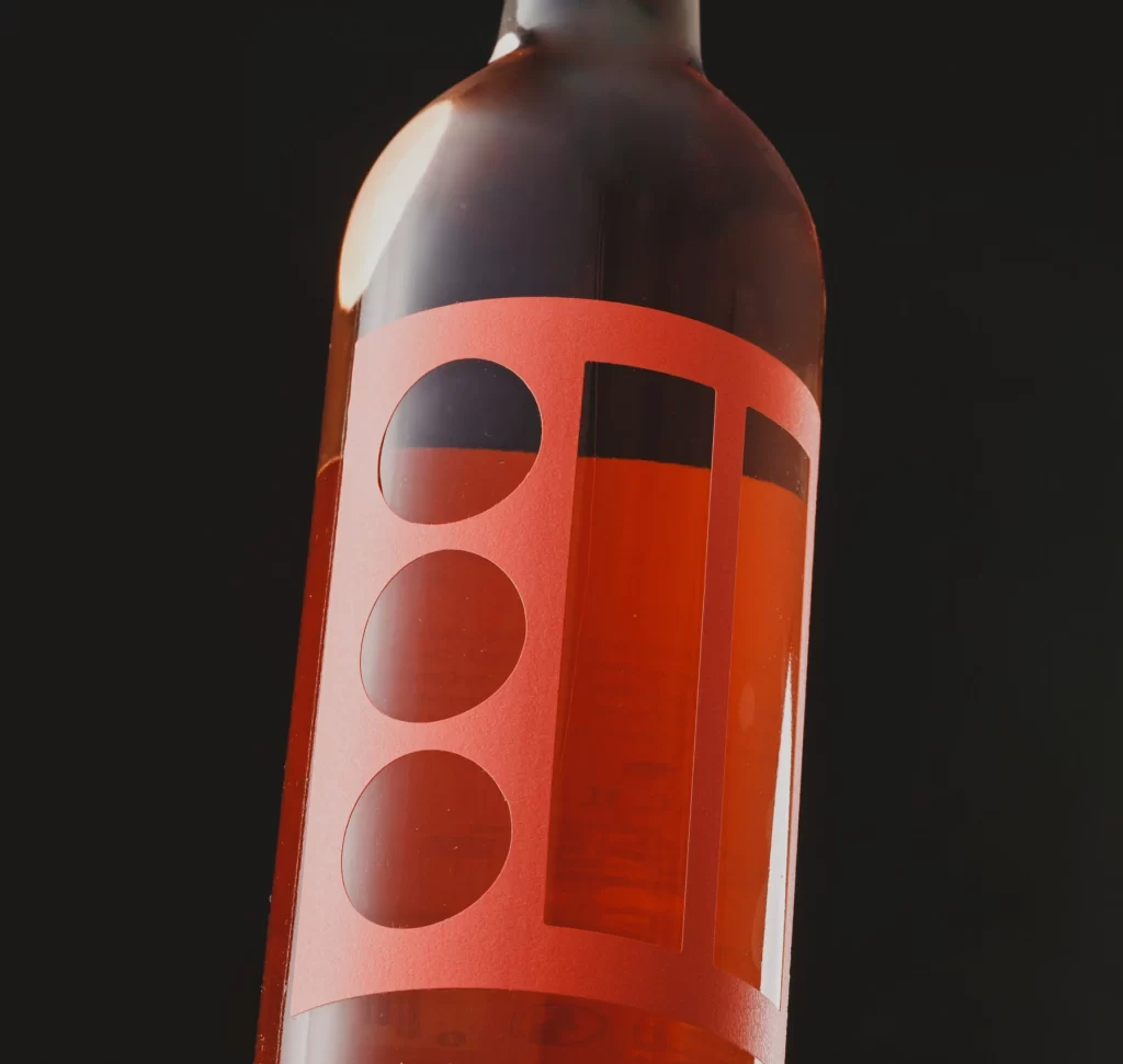
A salmon-pink label wraps around the upper torso of a glass bottle filled with translucent amber liquid, featuring three vertically stacked circular cutouts on the left and two tall rectangular windows on the right. The matte finish of the coral-toned paper contrasts with the glossy surface of the container, while deep black negative space peeks through each geometric aperture. Shot from a low three-quarter angle against an absolute black void, directional lighting creates a bright specular highlight along the bottle's shoulder and subtle reflections within the liquid itself.
What sets this packaging apart is its bold typographic abstraction, where the brand identity relies entirely on geometric rhythm rather than traditional lettering or illustrations. The interplay between opaque material and transparent cutouts creates a layered depth that changes as the viewer shifts position, making the rosé hue of the wine an integral part of the visual composition. Such minimalism demands precision in die-cutting execution and color matching to maintain its sophisticated, contemporary aesthetic.
Packaging designers studying modern wine branding will find this example particularly useful for analyzing how negative space can function as a primary design element without sacrificing shelf presence. Art directors working on beverage campaigns might reference the lighting setup to understand how to photograph translucent liquids while preserving label legibility through cutouts. Students exploring material contrasts could examine how the matte label texture interacts with reflective glass surfaces under controlled studio conditions.