
Packaging Picks — Shiseido: Shapes, Gradients, Japanese Minimalism
Few beauty brands have turned their own packaging into a design language as completely as Shiseido. Since its beginnings as a Ginza pharmacy in 1872, the house has built a visual system so disciplined that a single red bottle or a white camellia on red is enough to identify it — no logo required. For packaging designers, Shiseido is a reference study in how silhouette, color and restraint work together across dozens of product lines.
This design reference breaks the system into its three load-bearing parts: the bottle silhouettes that act as brand assets, the gradients that tell each product’s story, and the Japanese minimalism that keeps it all coherent.
Bottles and Jars: Silhouettes as Brand Assets
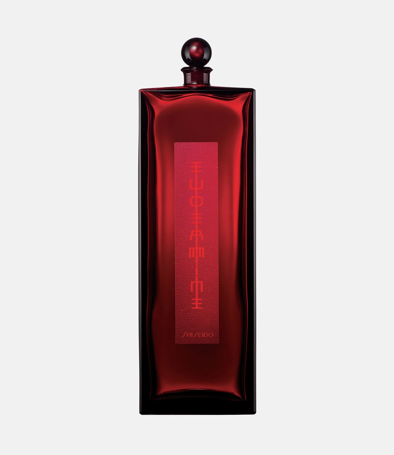
Shiseido’s most important packaging decision isn’t a graphic — it’s a shape. The Eudermine essence, the brand’s first skincare product from 1897, still ships in a tall, slender bottle of deep crimson glass crowned by a small cap, its vertical label running top to bottom like a strip of calligraphy. The silhouette has survived generations of reformulations because it is the product: remove every word from the bottle and any designer in the room still names the brand.
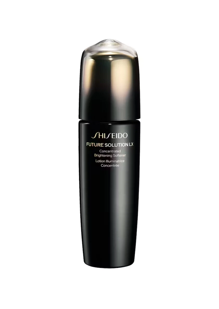
At the top of the range, the Future Solution LX line switches codes entirely. The Concentrated Brightening Softener comes in opaque black glass with a dark cap topped by an iridescent dome, the label set in light gold — French product name included. Luxury here is expressed by withdrawing color, the exact opposite of the entry-level lines, yet the typography keeps it unmistakably in the family.
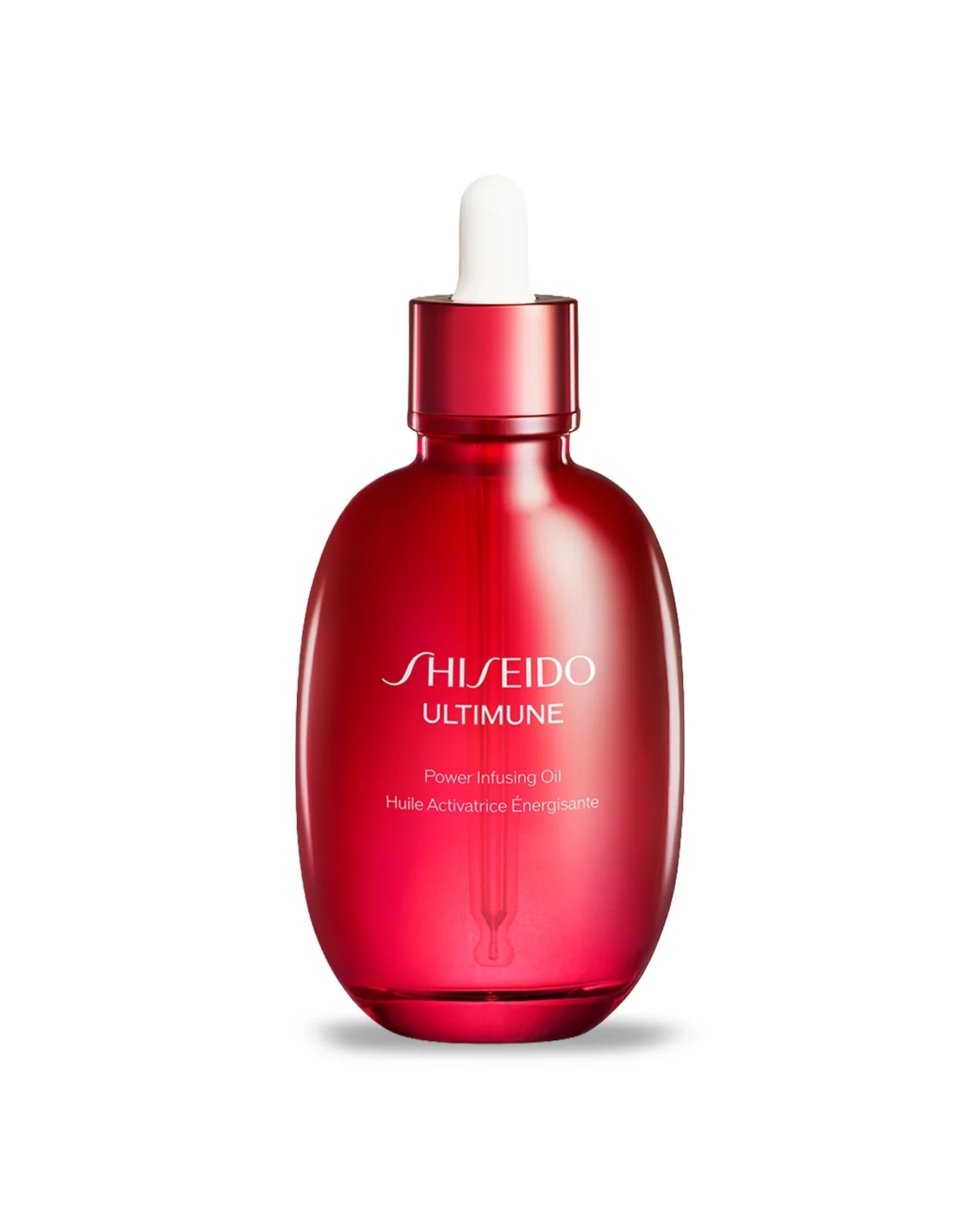
The Ultimune Power Infusing Oil proves the same thinking works in miniature: a bulbous teardrop of glossy red glass with a white dropper bulb, as sculptural closed as it is functional open. One curve, one color, one gesture — the anti-aging story told entirely by form.
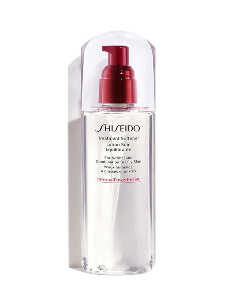
And when Shiseido needs a supporting actor, it reaches for transparency: the InternalPowerResist Treatment Softener is a clear cylinder whose only saturated color is the red pump above it. The product liquid becomes part of the design, and the brand’s signature red is spent on exactly one component.
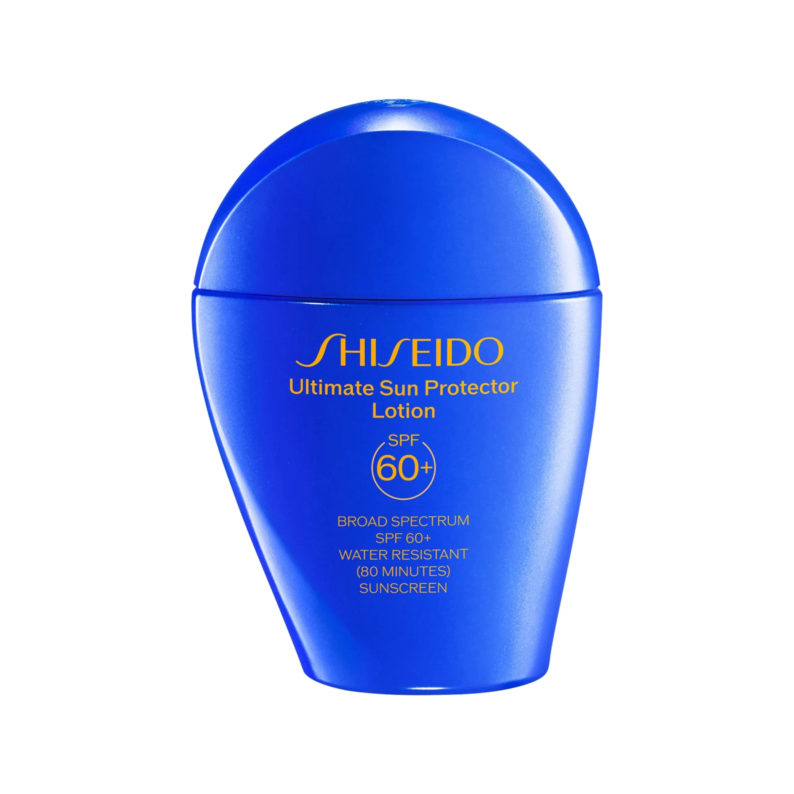
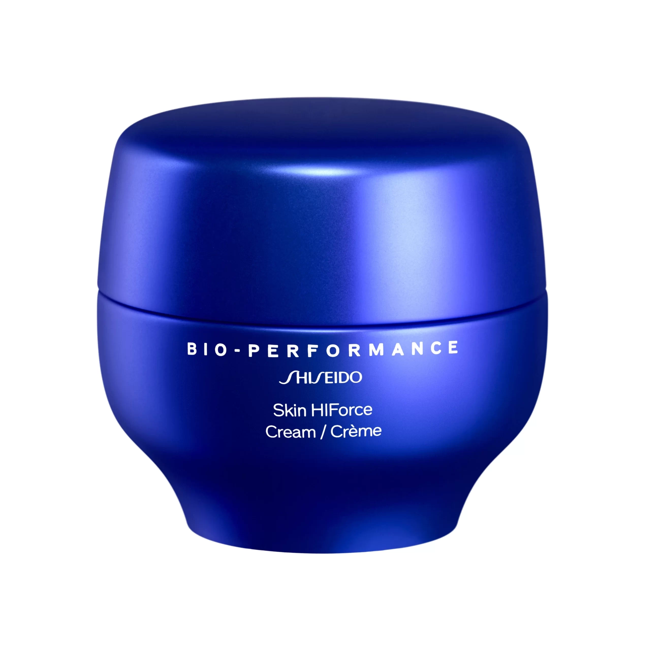
Not every Shiseido bottle wears the house red. When the brief is protection and technology, the palette rotates to a deep, saturated blue. The Ultimate Sun Protector lotion is a seamless teardrop of glossy blue, its SPF 60+ badge and claims set in warm orange — the one corner of the system that deliberately courts contrast. The Bio-Performance Skin HiForce cream jar takes the same blue into quieter territory: a bulbous body, a domed lid, nothing but white type. Same color, two temperatures — sport on one side, anti-aging precision on the other.
Gradients: Color That Tells the Product Story
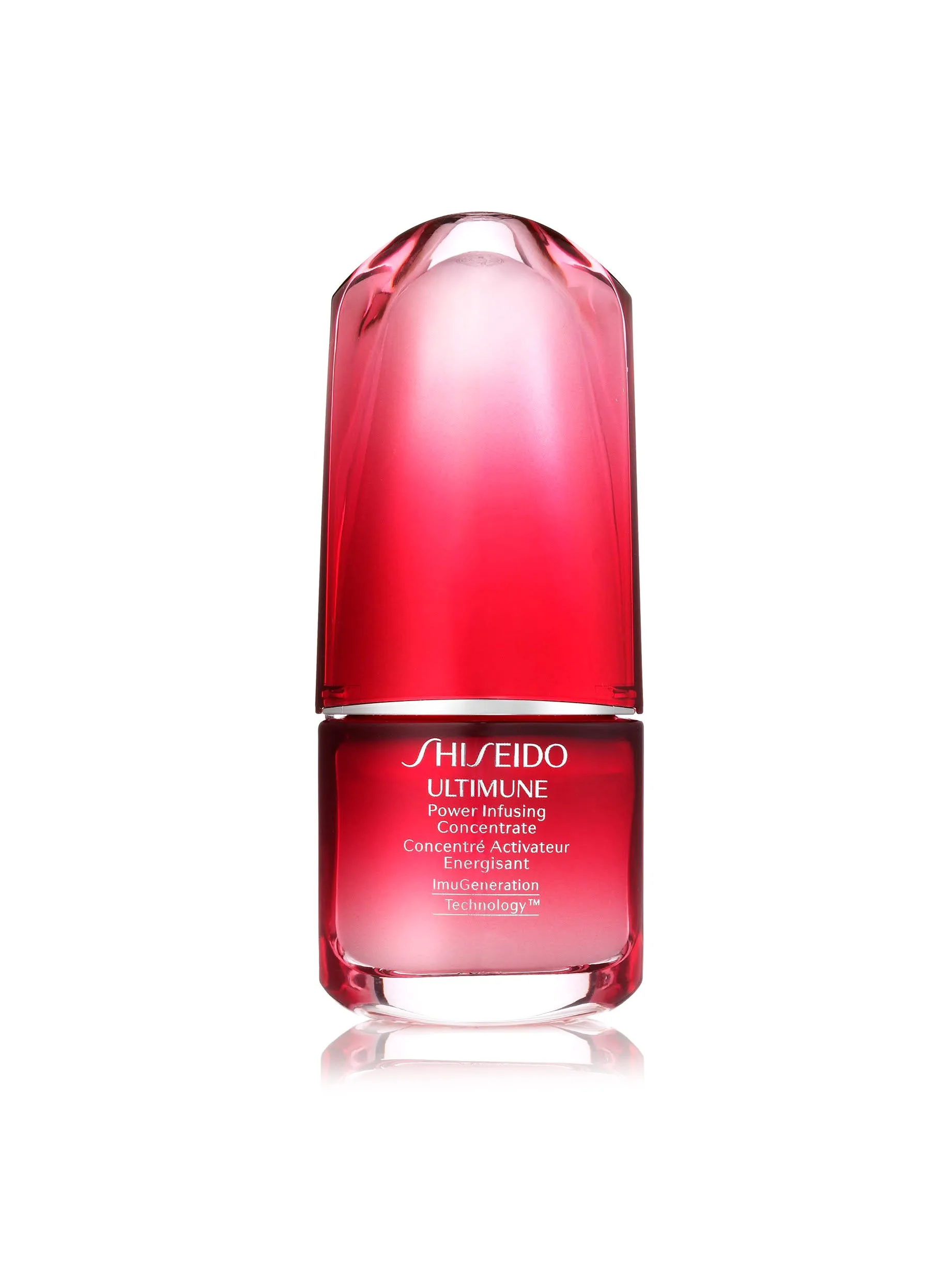
Shiseido uses gradients with unusual intent. The Ultimune Power Infusing Serum — the hero product — is the only bottle in the routine allowed to wear the full transition: deep red at the base dissolving into soft pink toward the shoulders, a red cap closing the composition. The ombre isn’t decoration; strength ending in gentleness is the product’s entire claim, printed in glass.
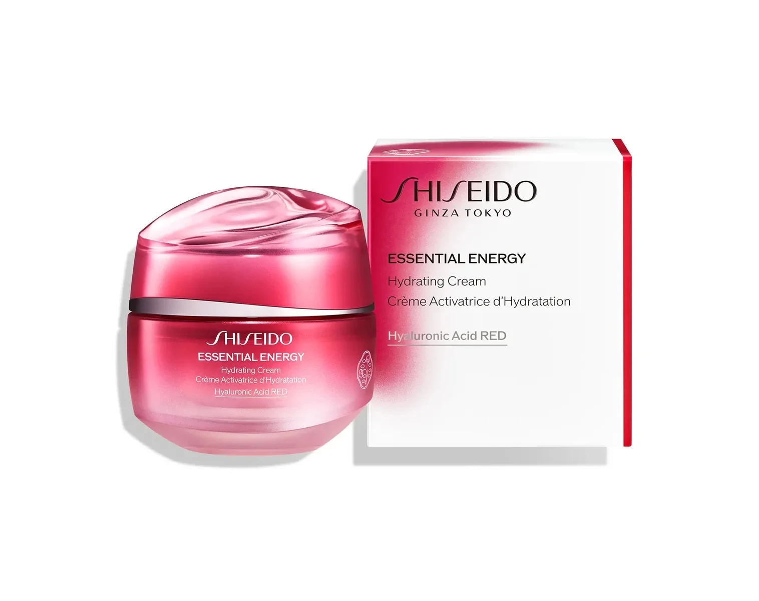
The same grammar scales down to cartons. The Essential Energy hydrating cream ships in a box that fades white into rose pink, cut by a single bold red stripe down one edge — the jar inside echoing the pink in its domed lid. Box and bottle read as one continuous color sentence.
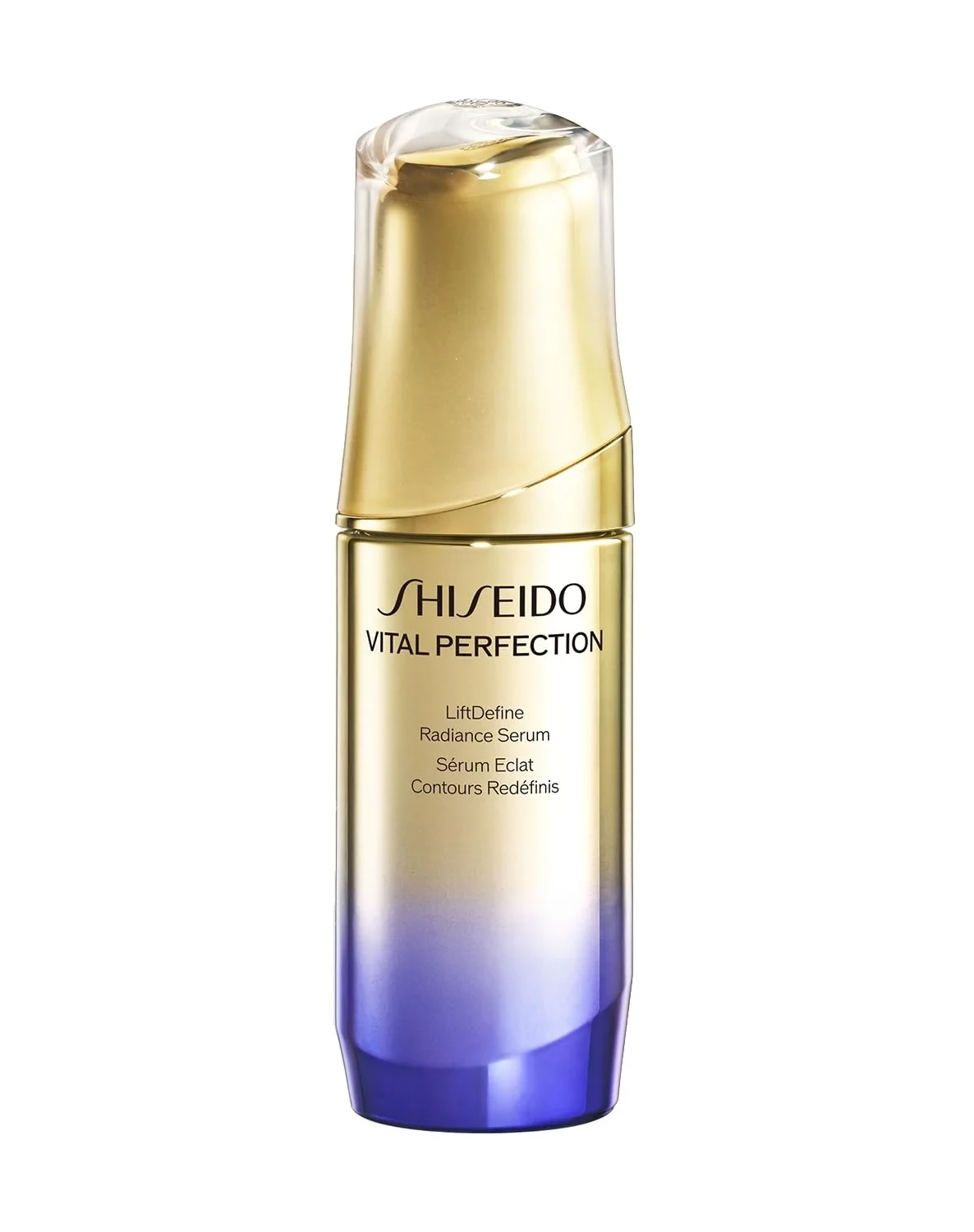
Gradients also climb the price ladder. The Vital Perfection LiftDefine Radiance Serum dresses its slender bottle in a vertical descent — metallic gold through ivory into deep blue — beneath a clear domed cap. Where Ultimune’s ombre softens, this one ennobles: the gradient itself becomes the prestige code, no foil required.
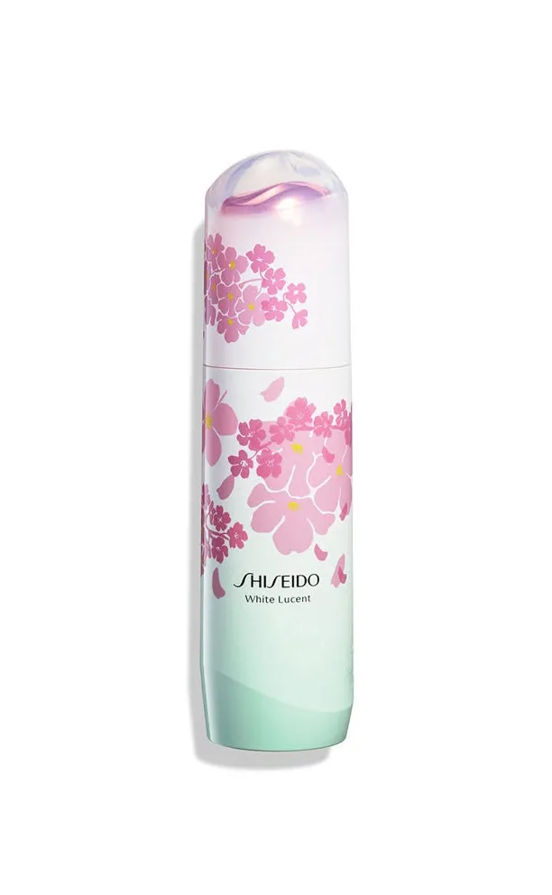
Limited editions push the tool toward seasonality. The White Lucent Sakura Edition fades from white into soft mint while cherry blossoms drift across the bottle — a gradient that means spring before a single flower is registered. In Shiseido’s hands a gradient is never ornament; it is the fastest possible summary of what the edition is about.
Japanese Minimalism: The Discipline of Less
The third pillar is what keeps the first two from tipping into noise. Shiseido’s brand mark reduces the camellia — the house’s historic motif — to a white emblem on red, closer to a family crest (mon) than a logo, and that origin explains the brand’s entire packaging behavior: forms stay soft, palettes stay tiny, and color is spent surgically.
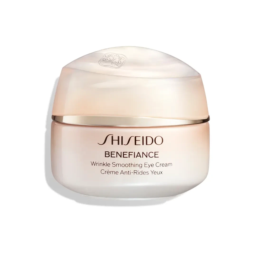
The Benefiance Wrinkle Smoothing Eye Cream shows the discipline at its warmest: a pale peach jar, a frosted domed lid, and one thin gold band at the seam. No pattern, no photography, no foil — warmth delivered by color temperature alone.
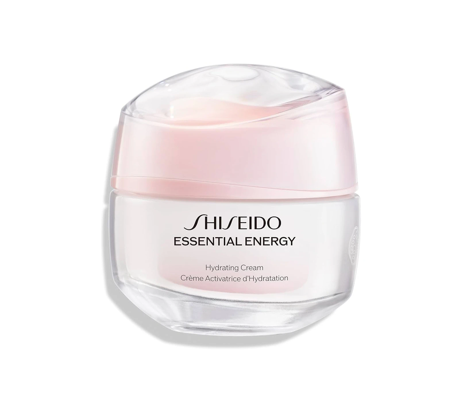
The Essential Energy hydrating cream goes further toward nothing: a transparent body, a pink-tinted dome, black type on a light label. The cream itself is the only color on display — packaging as glass architecture around the product.
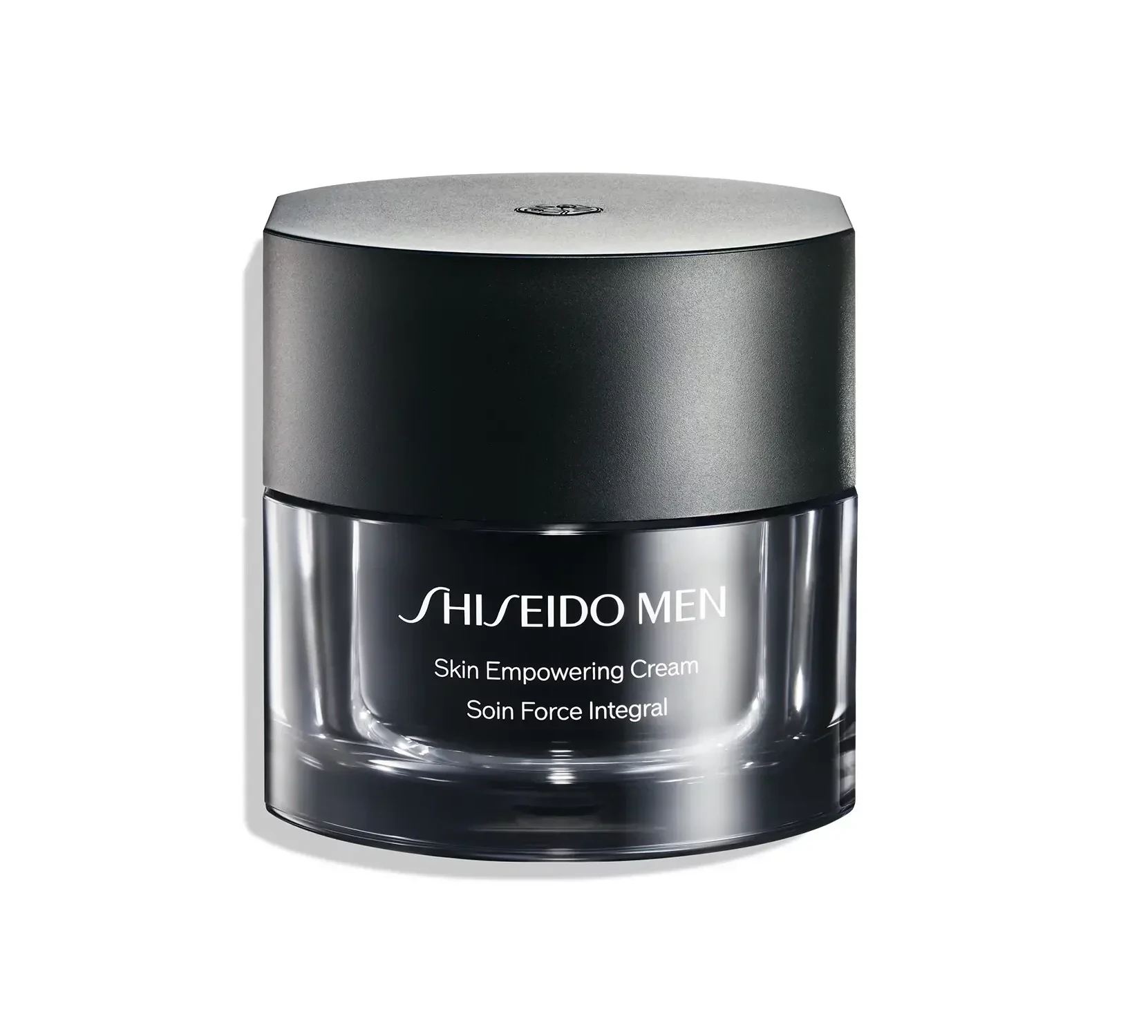
Even the men’s counter speaks the same quiet language. The Shiseido Men Skin Empowering Cream splits its cylinder between a matte black upper body and a clear lower half, white serif type on the dark band — strength communicated by subtraction, not by shouting.
What Designers Can Take From Shiseido
- Own a silhouette before a graphic. The Eudermine bottle proves a shape can carry a brand longer than any logotype.
- Let color rank hierarchy. Full red is reserved for heroes; clear and white mark supporting roles; black and gold signal the top tier. Every line knows its place in the palette.
- Use gradients as narrative, not ornament. Ombre for softness, rose cartons for hydration, sakura fades for season — each transition summarizes the product’s story.
- Spend one accent at a time. A single red pump on a clear bottle, a single gold band on a peach jar: restraint is what makes the accent audible.
Explore the full Shiseido collection on Gropicture for more bottles, jars and packaging design references.