ACNE Typography
Topics
Details
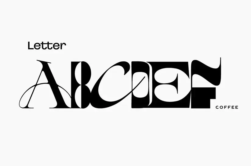
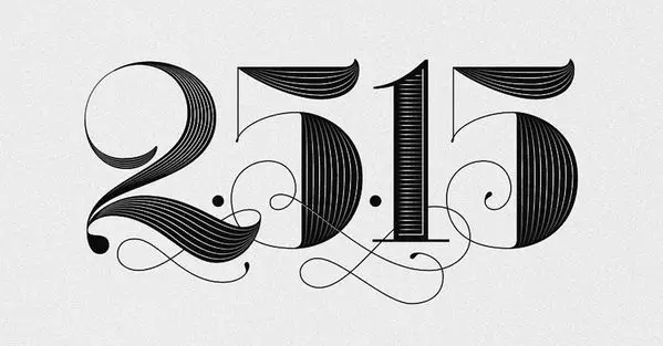
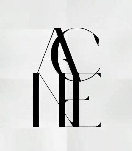
Black serif letterforms spelling 'ACNE' dominate the composition through a deliberate interplay of contrasting line weights and overlapping geometry. The 'A', 'C', and upper portions of the 'N' and 'E' employ delicate hairline strokes, while the vertical stems of the final two letters anchor the design with substantial weight. These characters rest upon a pale, subtly textured off-white surface that provides minimal distraction from the typographic interplay.
Visual tension drives the appeal of this specific lettering style, as it masterfully balances fragility with structural heaviness through its varied stroke widths. By allowing the characters to intersect and share space rather than sit in a rigid row, the designer creates a monogram-like lockup that feels both elegant and industrial. The deliberate clash between the airy, almost skeletal upper letters and the grounded, massive presence of the bottom-right ‘E’ generates a rhythmic asymmetry that keeps the eye moving across the entire frame.
Fashion branding teams might look to this reference when developing luxury identity systems that require a mix of classic serif authority and modern, deconstructed flair. Editorial art directors could adapt similar overlapping techniques for magazine cover titles where text needs to function as a primary graphic element rather than just information. Additionally, typographers studying weight distribution will find value in analyzing how such extreme contrasts between thin and thick strokes can be harmonized within a single wordmark.