Hi! Typography
Topics
Details
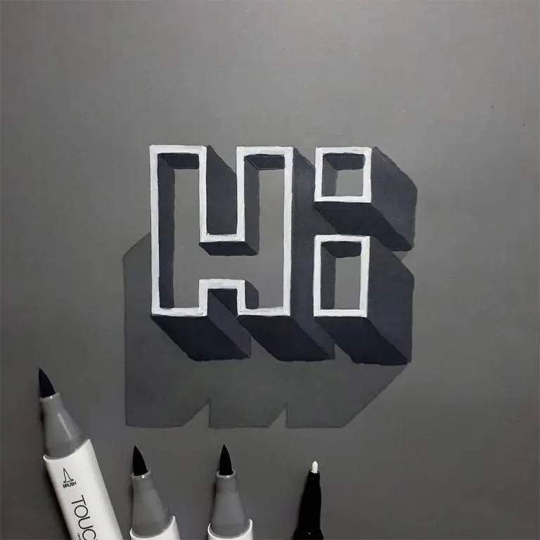
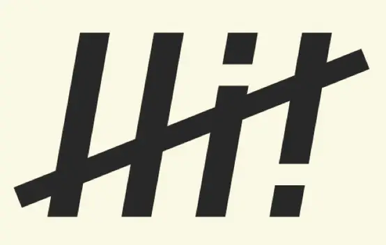
Heavy, black, sans-serif letterforms spell out the word 'HI!' on a pale cream surface. The composition features two vertical strokes for the H, a vertical stroke with a detached square dot for the I, and a thick exclamation mark. A bold diagonal slash cuts aggressively from the lower left to the upper right, intersecting all four primary characters in a single, continuous line.
Visual tension arises from the contrast between the rigid, upright geometry of the typeface and the dynamic angle of the striking line. The deliberate separation of the tittle from the I’s stem adds a modular, constructed feel to the otherwise solid forms. Such an aggressive overlay transforms a simple greeting into a graphic statement about cancellation or emphasis.
Brand identity designers might study this mark to understand how to convey energy through static letterforms. Editorial illustrators could adapt this technique for headlines requiring a sense of urgency or negation. Motion graphics artists may reference the intersection points to plan how animated lines should interact with text layers.