Aroma Mocha Coffee Bags Packaging Design
Topics
Details
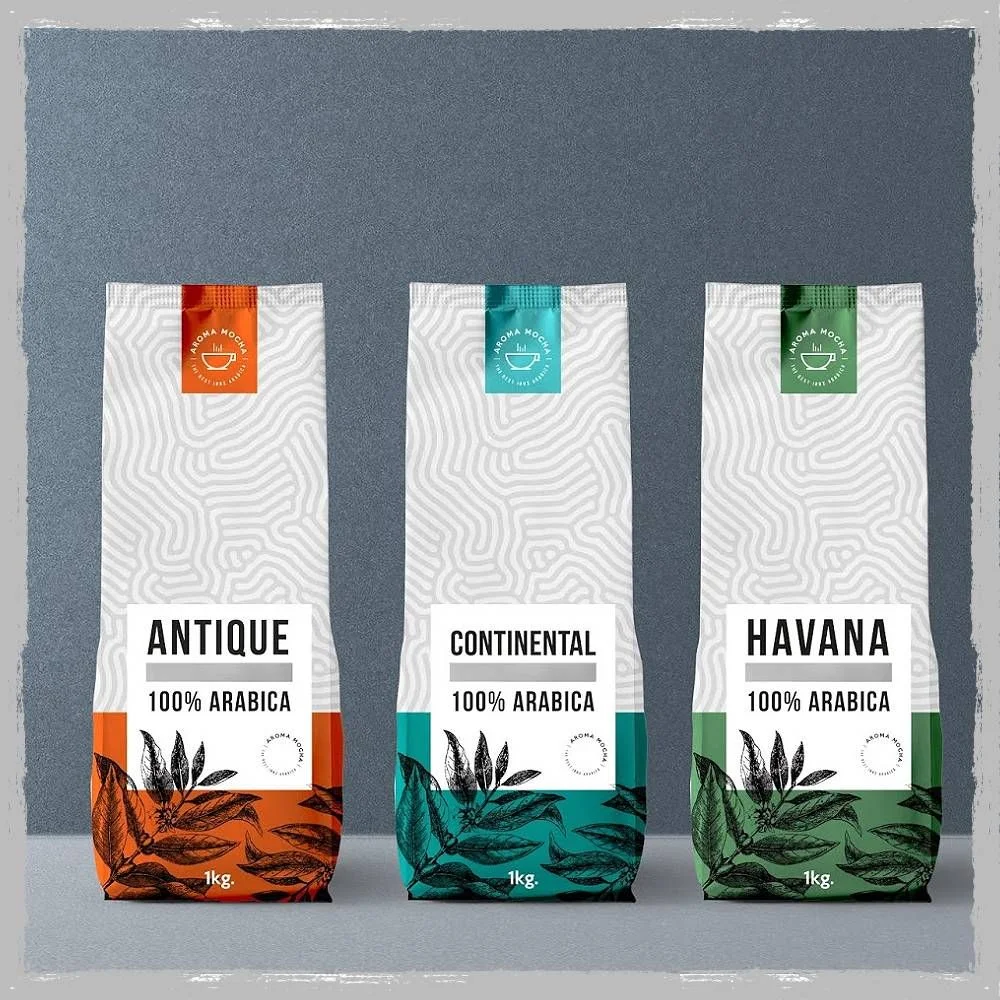
Three tall, gusseted coffee bags stand in a row, each featuring a white upper body with a subtle topographic line pattern and a solid color-blocked base. The left bag displays a burnt orange bottom with an 'ANTIQUE' label, the center shows a teal base labeled 'CONTINENT', and the right features a forest green section marked 'Havana'. Every package bears the text '100% ARABICA' and '1kg' alongside detailed botanical illustrations of coffee leaves, while small colored tabs at the top carry the 'AROMA MOCHA' brand name against a textured slate-gray backdrop.
Visual hierarchy emerges through the disciplined use of negative space and the strategic placement of bold sans-serif typography that anchors each composition. The interplay between the monochrome botanical artwork and the vibrant accent colors creates a sophisticated contrast that feels both artisanal and modern. This approach balances minimalism with organic detail, allowing the product names to command attention while the intricate leaf patterns add tactile depth without overwhelming the overall clean aesthetic.
Brand strategists developing premium food packaging can study how this layout manages multiple information tiers while maintaining visual breathing room. Print production teams might reference the specific way spot colors interact with fine-line illustrations when planning similar retail applications. Art directors working on beverage identity systems could adapt this modular color-coding system to distinguish between different roast profiles or origin stories within a unified product family.