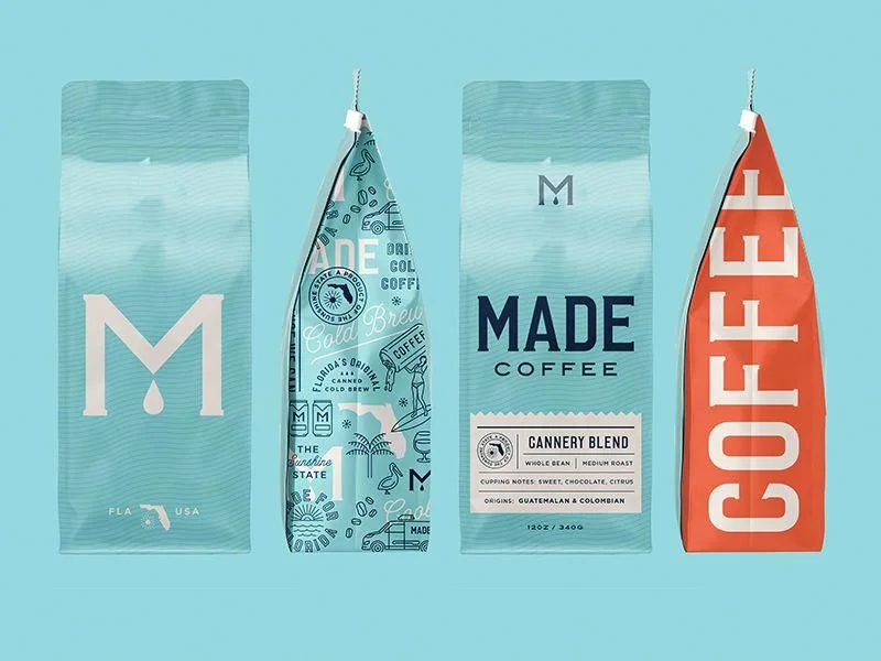
Made Coffee Bags Packaging Design
Topics
Details
Four coffee bags appear in a straight horizontal row against a solid light cyan backdrop, each sealed at the top with a white hang-tag and string. The leftmost package is a matte teal rectangle featuring an oversized cream 'M' with a droplet detail, while the second bag tapers to a point like a surfboard fin, covered in white line-art illustrations of palm trees, vintage cars, and the Florida state outline. The third pouch returns to a rectangular form with bold navy 'MADE COFFEE' lettering above a detailed label for 'Cannery Blend,' and the rightmost item presents a bright coral-red tapered shape with 'COFFEE' stacked vertically in large white sans-serif characters.
Visual interest emerges from the deliberate contrast between rigid rectangular forms and dynamic pointed silhouettes that break conventional packaging expectations. Typography scales dramatically across the set, ranging from subtle monogram marks to oversized display type that dominates the entire surface area of individual bags. The restricted palette of teal, navy, cream, and coral creates a cohesive brand identity while allowing each variant to maintain distinct personality through pattern density and text hierarchy.
Brand strategists developing artisanal product lines could study how these packages balance minimalism with playful regional iconography without cluttering the visual field. Packaging engineers might reference the structural variations between flat-bottom rectangles and tapered fin shapes when prototyping shelf-differentiating containers for premium goods. Print production teams evaluating spot-color applications on flexible substrates would find practical value in observing how fine line work holds up against solid color blocks across different material finishes.