Kraft Paper Coffee Bags Packaging Design
Topics
Details
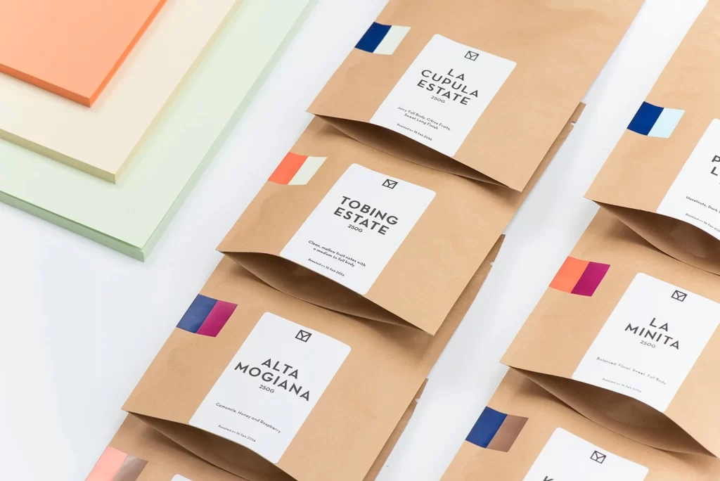
Kraft paper coffee bags with white rectangular labels display estate names like La Cupula Estate, Tobing Estate, Alta Mogiana, and La Minita in bold black sans-serif type. Each bag features a small geometric logo at the label's top and a two-tone color block sticker in the upper corner showing combinations of navy blue, coral orange, magenta, and brown. The packages rest on a light surface alongside stacked sheets of peach and mint green paper, photographed from an elevated angle under bright, even lighting that emphasizes the natural fiber texture of the brown material.
Visual distinction emerges from the restrained palette pairing unbleached cardboard warmth with crisp white labeling and strategic pops of saturated color. The diagonal arrangement creates rhythmic repetition while allowing each origin's unique color coding to stand out individually. Minimalist typography and generous negative space on the labels convey premium positioning without decorative clutter, letting the material quality and color accents carry the brand identity.
Packaging designers studying sustainable material applications would examine how kraft substrates interact with modern labeling systems. Brand identity teams developing color-coding systems for product lines could reference the sticker placement and hue selections. Art directors planning e-commerce photography might analyze the flat-lay composition and lighting setup for showcasing textured paper goods across multiple SKUs.