Bakery Display Yellow Packaging Sanela Brand
Topics
Details
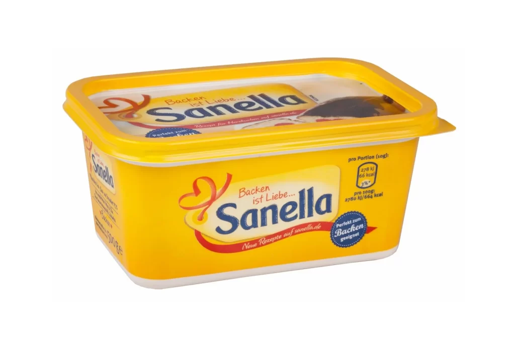
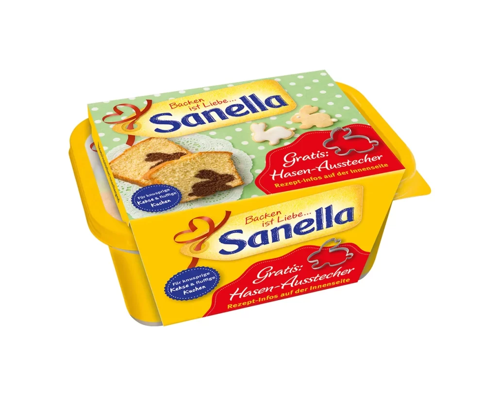
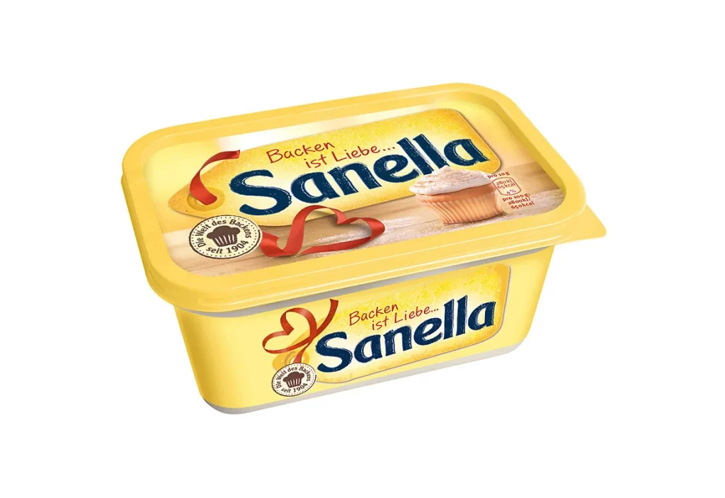
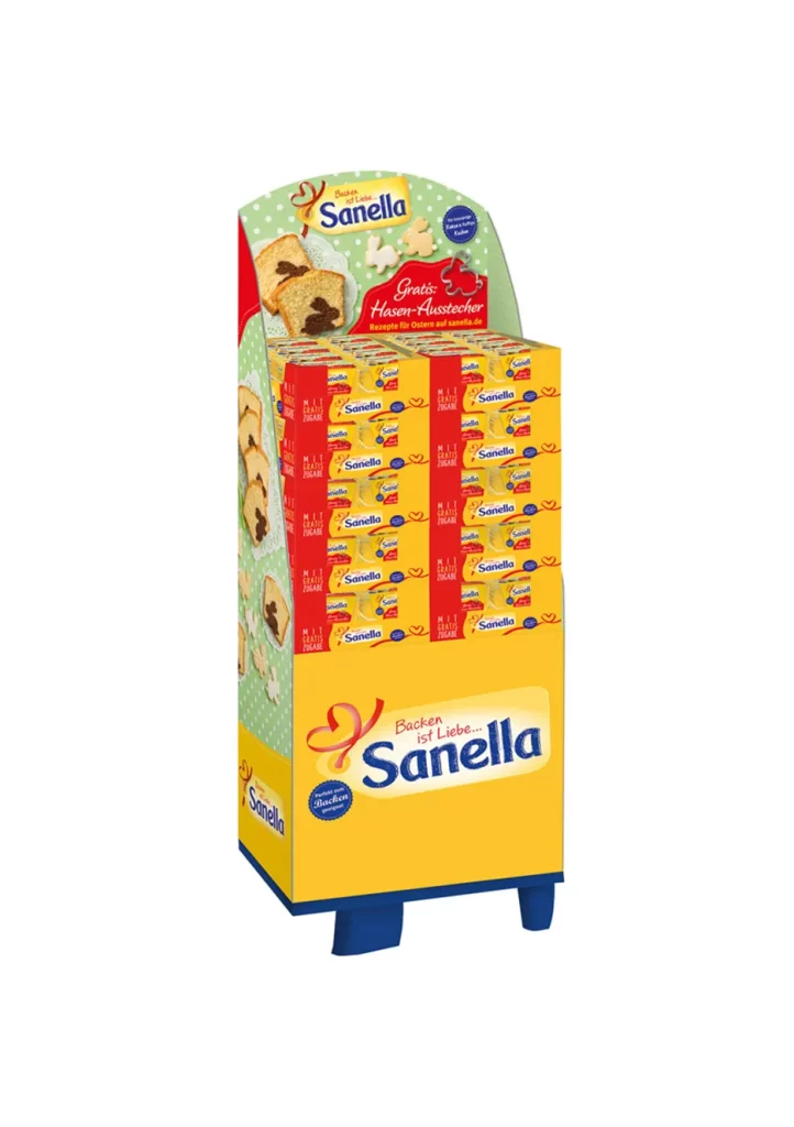
A freestanding cardboard floor display for the Sanella margarine brand dominates the frame, constructed from corrugated board with a vibrant yellow base and a curved green header. The structure holds multiple rows of small yellow product boxes, each bearing the blue 'Sanella' logotype and red accent graphics. Visible German text includes the slogan 'Backen ist Liebe' (Baking is Love) and a promotional callout for free hazelnut cutters, while photographic images of sliced cake and baked goods decorate the side panels.
Visual impact derives from the aggressive saturation of the primary yellow field, which creates an immediate shelf-presence that contrasts sharply with the cooler green upper section and deep blue footer supports. The repetition of the small packaged units creates a textured grid pattern across the front face, while the arched top header breaks the rectangular monotony with its organic curve and playful polka-dot motif. Typography balances a friendly, rounded script for the emotional slogan against a bold, authoritative sans-serif for the brand name, establishing a clear hierarchy between lifestyle appeal and product identification.
Retail planners and packaging engineers could analyze this structure to understand how color blocking guides consumer attention from brand recognition at eye level to promotional incentives at the top. Marketing teams might reference the spatial arrangement when planning seasonal campaigns for baking ingredients, noting how secondary graphics reinforce the primary usage occasion without cluttering the core identity. Environmental designers could also study the structural engineering of the cardboard feet and header support to calculate load-bearing requirements for similar point-of-sale installations in grocery environments.