Baking Butter Block Sanelle Brand
Topics
Details
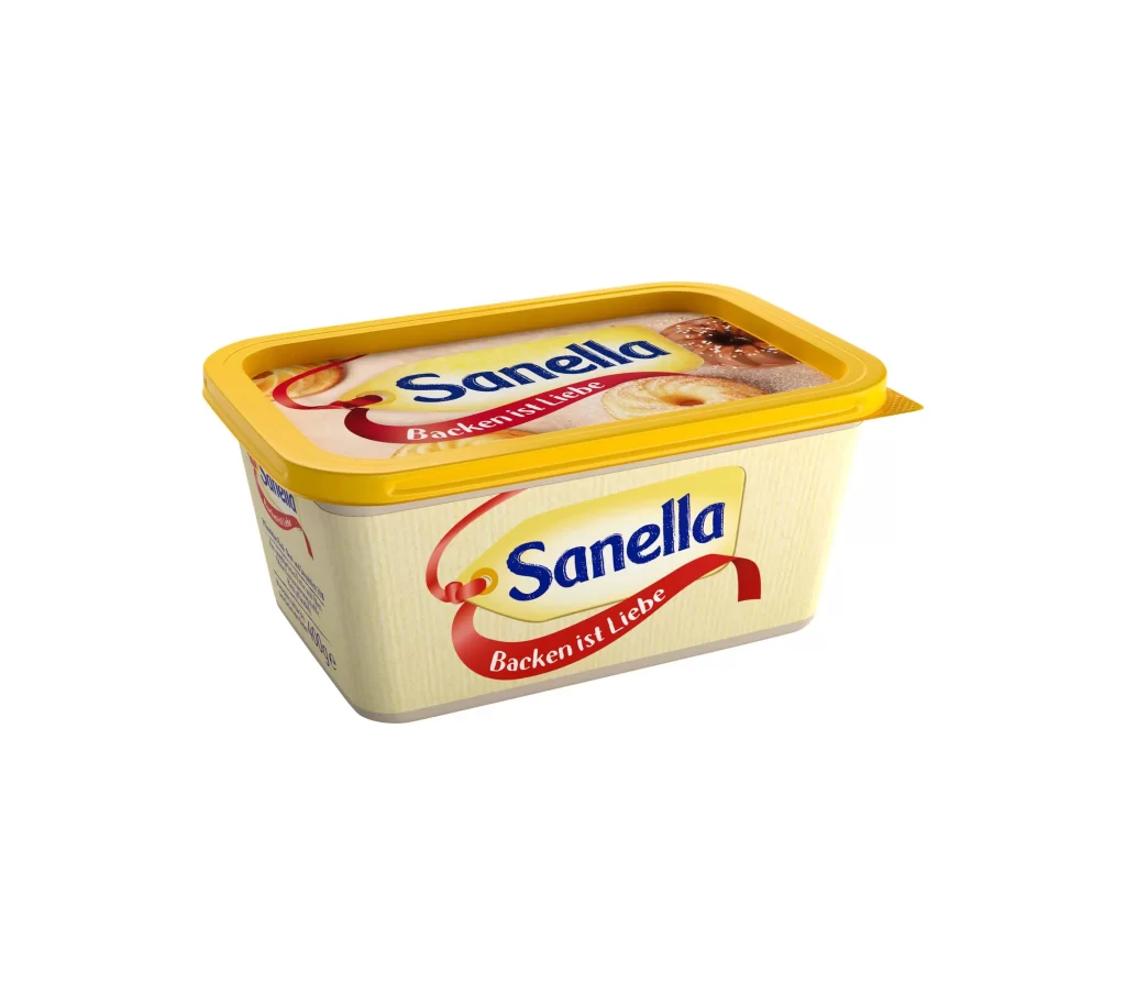
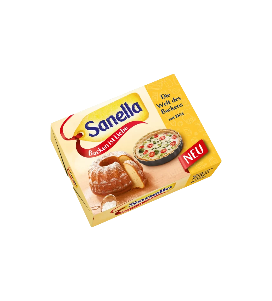
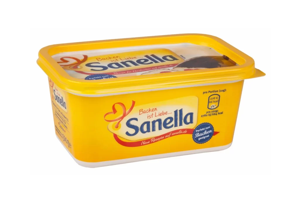
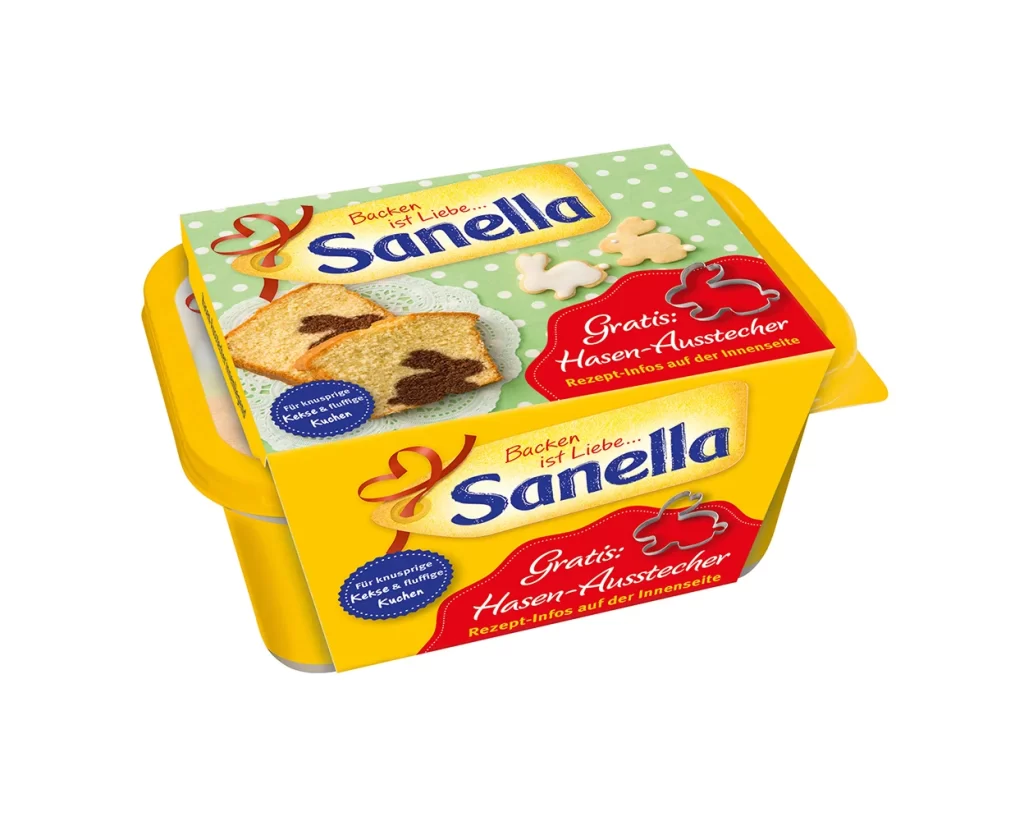
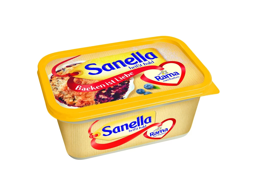
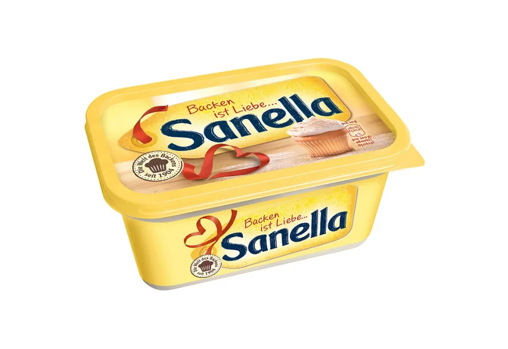
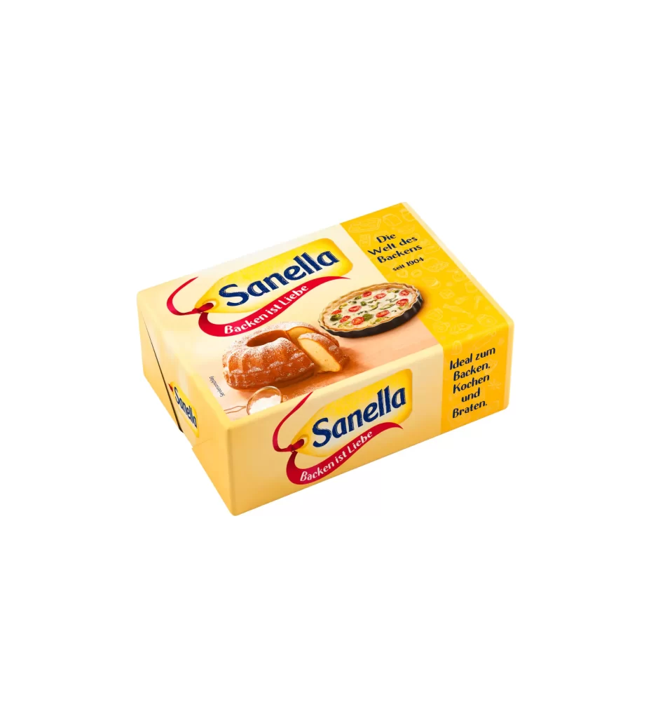
A rectangular yellow butter block package sits at a three-quarter angle, showcasing the Sanella brand name in bold blue serif lettering across two visible faces. The primary panel features a powdered sugar-dusted bundt cake with a slice removed, while the side displays a savory tart topped with red and green ingredients against a bright golden-yellow field. Red ribbon banners curve beneath each logo bearing the German slogan 'Backen ist Liebe,' with additional black text noting the brand's heritage since 1894 and its suitability for baking, cooking, and frying.
Warm cream and sunshine-yellow tones dominate the packaging, creating an inviting culinary atmosphere that feels both traditional and appetizing. The deliberate placement of sweet and savory baked goods demonstrates the product's versatility without relying on excessive graphic elements or modern minimalist trends. Typography choices balance the friendly curves of the ribbon script with the authoritative weight of the main brand name, establishing clear visual hierarchy across the box's surfaces.
Food photographers studying commercial packaging compositions could analyze how this angle reveals multiple text panels while maintaining product focus. Brand designers developing dairy or baking product lines might examine the color psychology of yellow associations with freshness and richness. Illustrators requiring reference for realistic food rendering would find useful details in the cake's texture, the tart's topping distribution, and the soft shadows cast by the box geometry.