Sanella Margarine Packaging
Topics
Details
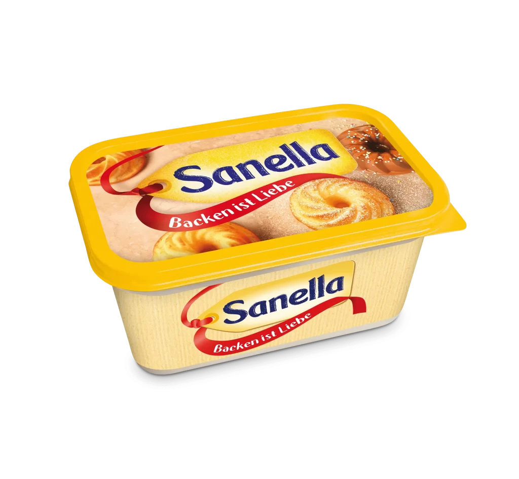
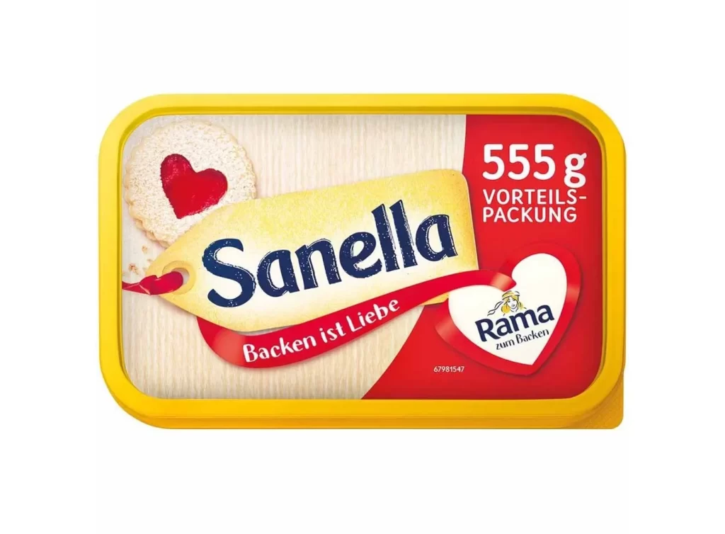
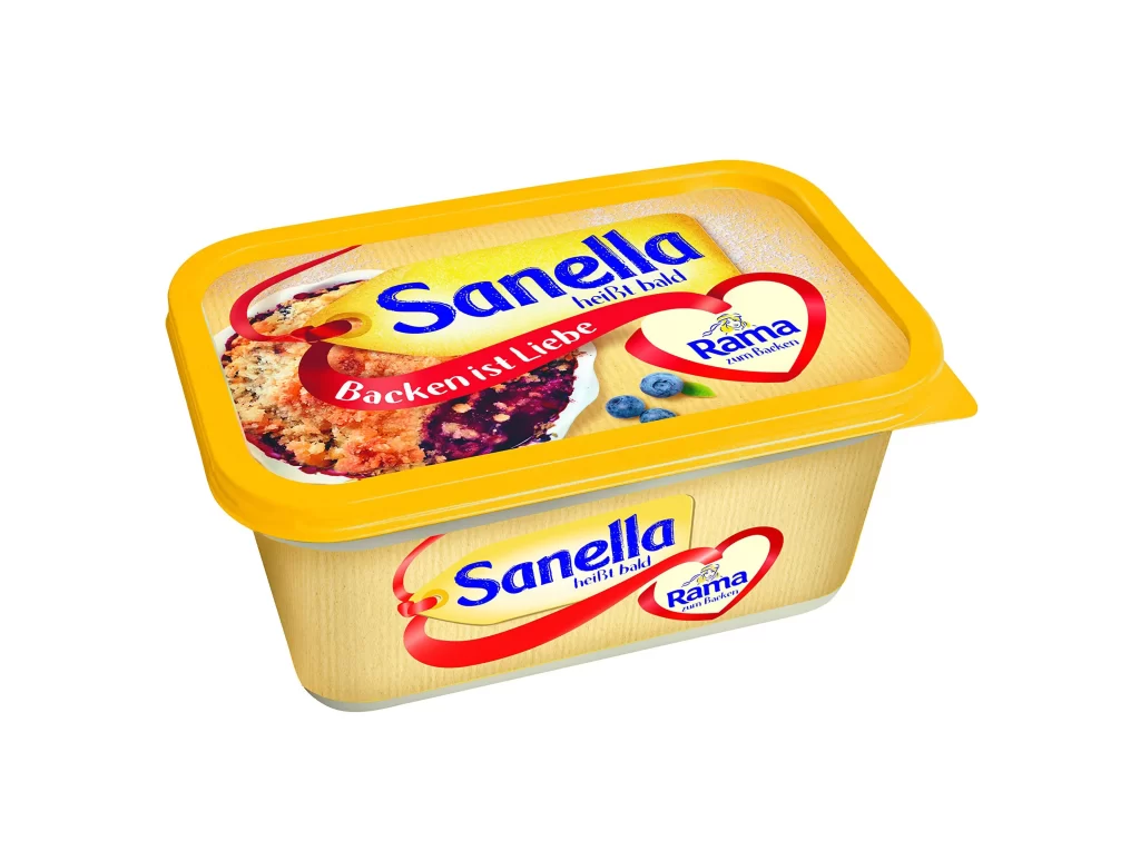
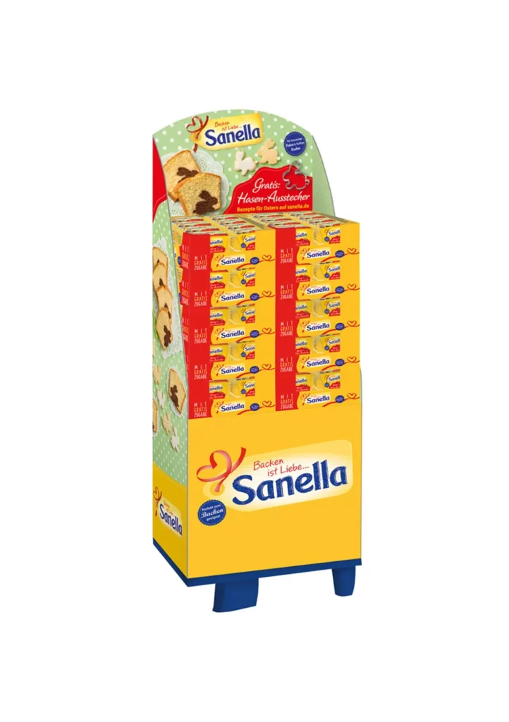
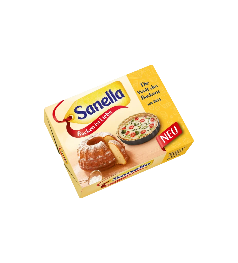
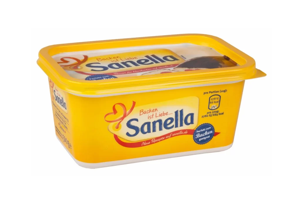
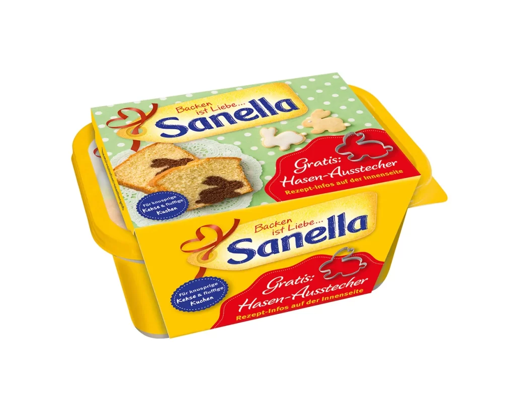
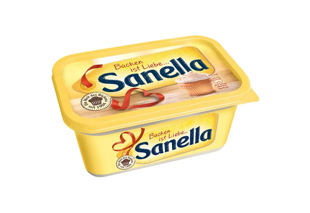
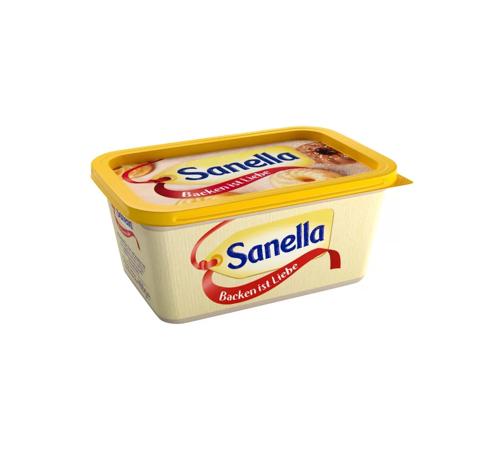
A rectangular tub of Sanella margarine sits at a three-quarter angle, showcasing its cream-colored body and bright yellow plastic lid. The packaging features the brand name 'Sanella' in bold blue serif lettering inside a pale yellow tag shape, with a red ribbon banner beneath it bearing the German slogan 'Backen ist Liebe.' Subtle vertical ribbing textures the container's surface, while the lid displays small photographic images of baked pastries. Even studio lighting illuminates the object against a clean, light backdrop without casting harsh shadows.
The color palette creates immediate visual contrast between the warm yellow lid and the cooler cream base, making the product stand out on retail shelves. That red ribbon element adds a festive, almost gift-like quality that reinforces the emotional messaging about baking as an act of love. Typography choices balance the friendly, rounded brand name with the more traditional script used for the tagline, establishing a tone that feels both approachable and established.
Packaging designers studying European dairy branding would find this useful for analyzing how color coding communicates product categories across different markets. Industrial designers working on food containers could reference the ribbing texture and lid integration details when developing their own structural concepts. Marketing teams localizing German consumer goods might examine how the slogan placement integrates with the overall visual hierarchy without overwhelming the primary logo.