Black White Sandwich
Topics
Details
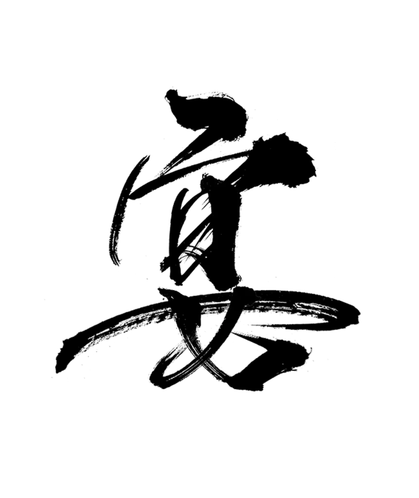
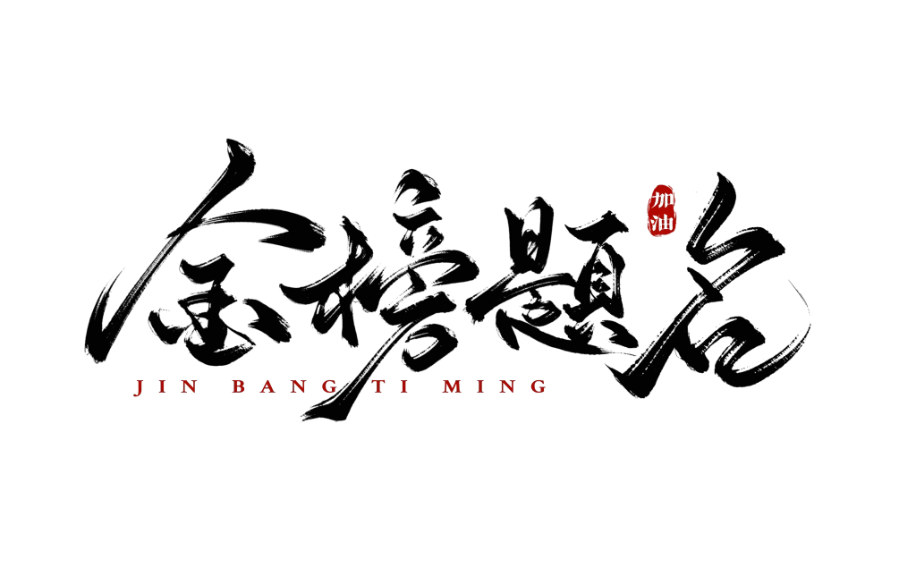
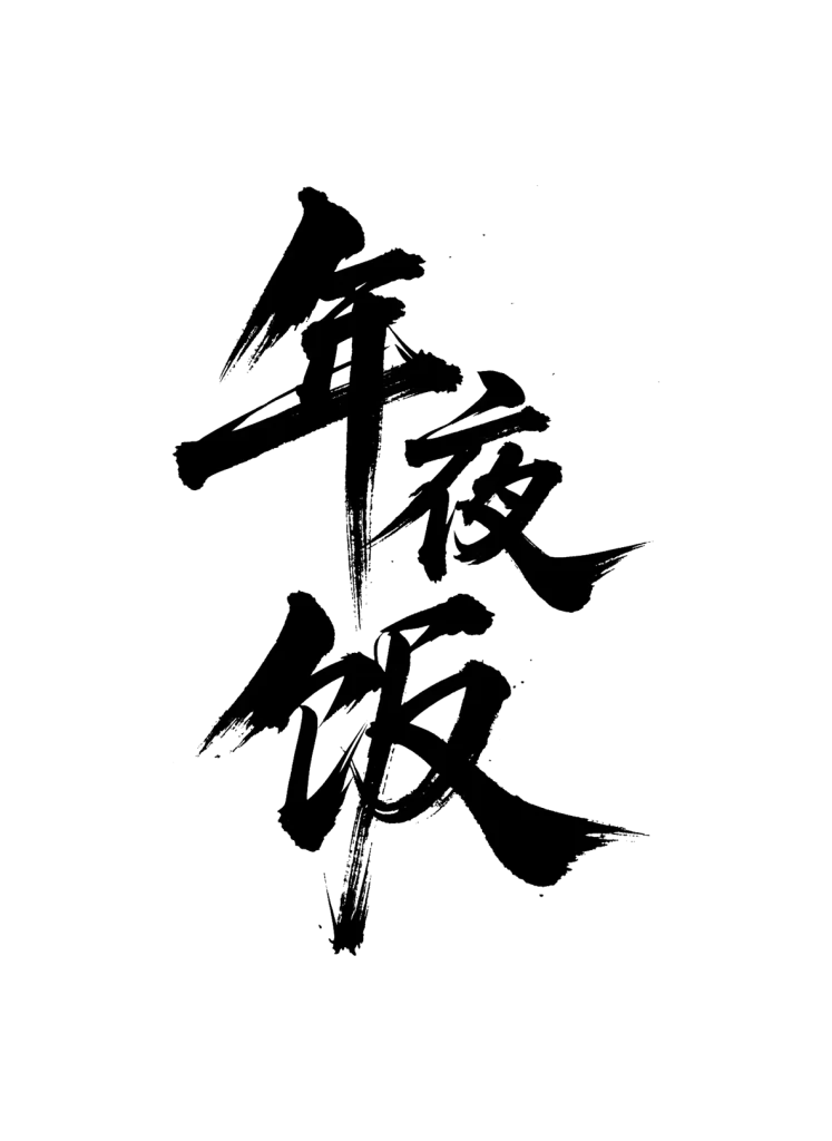
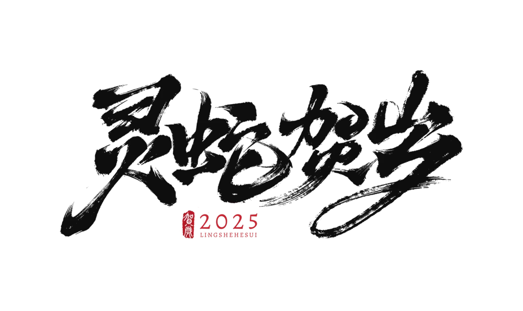
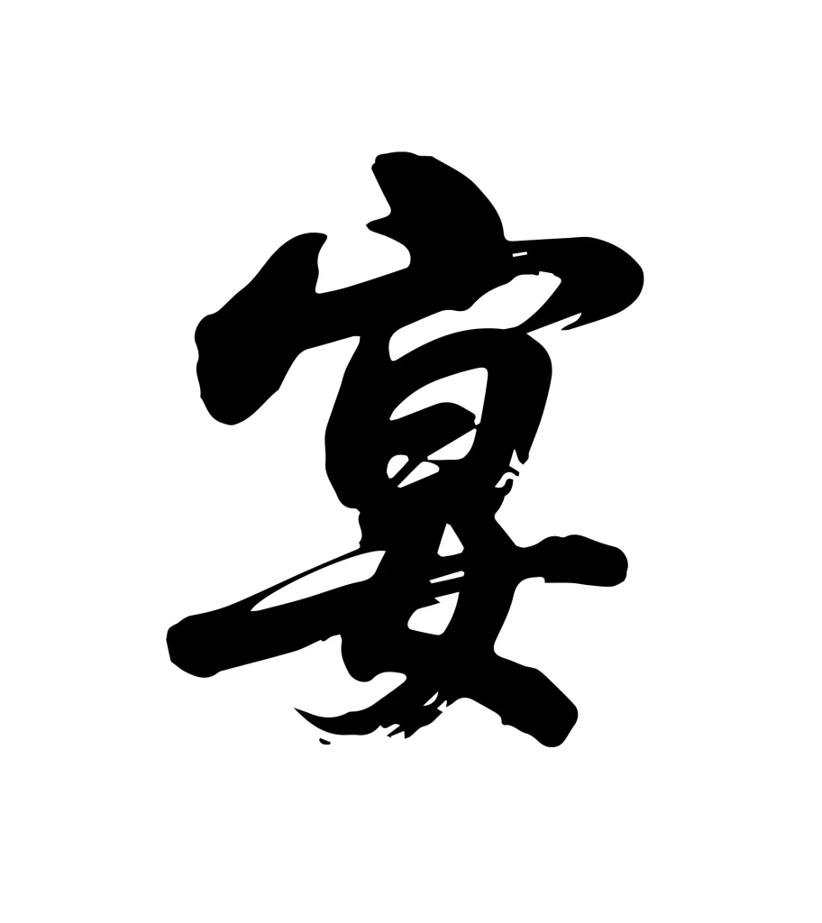
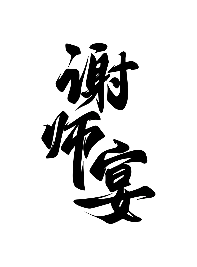
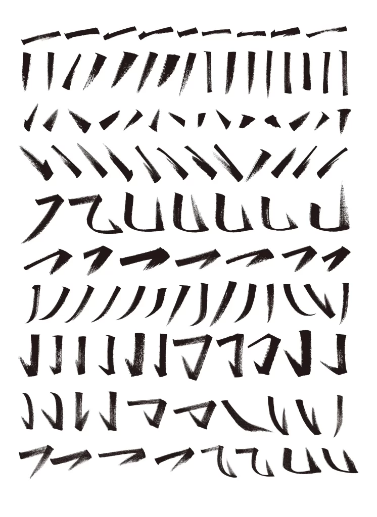
Ink-black brushstrokes carve out a galloping horse across a clean white field, the animal caught mid-stride with legs extended and mane streaming backward. The composition relies on bold, calligraphic lines of varying weight—thick, saturated marks define the head and torso while thinner, drier strokes suggest motion in the tail and hooves. No text interrupts the visual field, leaving the equine form as the sole focus under even, shadowless lighting that flattens depth into pure graphic contrast.
What distinguishes this particular rendering is its fusion of East Asian ink-wash technique with Western minimalist sensibility, where every stroke serves dual purpose as both anatomical suggestion and abstract gesture. The deliberate irregularity of line edges—some bleeding softly, others terminating in sharp, bristled points—lends an organic immediacy that polished vector work rarely achieves. Such controlled spontaneity creates visual tension between the subject's dynamic energy and the image's stark two-tone restraint.
Brand identity specialists might deploy this mark for equestrian businesses, luxury fashion houses, or cultural institutions seeking to convey both tradition and forward momentum. Motion graphics animators could trace these fluid contours to generate frame-by-frame horse gallop sequences that retain the original brushwork's expressive character. Print designers working on editorial layouts or book covers would find the high-contrast silhouette particularly effective when reversed or overlaid with typography.