Chinese Calligraphy Art
Topics
Details
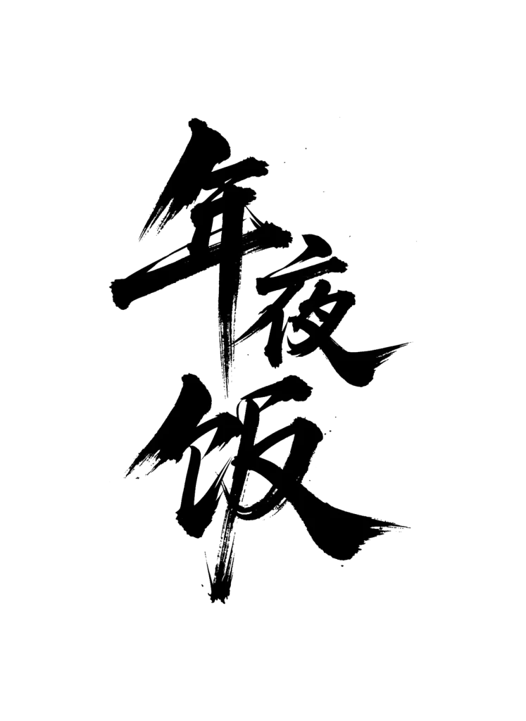
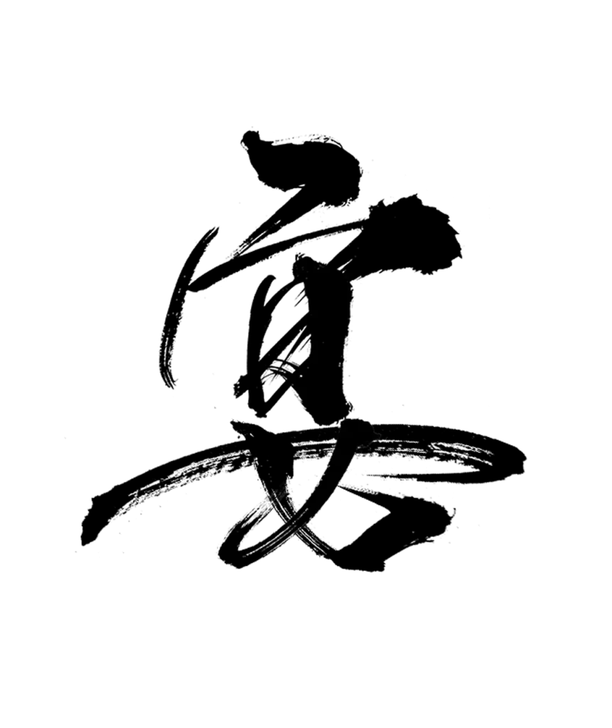
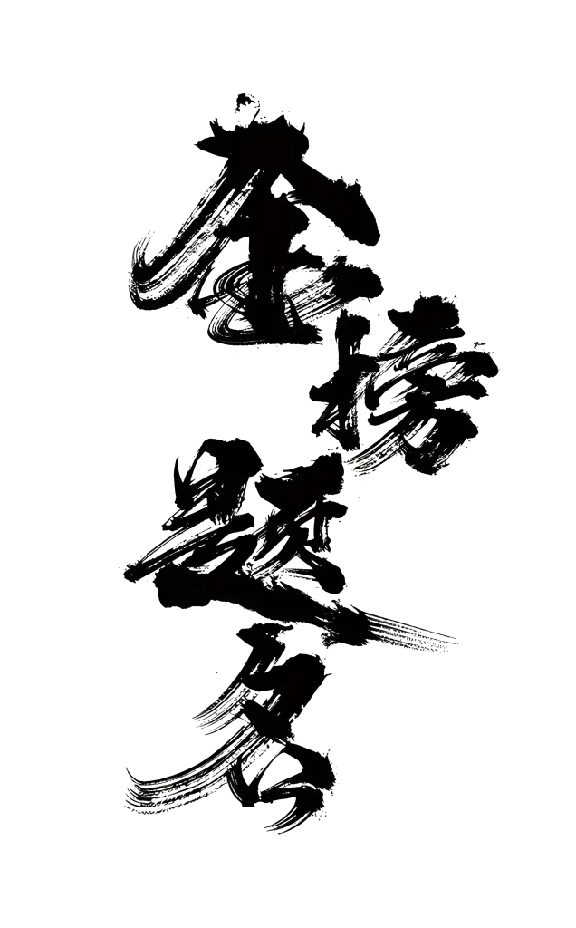
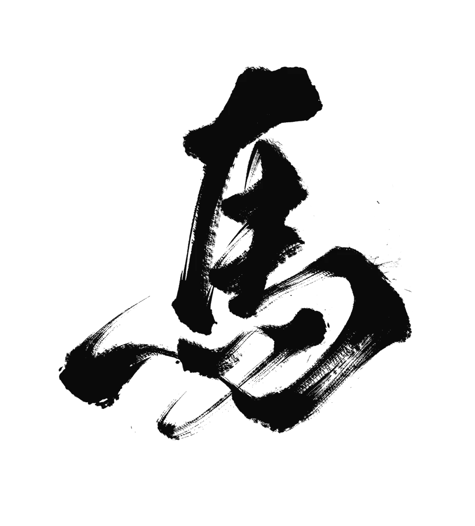
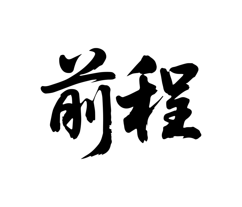
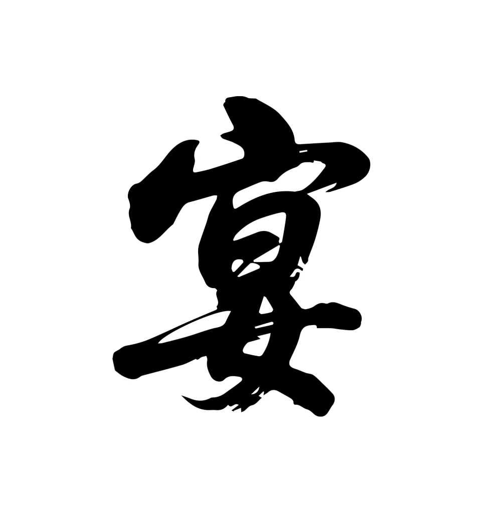
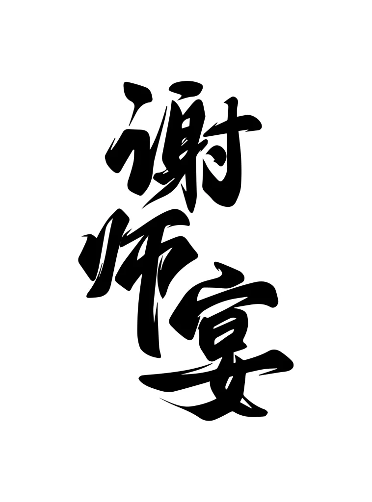
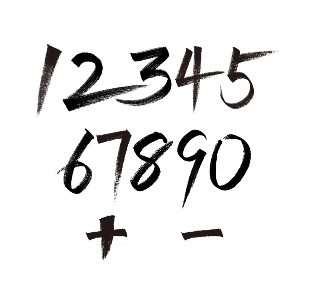
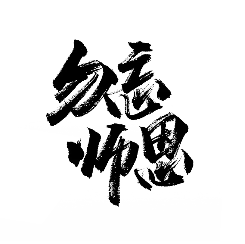
Bold black ink strokes form four Chinese characters across a clean white field, reading from top to bottom as 勿忘师恩. The calligraphy employs a thick, expressive brush technique with visible bristle texture and varying pressure that creates tapered ends and saturated centers. Characters occupy the central frame with a slight diagonal tilt, leaving ample negative space around the composition.
Dynamic brushwork defines each character through dramatic contrast between heavy downstrokes and delicate connecting lines, giving the text an energetic, hand-painted quality. The ink exhibits natural bleeding and dry-brush effects along stroke edges, suggesting rapid execution with a loaded brush rather than careful digital rendering. This particular arrangement balances dense black masses against airy internal spaces within complex character structures like 恩 and 师.
Typography researchers studying East Asian script evolution will find value in analyzing the stroke order and pressure variations evident here. Cultural event organizers creating materials for Teacher's Day celebrations in Chinese-speaking regions could adapt this sentiment for banners or commemorative publications. Brand designers developing identities for educational institutions might reference the weight distribution and spatial rhythm when commissioning original logotype work.