Herbist Skincare Render
Topics
Details
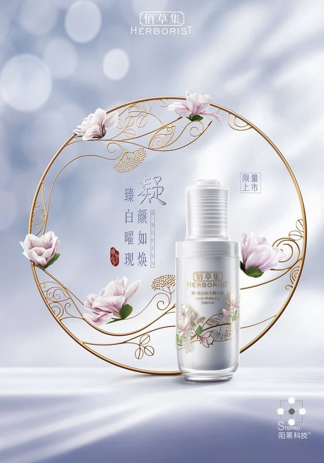
Neon accent lighting is not present in this image; instead, centered in the frame is a white Herbist skincare bottle adorned with delicate floral illustrations, set against a soft, ethereal blue background. A large, ornate golden circular motif frames the product, featuring intricate filigree patterns and realistic magnolia blossoms. Chinese characters for ‘Herbist’ appear at the top, while vertical text reading ‘臻白顏如煥’ (Radiant White Complexion) sits to the left of the bottle alongside a red seal stamp.
The composition employs a symmetrical layout that draws the eye directly to the product through the use of a golden circular border. Typography blends traditional calligraphy with modern sans-serif fonts, creating a bridge between heritage and contemporary science. The color palette is restricted to cool whites, soft pastel blues, and metallic gold accents, utilizing high-key lighting to create a clean, premium aesthetic typical of luxury cosmetic advertising.
Advertising professionals utilize such renders to analyze how negative space and framing elements can elevate a standard product shot. Marketing students often reference this style when studying visual hierarchy in Asian beauty markets. Packaging designers look to these images for guidance on integrating traditional motifs with minimalist bottle designs for limited-edition releases.