Bifesta Micellar Water Advertisement
Topics
Details
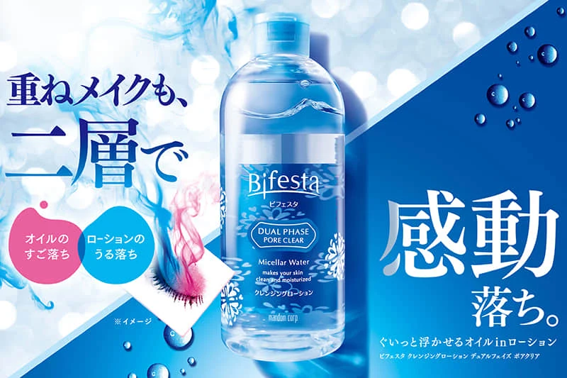
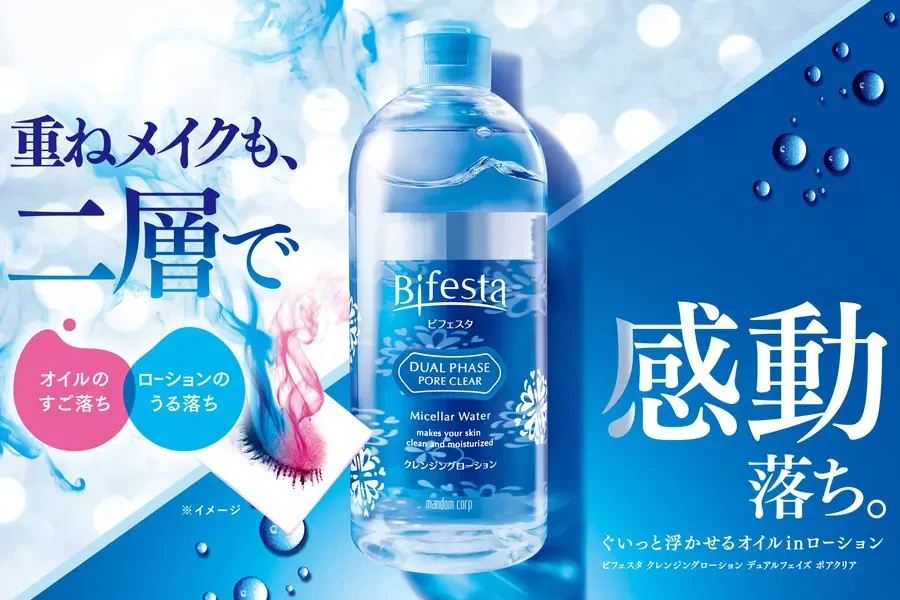
The advertisement showcases a clear plastic bottle of Bifesta Dual Phase Pore Clear Micellar Water positioned centrally against a blue gradient background. Japanese text dominates the layout, with large characters reading '重ねメイクも、二層で' (Even layered makeup, with two layers) on the left and '感動 落ち' (Amazingly removes) on the right. The composition includes water droplet graphics, a cotton pad demonstration showing oil and lotion separation, and the Mandom Corporation branding at the bottle's base.
Visual hierarchy is established through bold, stylized Japanese typography that contrasts sharply against the cool blue and white color palette. The design employs a diagonal split background transitioning from light bokeh effects to deep navy, creating depth while keeping focus on the transparent product. Photographic elements of the micellar water are enhanced with subtle floral patterns and liquid motion graphics that emphasize the dual-phase cleansing technology.
Marketing professionals and graphic designers utilize this campaign material to analyze effective cosmetic advertising strategies and color psychology in beauty product promotion. Packaging specialists reference the label's information architecture when developing multilingual skincare products for Asian markets. Brand strategists study how the visual balance between scientific claims and emotional appeal drives consumer engagement in the competitive makeup remover category.