Bifesta Cleansing Water Advertisement
Topics
Details
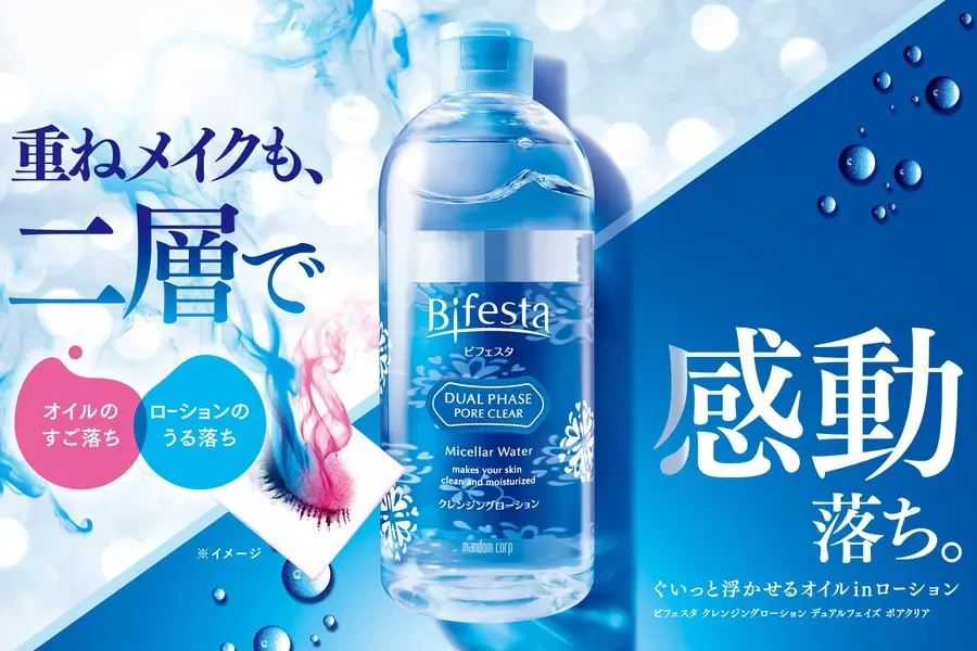
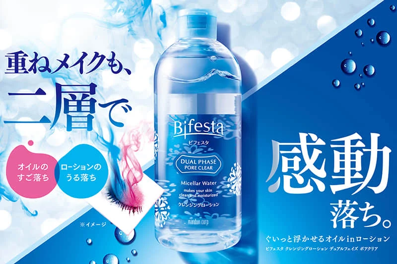
Built around a clear plastic bottle of Bifesta Dual Phase Pore Clear Micellar Water centered against a split background of light blue and deep navy, the advertisement features Japanese text on the left reading ‘重ねメイクも、二層で’ (Even layered makeup, with two layers) above two circular callouts for oil and lotion removal. The right side displays the large kanji ‘感動落ち。’ (Amazingly removes), while smaller text at the bottom right specifies the product’s ability to dissolve floating oil in lotion.
The layout employs a dynamic diagonal division that separates the airy, water-textured left quadrant from the solid, droplet-speckled navy blue right section. Typography varies dramatically in scale, from the bold headline characters to delicate product labeling, creating clear visual hierarchy. Photographic elements include realistic water droplets, soft bokeh light effects, and a demonstration swatch showing dissolved mascara on cotton.
Graphic designers reference this composition when studying effective use of negative space and diagonal balance in cosmetic advertising. Marketing analysts examine the bilingual text strategy and color-coded benefit callouts for skincare campaign development. Packaging teams utilize the bottle presentation style as a benchmark for transparent product photography in beauty catalogs.