Anmuxi Hami Melon Yogurt
Topics
Details
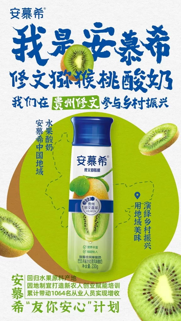
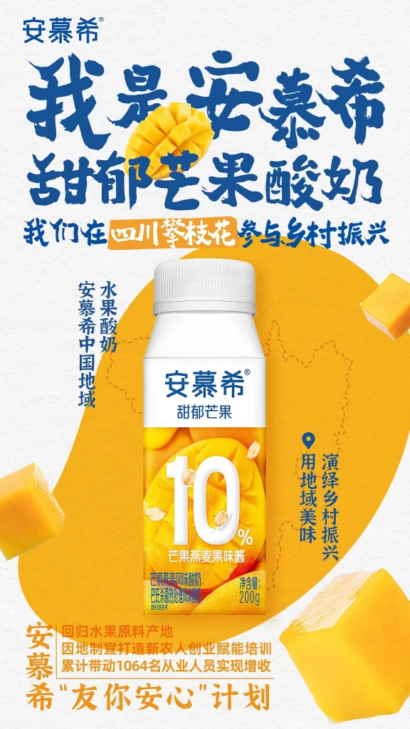
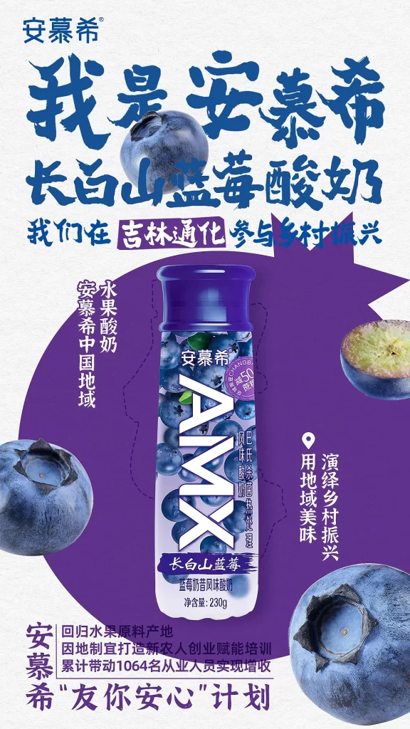
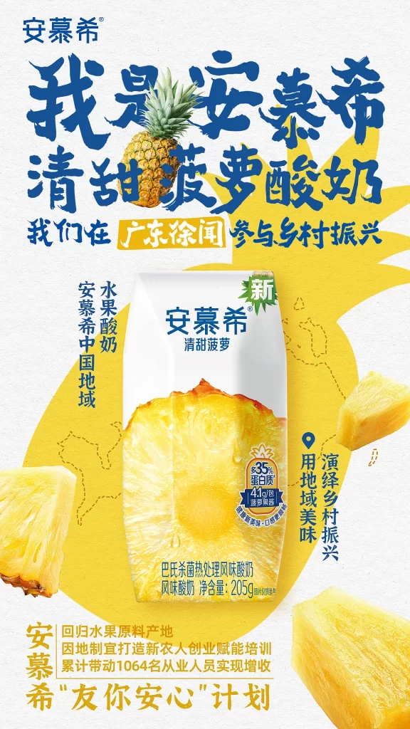
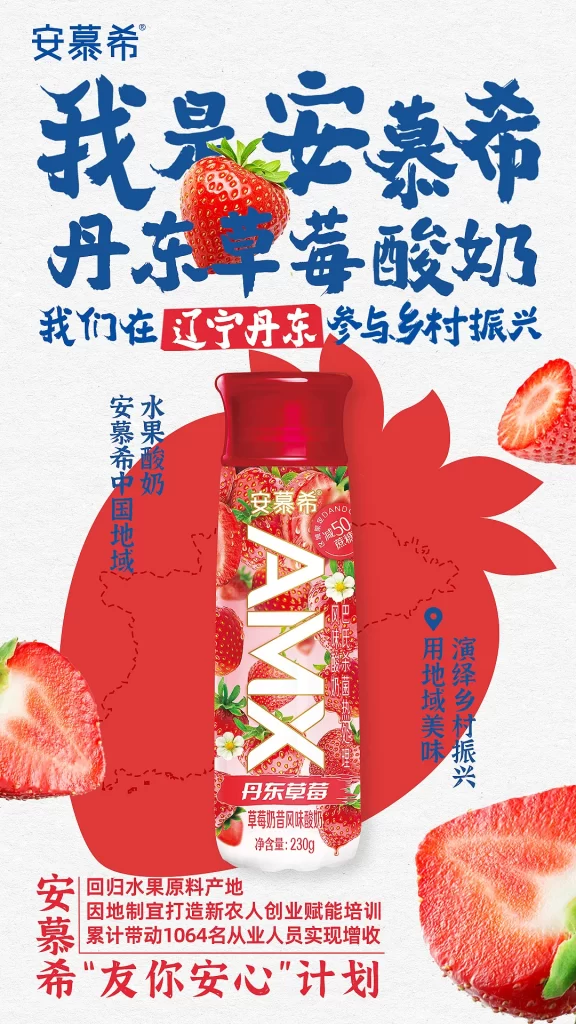
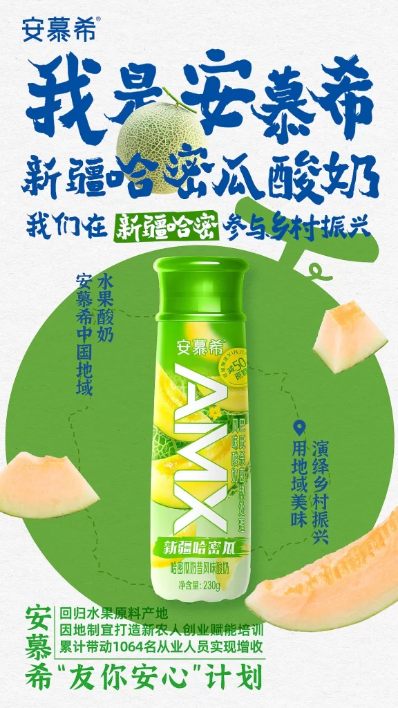
Quiet negative space frames the Anmuxi brand name at the top, where a bottle of Xinjiang Hami Melon yogurt is centered against a large green circular backdrop. Bold blue Chinese calligraphy announces the product and its connection to rural revitalization, while realistic photography of whole and sliced cantaloupes surrounds the packaging alongside smaller text detailing the ‘Friend You Peace of Mind’ initiative.
Design elements utilize a fresh palette of vibrant greens and melon oranges contrasted against deep navy typography to evoke natural freshness. The layout balances heavy brush-stroke headlines with clean sans-serif informational text, creating a dynamic visual hierarchy. Photographic assets are integrated seamlessly with graphic shapes to emphasize the fruit’s origin and the product’s creamy texture.
Marketing professionals analyze this campaign for its effective use of regional sourcing as a core brand value proposition. Graphic designers reference the typographic interplay between traditional calligraphy and modern packaging aesthetics. Business strategists study how the poster communicates corporate social responsibility through specific rural development statistics.