Bones Coffee Jacked O’ Lantern Coffee Bag Front Packaging
Topics
Details
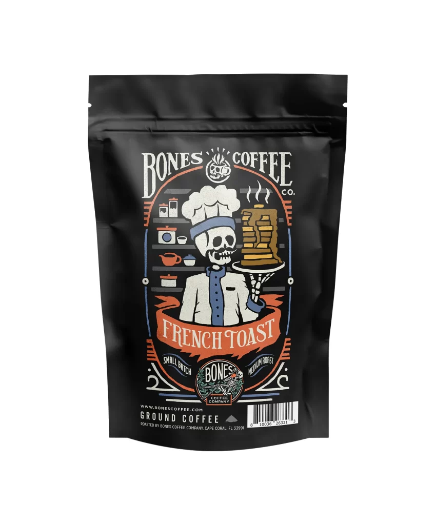
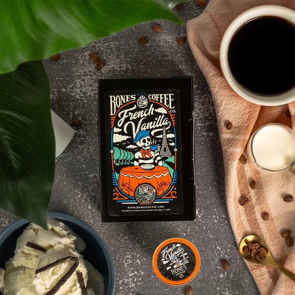
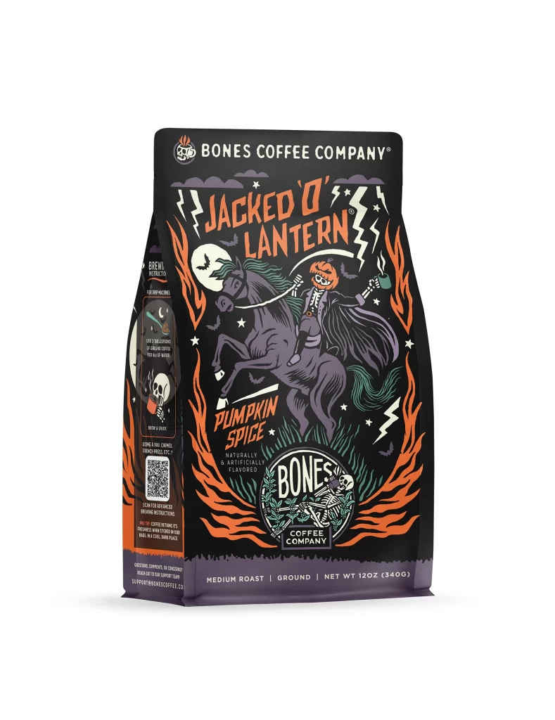
This post showcases the front face of a 12 oz (340 g) Bones Coffee Company coffee bag, centered on a plain white studio background. The product is a Halloween seasonal release featuring a medium roast blend. It presents the official packaging artwork for the Jacked O Lantern flavor. The isolated studio shot provides a clear view of the layout and visual elements used by the brand.
The design language relies on a black bag ground overlaid with orange flame motifs, a skeleton riding a horse, and a moon illustration. At the top sits the white BONES COFFEE COMPANY wordmark alongside a skull-and-plant logo. Typography hierarchy is established with large JACKED O LANTERN flavor lettering dominating the center. The NET WT 12OZ (340G) declaration is printed directly on the front, balancing the thematic imagery with required product information.
Packaging designers can study how this layout balances dense thematic illustration with strict regulatory text requirements. The contrast between the black ground and orange motifs offers a lesson in seasonal visual storytelling. Designers can also examine the typographic hierarchy that keeps the brand wordmark distinct from the bold flavor name. Additionally, the placement of the net weight text demonstrates how to integrate mandatory details without disrupting the core artwork.