Bones Coffee Macamaniac Coffee Bag Back Packaging
Topics
Details
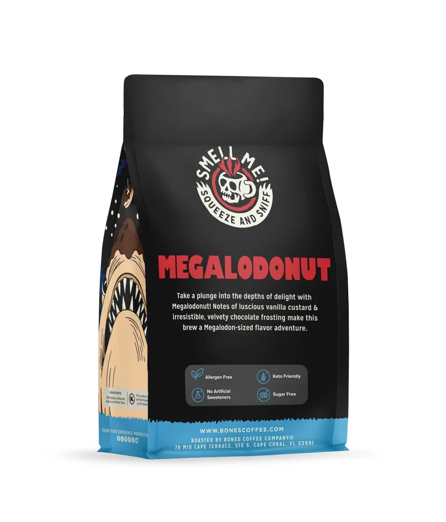
This post presents the flat straight-on back view of the 12 oz Bones Coffee Company Macamaniac coffee bag, photographed against a plain white studio background. The image captures the reverse side of the gusseted bag, highlighting the specific layout elements brands use to communicate required product details. It provides a clear look at how the rear panel balances regulatory information with interactive consumer features.
The packaging design language relies on a black ground that matches the front of the bag, creating a cohesive and bold visual identity. Typography hierarchy is established through the prominent MACAMANIAC flavor name and the medium roast marking, ensuring key product attributes are immediately legible. A skull mascot panel introduces an illustration style that is both edgy and playful, drawing attention to the interactive SMELL ME! SQUEEZE AND SNIFF callout positioned above the barcode at the bottom of the layout.
Packaging designers can study how this back panel effectively organizes mandatory elements like the barcode while maintaining high brand engagement. The strategic placement of the SQUEEZE AND SNIFF callout demonstrates how to turn a standard flat straight-on back view into a tactile experience. Additionally, the use of a continuous black ground on the gusseted bag shows how to sustain a thematic aesthetic across all sides of a product without visual disruption.