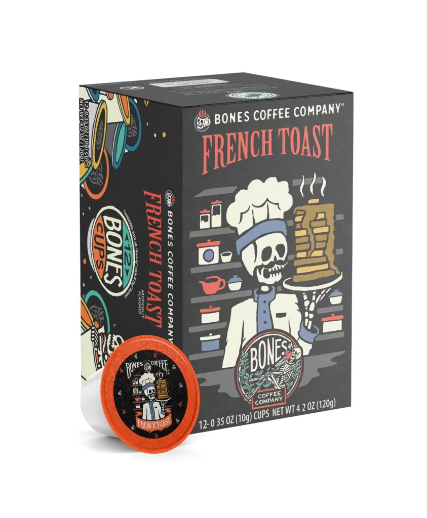
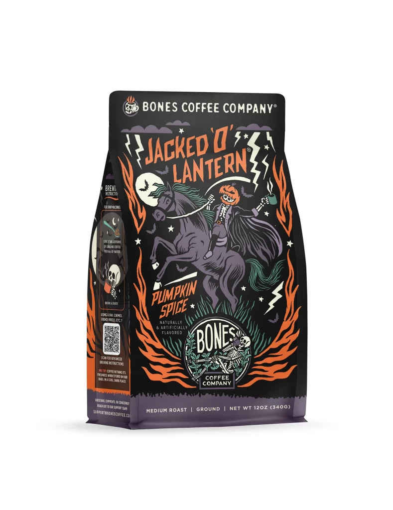
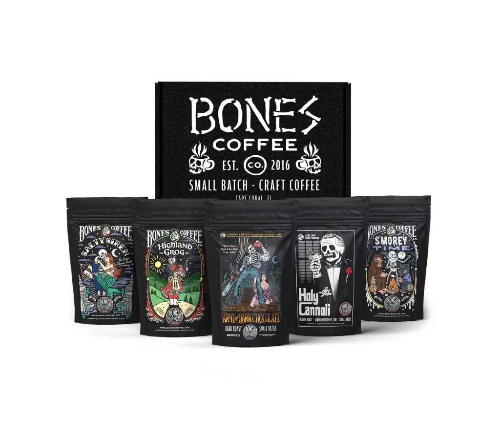
Bones Coffee Megalodonut Coffee Bag Front Packaging
Topics
Details
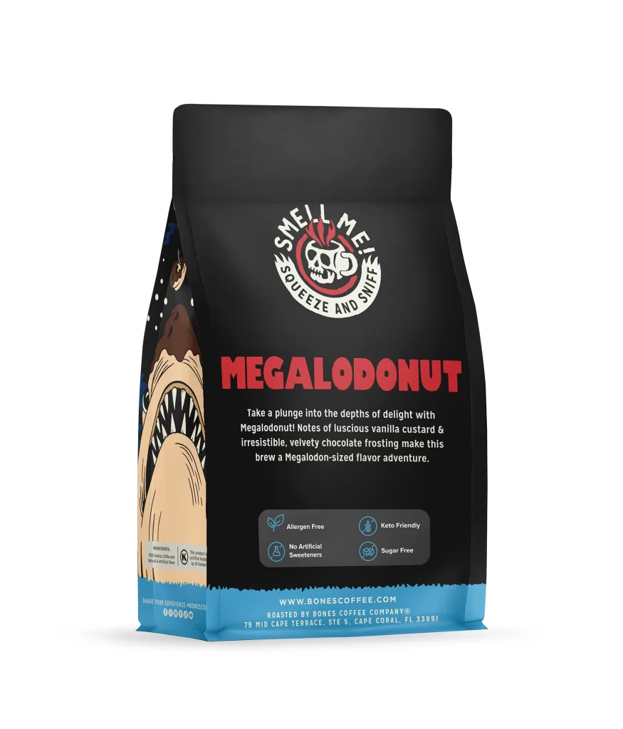
This post features the front face of a 12 oz (340 g) Bones Coffee Company coffee bag presented against a plain white studio background. The packaging showcases a striking ocean theme centered around the MEGALODONUT flavor. It provides a clear, unobstructed view of the bag's front panel for designers to examine. The imagery highlights the brand's playful approach to coffee packaging.
The design language relies on a deep black bag ground that makes the blue waves and ocean illustration pop visually. A giant megalodon shark and a small boat create a dramatic narrative scene across the front panel. The typography hierarchy establishes clear brand identity, starting with the white BONES COFFEE COMPANY wordmark and skull-and-plant logo at the top. The large MEGALODONUT flavor lettering dominates the center, while the NET WT 12OZ (340G) text anchors the lower portion.
Packaging designers can study how this layout balances a complex illustration with bold, readable typography. The contrast between the dark background and bright blue wave elements demonstrates effective use of color to draw attention to specific packaging details. Creators can also analyze the visual hierarchy that separates the primary brand mark from the playful shark-donut pun lettering. The composition offers a strong example of integrating character art with mandatory product information.