Chilli Crab Flavoured La Mian Ramen Packaging
Topics
Details
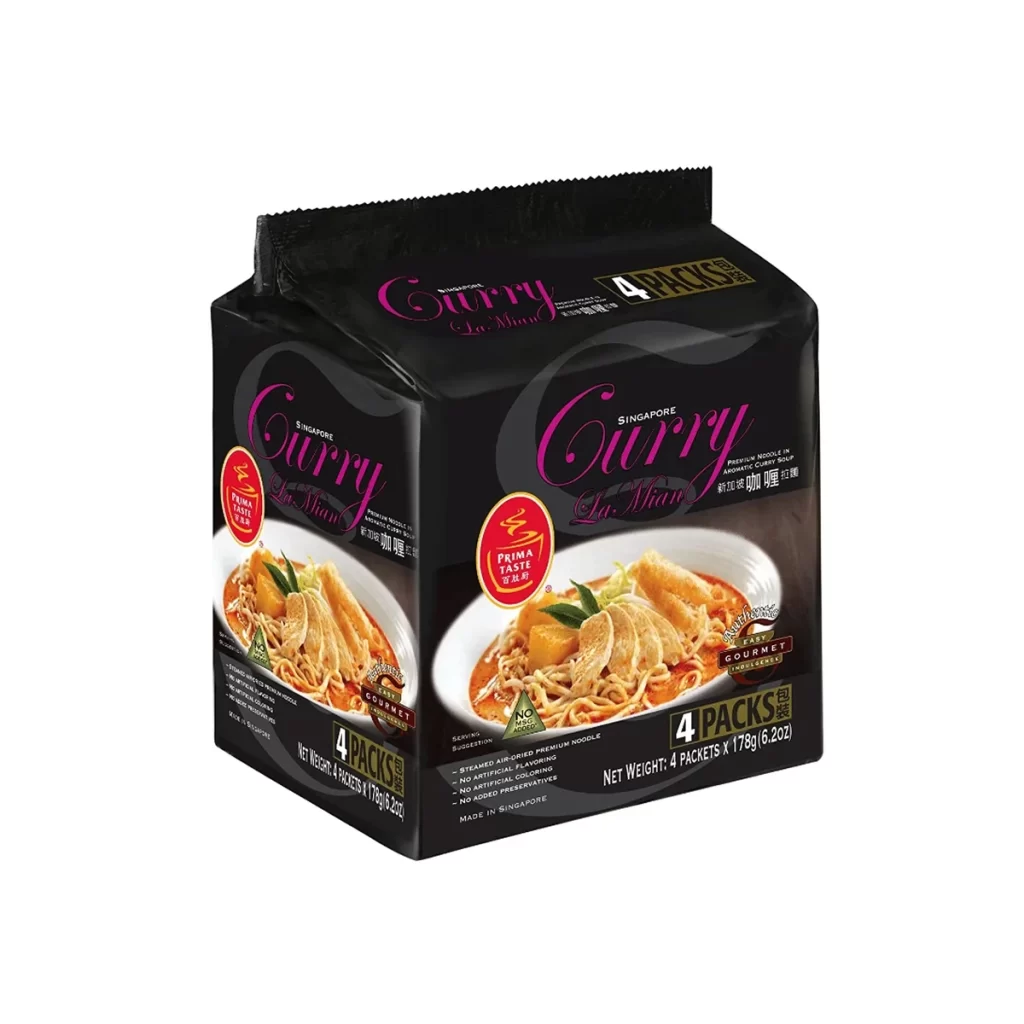
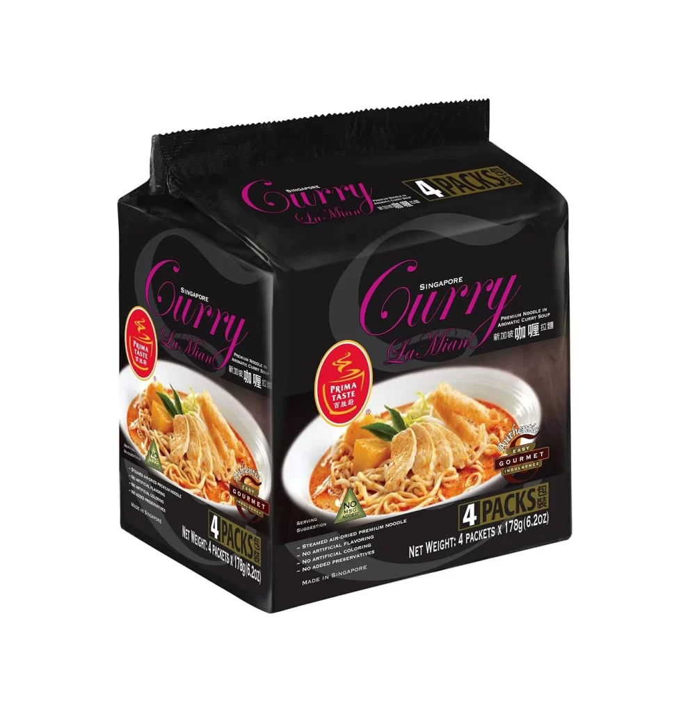
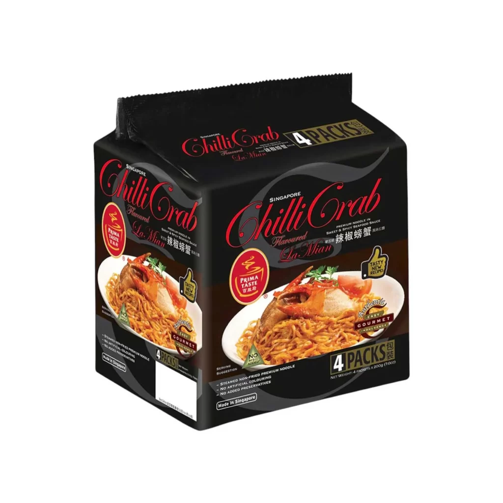
A rectangular black carton of Singapore Chilli Crab La Mian sits at a three-quarter angle, revealing both the front and side panels on a white surface. The packaging features bold, red cursive script for the product name, contrasted by gold and white text indicating it contains four individual packs. A vibrant photograph of the prepared noodles, garnished with crab and tomato slices, dominates the front panel.
Visual interest is driven by the dramatic interplay between the matte black substrate and the high-gloss, appetizing food photography. The typography creates a clear hierarchy, using elegant script to evoke a gourmet feel while maintaining legibility with clean sans-serif fonts for technical details. Circular badges like ‘Prima Taste’ and ‘Tasty Noodle’ add layers of branding that break up the dark negative space without cluttering the overall composition.
Packaging designers studying Asian market trends would find this layout useful for balancing traditional culinary imagery with modern minimalism. Illustrators looking to practice rendering reflective surfaces and complex food textures can use this as a study in lighting and color saturation. Marketing teams developing premium instant-food lines might reference this specific color palette to communicate quality and flavor intensity effectively.