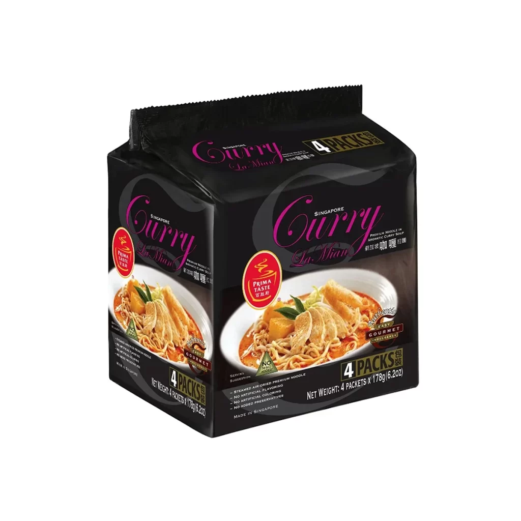
Prima Taste Curry La Mian Noodle Soup Packaging
Topics
Details
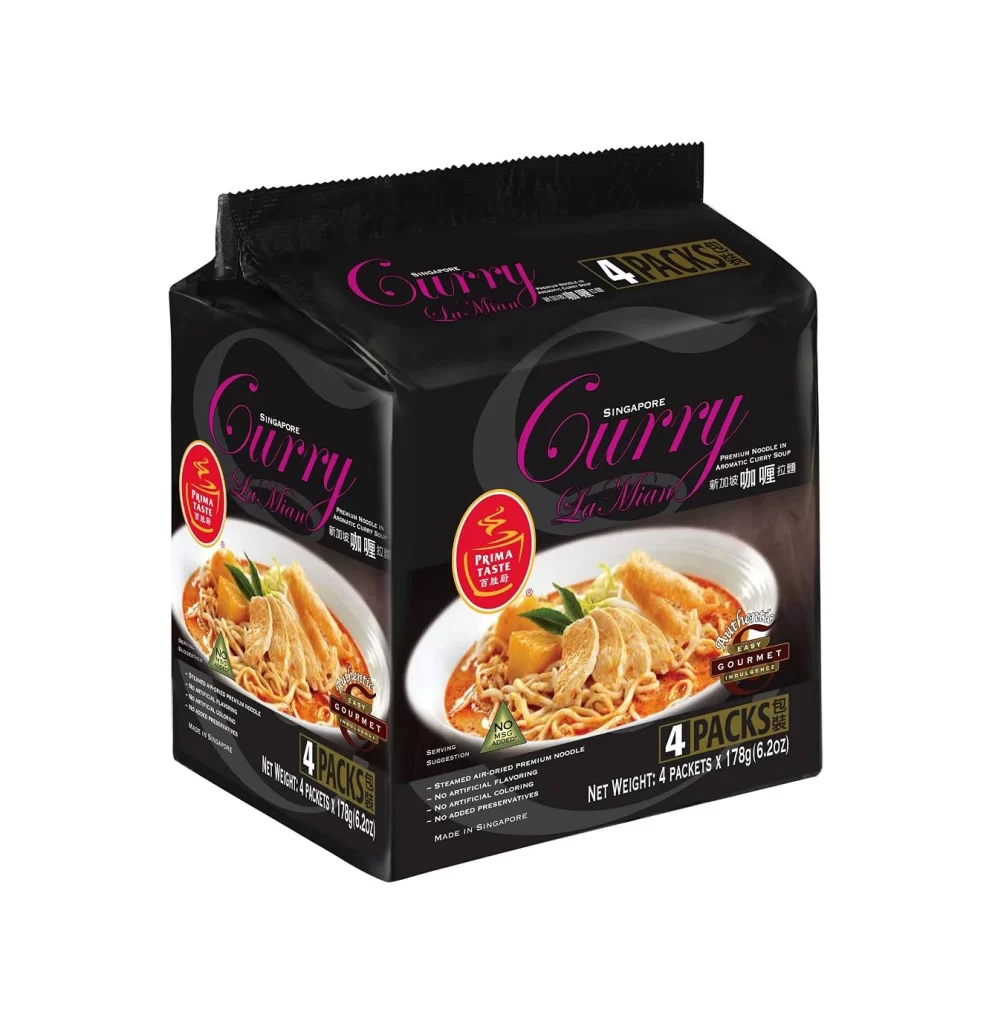
A matte black, rectangular package of Prima Taste Curry La Mian Noodle Soup displays a high-resolution photograph of the prepared dish on its front face, featuring thick noodles, tender chicken slices, and rich orange curry broth. Vibrant magenta script spells out 'Curry La Mian' above a red circular seal containing the Prima Taste logo, while '4 PACKS' appears in bold white text on a dark gold background at the bottom right corner. The packaging sits on a clean white surface with visible text indicating it is made in Singapore and contains four 178g packets.
Visual hierarchy on this packaging relies heavily on the contrast between the dark background and the luminous food photography. The use of elegant cursive typography for the flavor name adds a touch of sophistication to an otherwise utilitarian grocery item. By placing the ‘Prima Taste’ logo within a distinct red badge, the designers create a focal point that anchors the composition amidst the descriptive text and nutritional claims scattered across the lower third.
Brand managers analyzing Southeast Asian market trends would find this layout useful for studying color psychology in food retail. Packaging engineers might examine the structural folds and material sheen to understand how premium instant noodles are presented in multi-pack formats. Furthermore, food stylists could reference the specific garnish placement—such as the angle of the green leaves—to improve their own culinary photography compositions.