Prima Taste Laksa Fried Rice Noodle Soup Packaging
Topics
Details
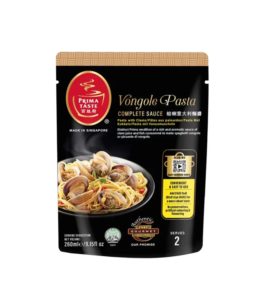
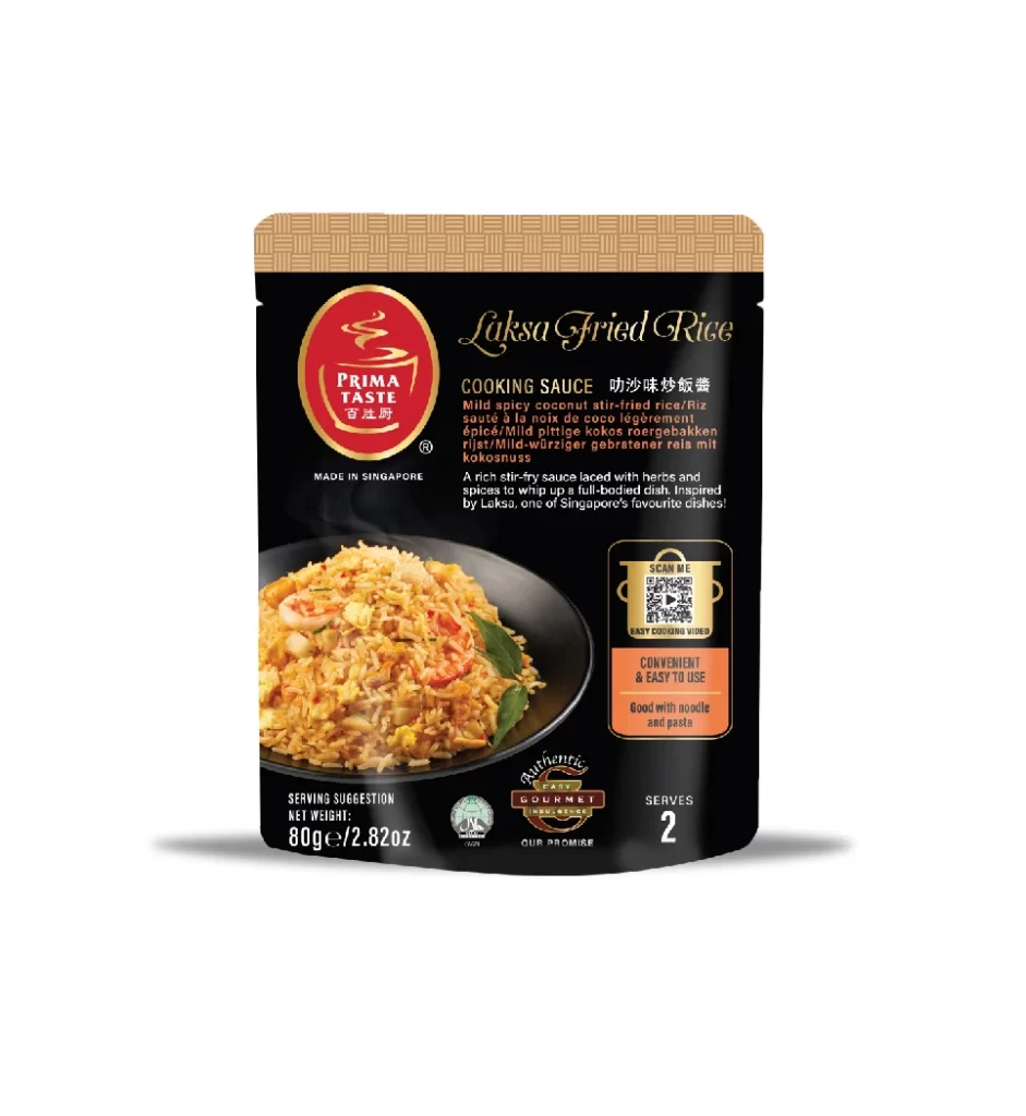
A black stand-up pouch for Prima Taste Laksa Fried Rice Cooking Sauce dominates the view, featuring a textured tan header at the top and a prominent red circular logo with white text on the left side of the main body. To the right of this logo, the product name appears in an elegant gold script font above a block of small descriptive text, while a vivid photograph of golden fried rice garnished with shrimp and green leaves occupies the lower left portion. The packaging rests on a white surface and includes additional details such as a QR code, serving information indicating it serves 2 people, and a net weight of 80g.
Visual hierarchy is established through the strategic use of metallic gold accents against the deep black background, which creates a premium feel typical of gourmet Asian food products. The inclusion of multiple languages—English, Chinese, German, French, and Malay—indicates a design intended for broad international distribution. Furthermore, the placement of certification logos like ‘Singapore’s Gourmet’ and the specific net weight information at the bottom provides essential consumer trust signals within the layout.
Brand managers analyzing Southeast Asian market trends would utilize this visual to study color psychology in savory food packaging. Packaging engineers could examine the structural proportions of the stand-up pouch format relative to the 80g volume. Additionally, typographers might reference the mix of serif script and sans-serif fonts to understand how luxury branding is applied to mass-market cooking sauces.