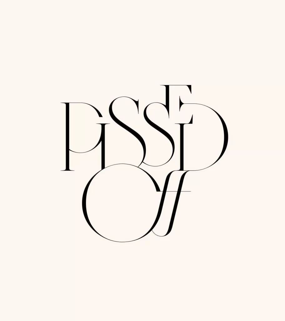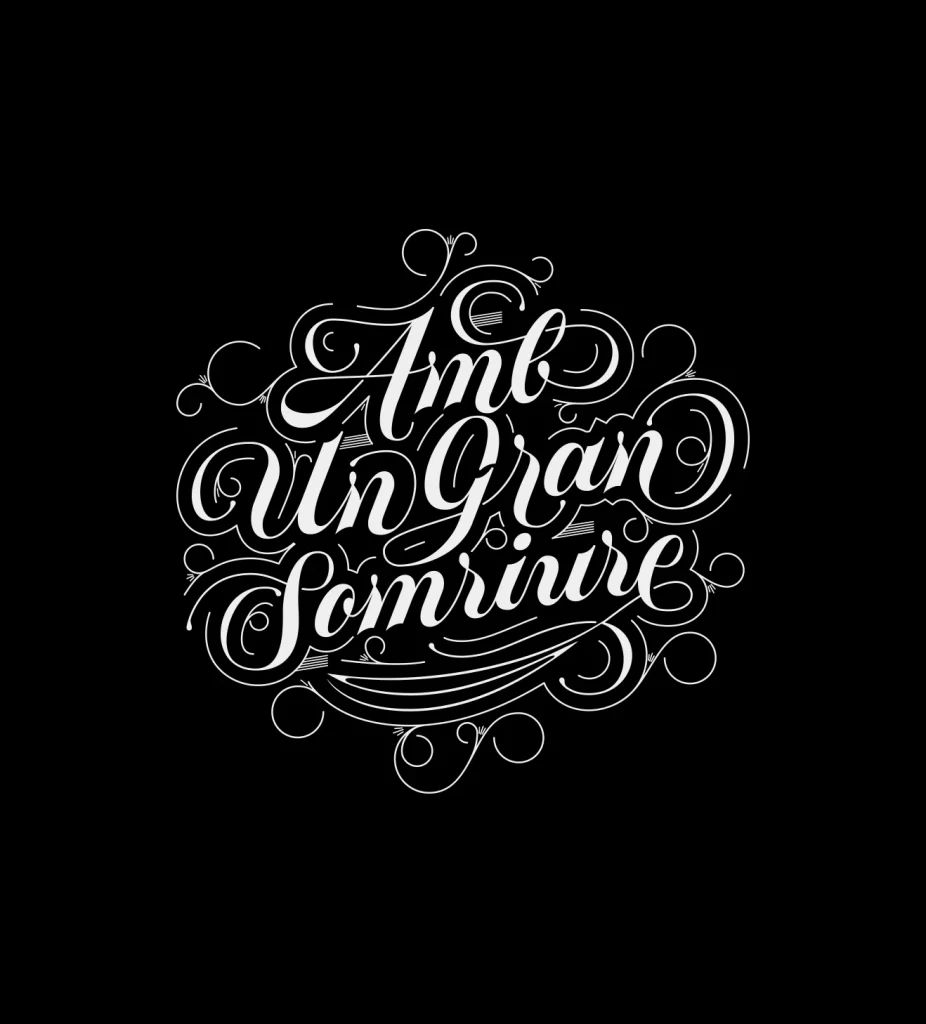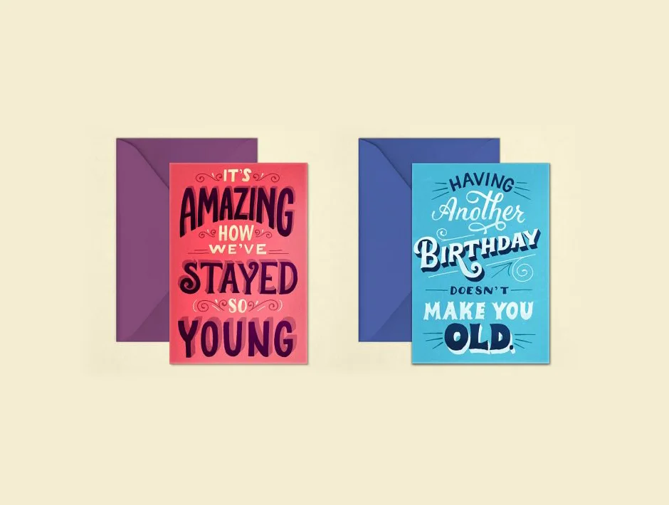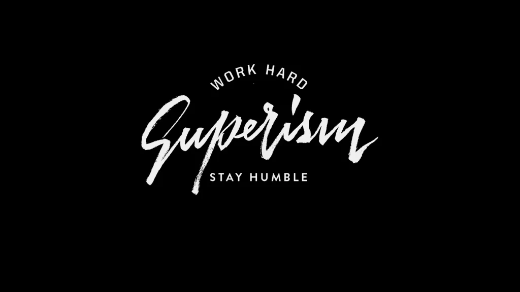
Elegant Script Black Thin Lines Artistic Overlapping Typography Design
DownloadTopics
Details
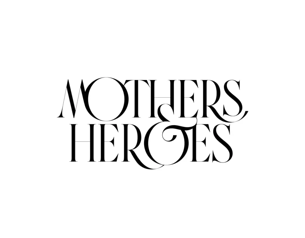
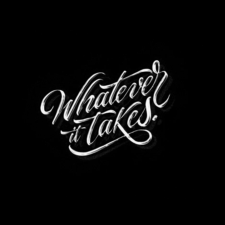
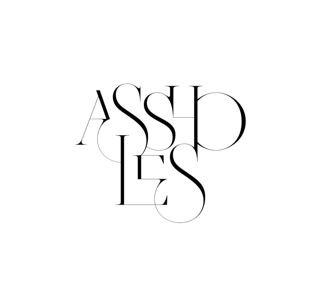
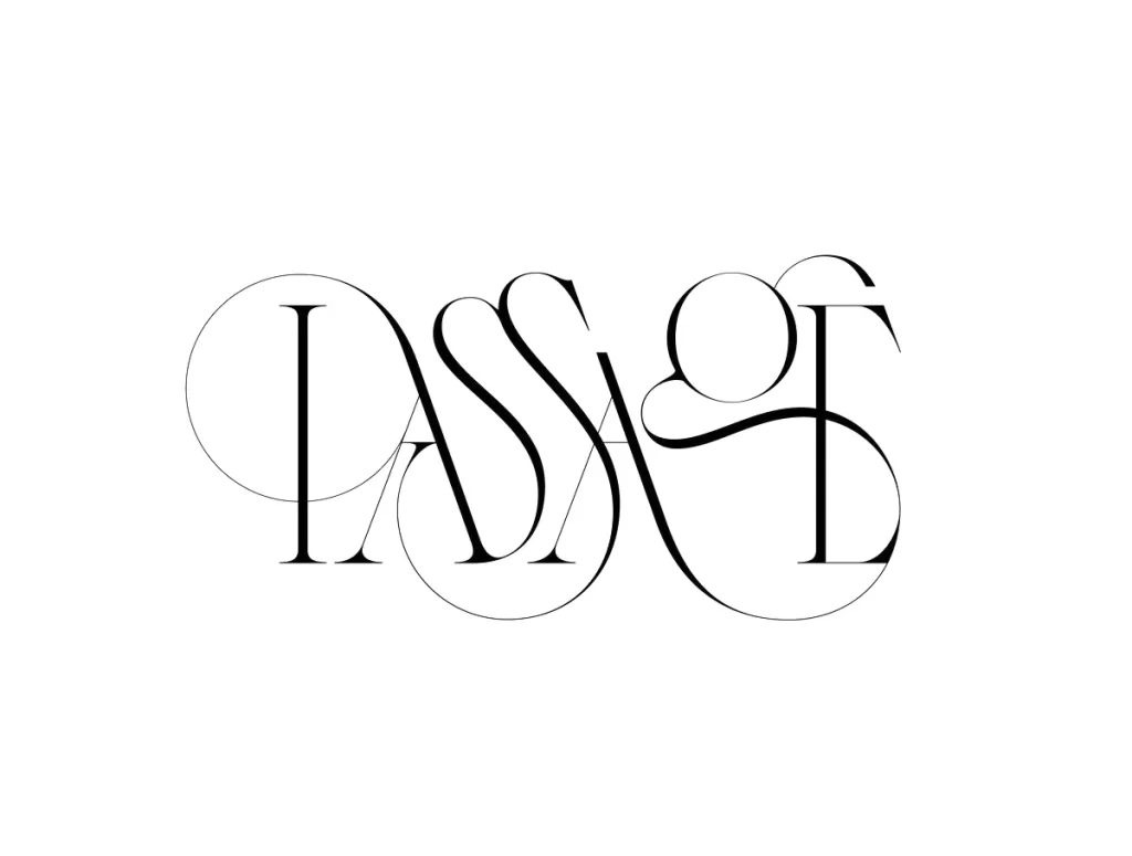
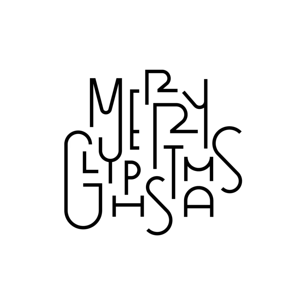
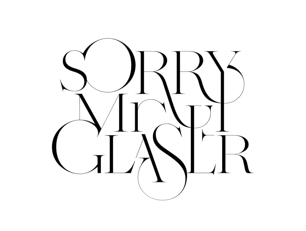
Black ink forms the words "SORRY MIRY GLASER" in a high-contrast serif typeface characterized by hairline strokes and dramatically oversized circular counters. The three lines of text stack vertically with intentional overlapping, where the descenders of the upper row intersect the ascenders of the lower rows, creating a dense typographic lockup. A clean, untextured white field surrounds the composition, photographed from a direct frontal perspective that eliminates any perspective distortion or shadow play.
Visual tension arises from the extreme contrast between the delicate weight of the letterforms and their bold, interlocking arrangement. The circular geometry of the O, G, and S characters dominates the negative space, forcing the viewer to navigate the text as a singular graphic shape rather than reading it linearly. Such a sophisticated balance of fragility and structural complexity makes this a compelling study in modern editorial typography. Designers can access the full-resolution asset at no cost to examine the precise stroke modulation and kerning decisions.
Art directors developing luxury branding campaigns might employ this aesthetic for high-end fashion editorials or gallery exhibition identities. Typography students could deconstruct the letter spacing to understand how thin strokes maintain legibility when layered densely. Social media managers creating minimalist quote graphics would find the airy yet impactful style effective for platforms favoring refined visual content.