Barcelona Typography Art Deco Yellow Red
DownloadTopics
Details
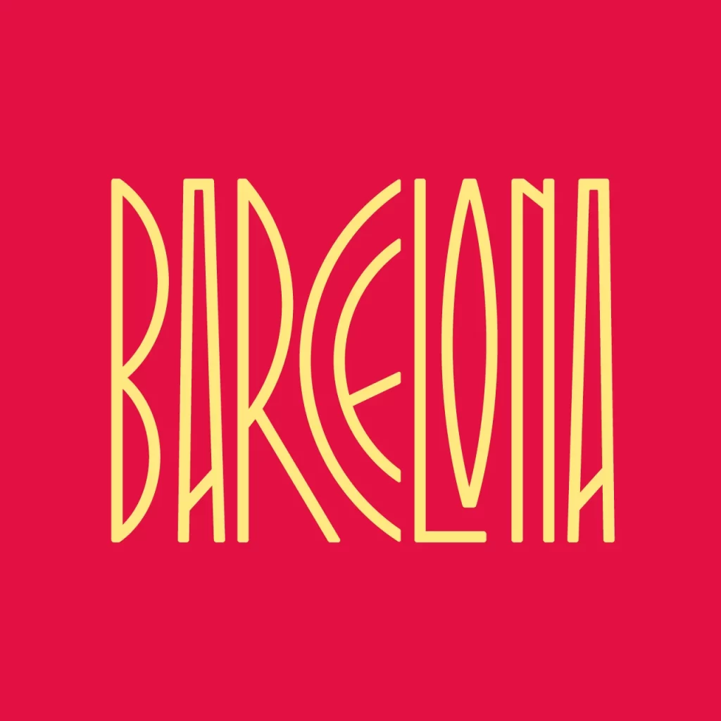
Vibrant crimson fills the entire frame, serving as a bold canvas for the word BARCELONA rendered in tall, slender yellow letterforms. Each character features an elegant Art Deco influence with elongated vertical strokes and sweeping curves, particularly noticeable in the rounded C and the sharp angles of the K. The composition centers the text with generous spacing, creating a balanced typographic statement that relies entirely on the striking contrast between the warm red background and the pale golden-yellow typeface.
What sets this particular design apart is its masterful use of negative space within each letterform, where the thin strokes maintain readability while achieving a delicate, almost architectural quality. The color pairing evokes both energy and sophistication, reminiscent of 1920s poster aesthetics but executed with modern flat-design principles that eliminate any gradients or shadows. Designers seeking clean, period-inspired typography will appreciate how the geometric construction of each glyph creates visual rhythm across the word.
Event promoters planning Spanish-themed gatherings or travel agencies marketing Catalan destinations could adapt this typographic style for eye-catching posters and social media graphics. Brand identity projects requiring a touch of European elegance might incorporate similar lettering for logos or packaging, especially when aiming for a retro-luxe atmosphere. Anyone needing this specific artwork for their own layouts can grab the full-resolution file at no cost directly from the resource section.