Fatso Peanut Butter Jar Design
Topics
Details
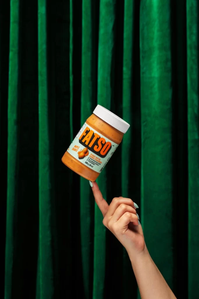
Deep emerald velvet curtains with vertical folds create a theatrical backdrop for the composition, while dramatic side lighting accentuates their plush texture and creates subtle shadows between each pleat. A hand with pale mint-green manicured nails extends upward from the lower right quadrant, balancing a tilted peanut butter jar precariously on the tip of its index finger. The container itself features an orange-brown translucent body revealing creamy contents within, topped by a white ribbed plastic lid, while its label displays bold orange 'FATSO' lettering against a mint-green background alongside smaller text reading 'MAPLE BLEND' and 'NET WT 16OZ'.
Retro-inspired typography dominates the visual identity here, with that chunky sans-serif wordmark immediately drawing attention through its high-contrast orange-on-mint palette. The label's color blocking cleverly echoes both the product's flavor profile and the model's nail polish, creating unexpected cohesion across different elements of the photograph. Tilting the jar at this precarious angle transforms an ordinary food package into something playful and dynamic, suggesting lightness despite the product's indulgent name.
Food photographers studying balance and prop styling might analyze how the finger placement creates visual tension without looking forced. Packaging designers evaluating retro revival aesthetics could reference how the two-tone label scheme performs under directional lighting. Social media content creators planning product unboxing sequences often seek examples of human interaction with packaging that feels spontaneous rather than posed.