Fatso Peanut Butter Jar
Topics
Details
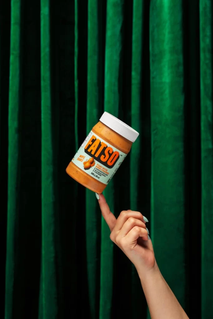
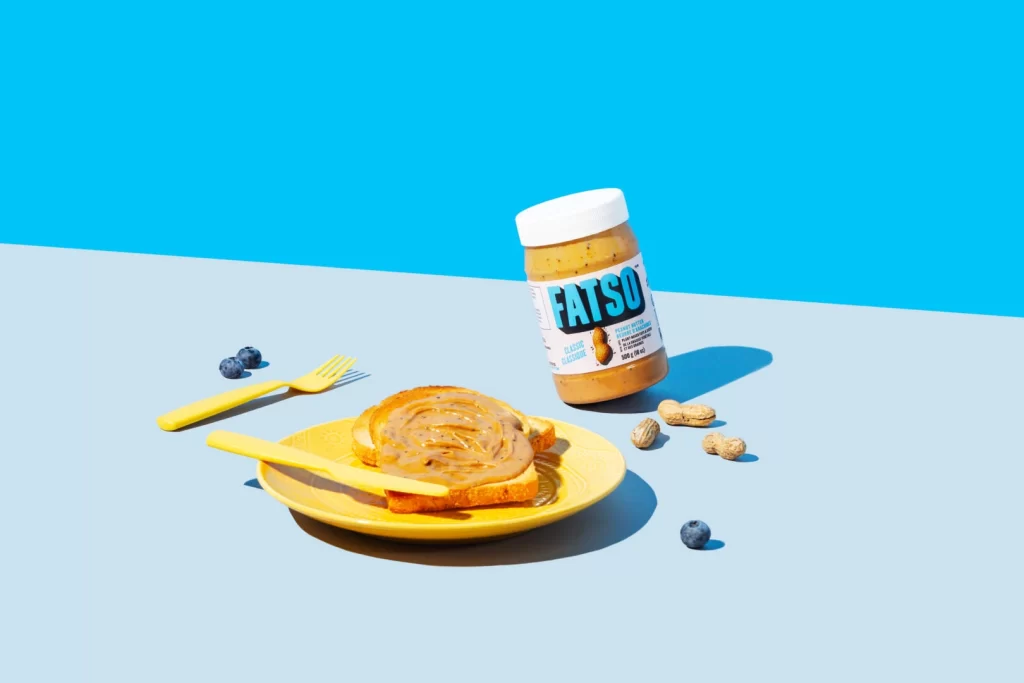
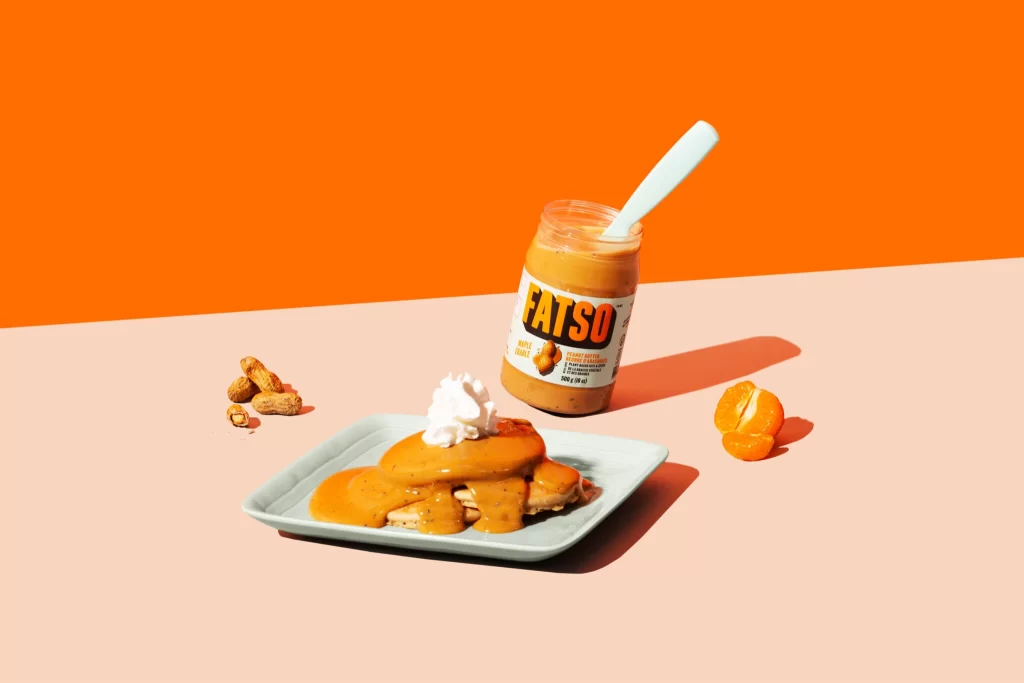
Against a split-field of saturated tangerine and pale salmon, a glass jar of FATSO peanut butter anchors the composition, its white label displaying bold black typography and a small peanut icon. A light blue plastic knife protrudes from the open jar at an acute angle, while the foreground features a square ceramic plate holding pancakes smothered in thick orange sauce and crowned with a dollop of whipped cream. Scattered peanuts rest to the left, and a peeled mandarin segment sits to the right, all illuminated by hard directional lighting that casts crisp shadows across the pastel surface.
The visual tension derives from the aggressive complementary color scheme—vibrant orange against cool cyan accents—creating immediate graphic impact while maintaining appetizing warmth. Product photography conventions are subverted through the unconventional utensil color choice and the deliberately messy, generous sauce application, which suggests authenticity over sterile perfection. This specific arrangement balances commercial clarity with editorial art direction, making the branded object feel integrated into a lifestyle moment rather than isolated for catalog purposes.
Food stylists might study the viscosity interaction between the peanut butter sauce and the pancake texture to replicate similar pour dynamics in their own shoots. Color theorists could analyze how the triadic relationship between orange, peach, and mint blue generates visual energy without overwhelming the subject matter. Art directors developing breakfast product campaigns would find value in examining how props like the segmented citrus and raw nuts reinforce flavor profiles without cluttering the primary focal point.