Japanese Food Packaging
DownloadTopics
Details
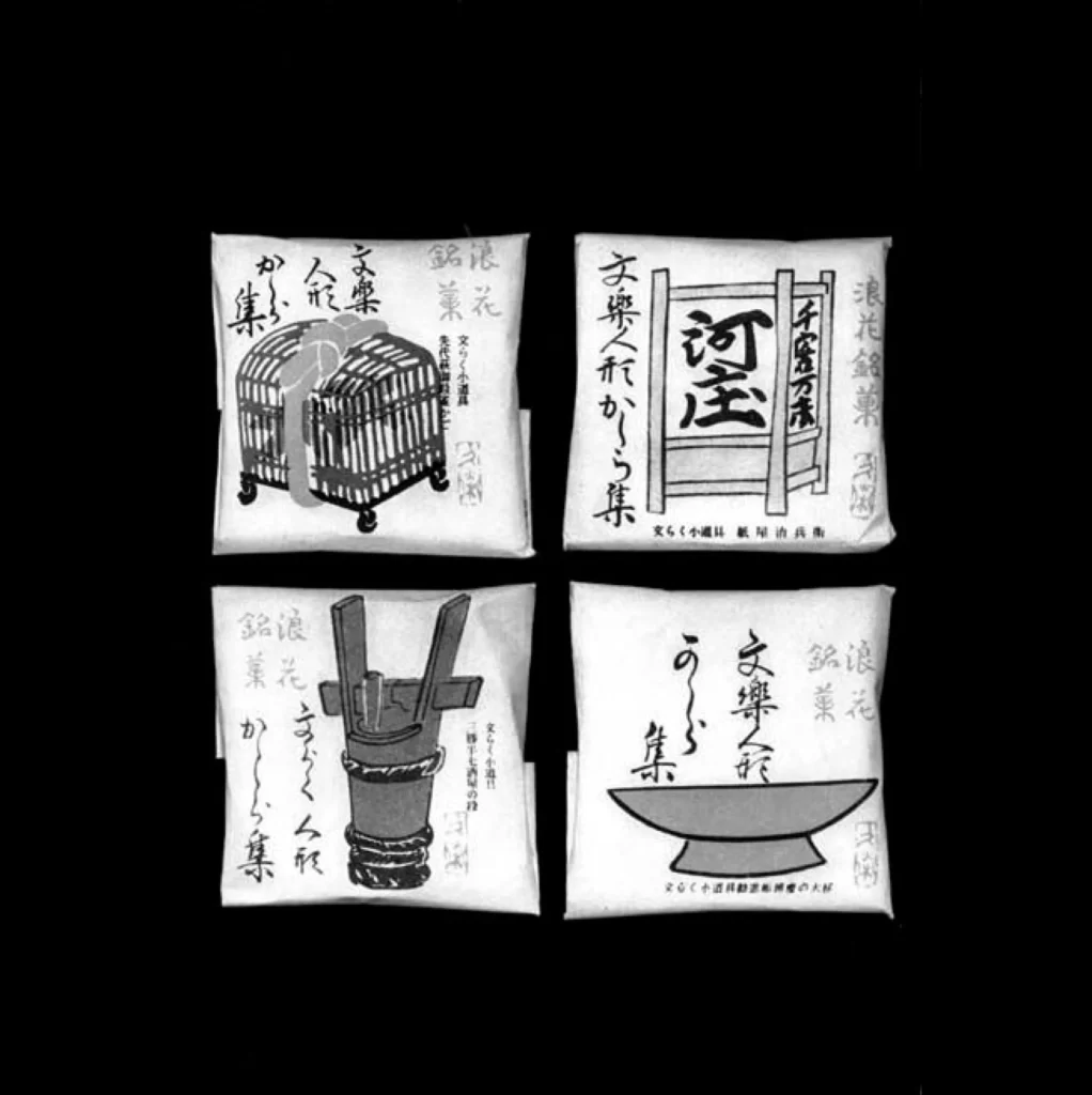
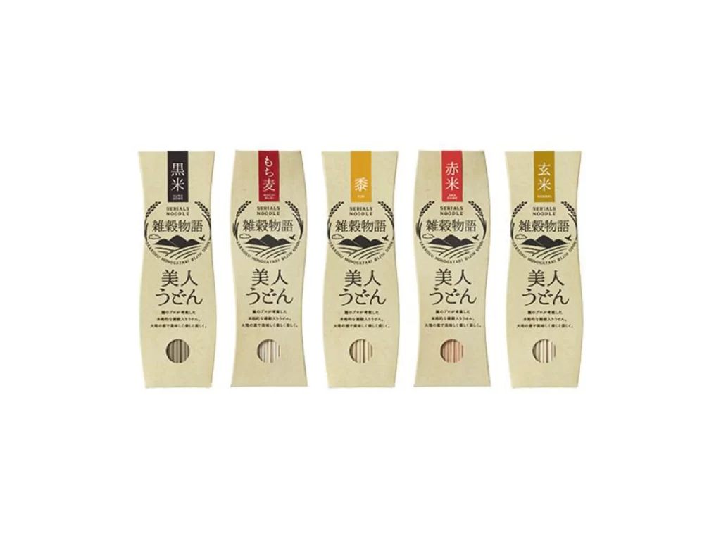
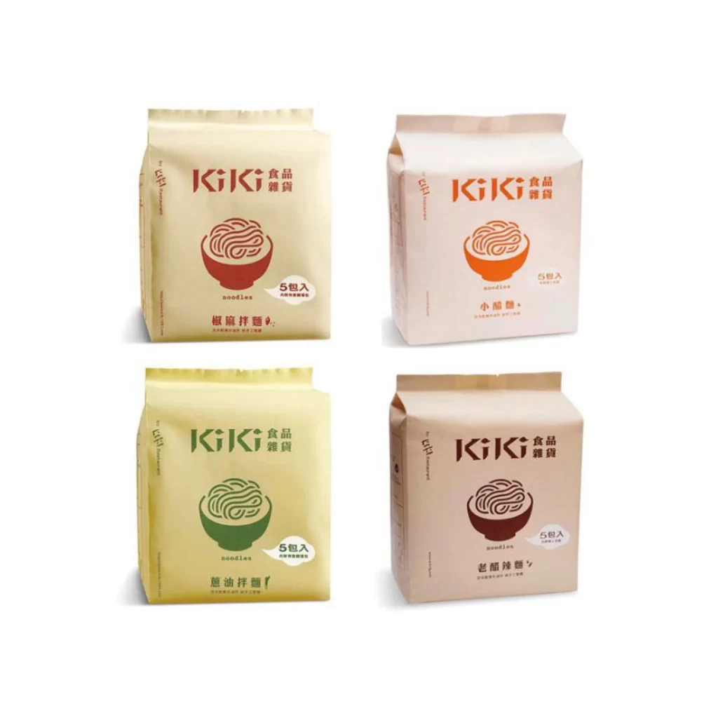
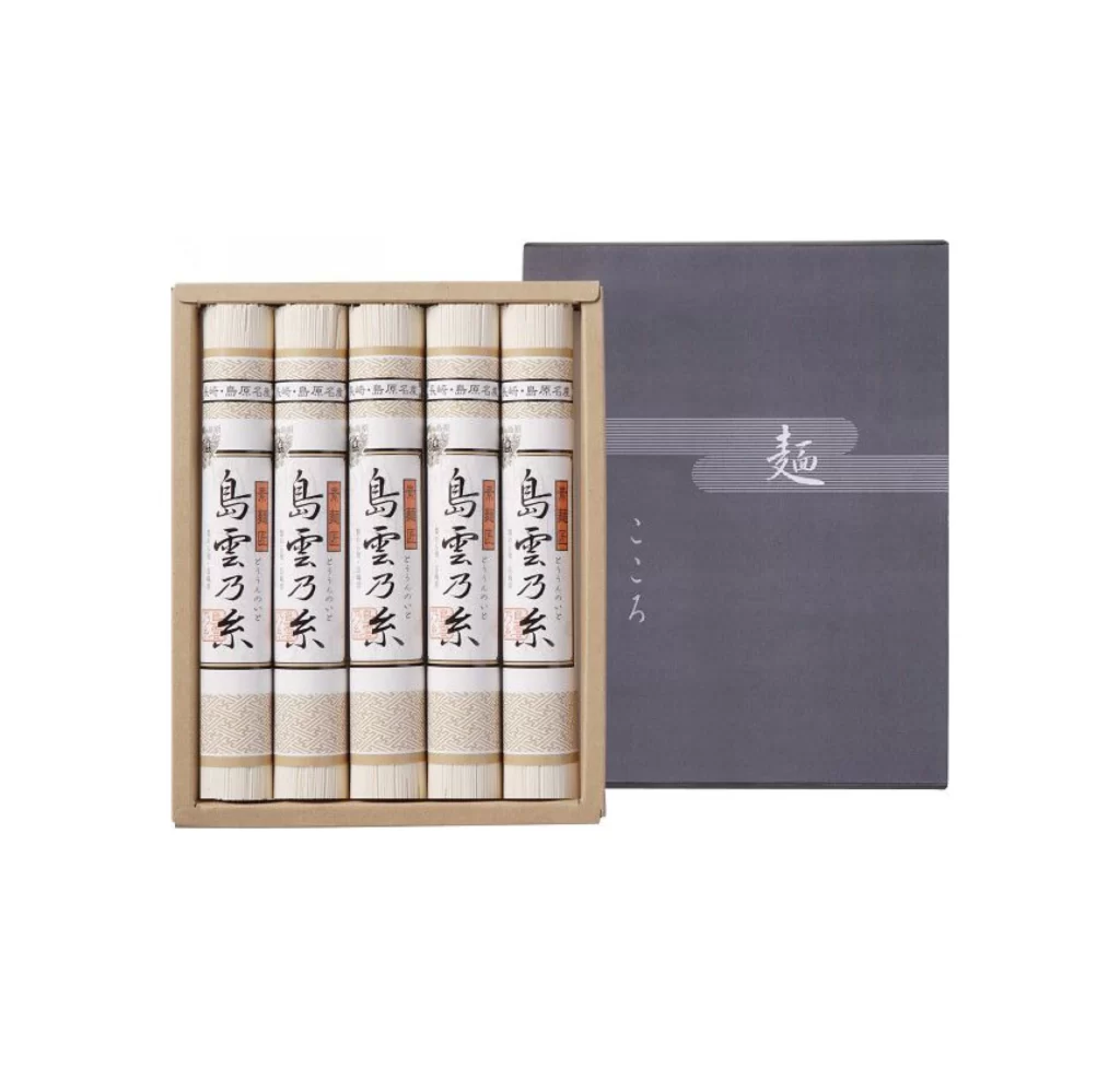
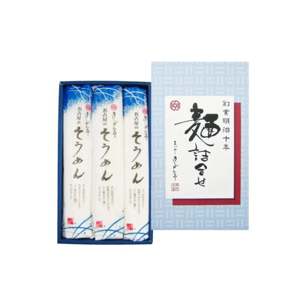
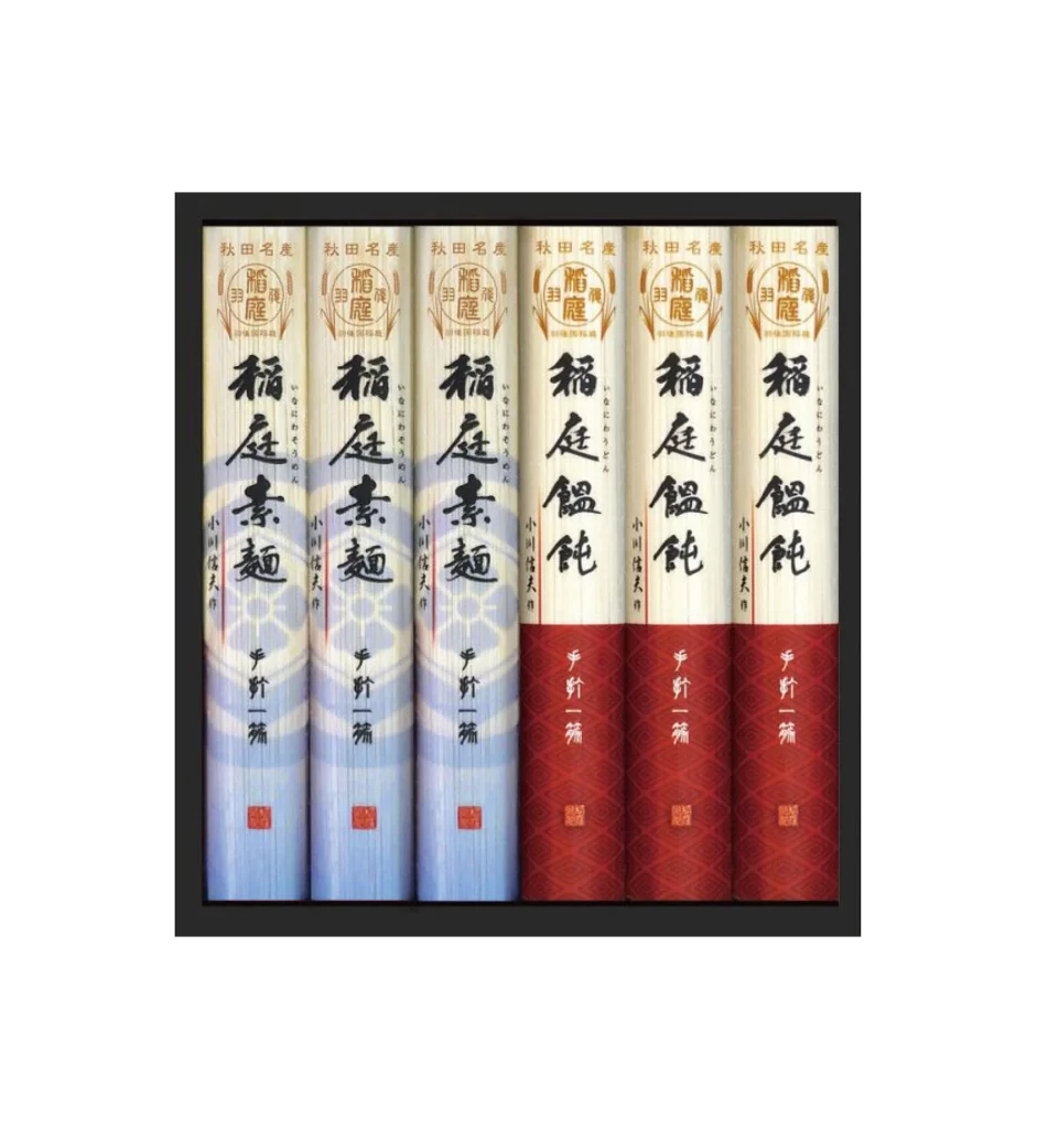
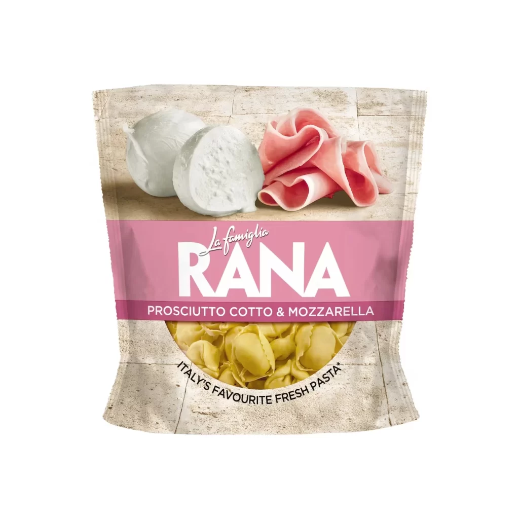
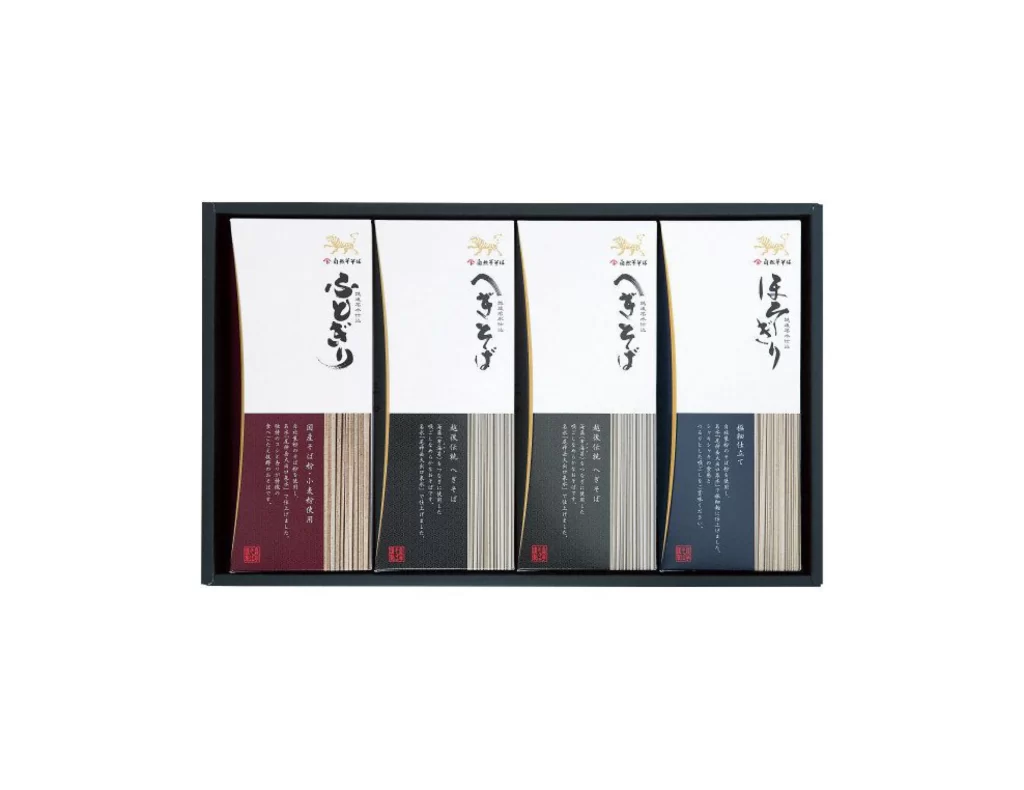
Four slender rectangular boxes sit side-by-side within a dark, thin-framed tray, each featuring a white upper panel and a deep burgundy or charcoal lower section. Bold black calligraphy dominates the upper half of every package, accompanied by smaller vertical Japanese text columns and red seal stamps near the bottom. The composition is shot straight-on under even, shadowless lighting that reveals the subtle ribbed texture on the colored portions of the packaging.
The visual hierarchy relies on the dramatic contrast between expansive negative space and dense typographic elements, creating a sophisticated balance between traditional aesthetics and modern minimalism. Each box follows an identical structural template while varying its accent color and calligraphic content, demonstrating how systematic design can accommodate product differentiation without losing brand cohesion. Designers studying this set can examine how the consistent placement of logos, seals, and descriptive text establishes a recognizable family of products.
Brand identity specialists developing premium gift sets or artisanal food lines would find this arrangement particularly useful for planning multi-SKU collections that require visual unity across variants. Packaging engineers might reference the proportions to understand how tall, narrow formats can effectively display both artistic lettering and regulatory information. Anyone needing to analyze the precise color relationships or typographic spacing can access the full-resolution file at no cost directly from the resource library.