Kaitsuya Namen Noodle Packaging
DownloadTopics
Details
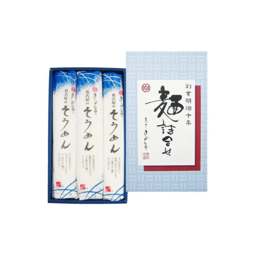
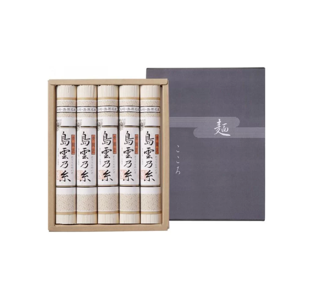
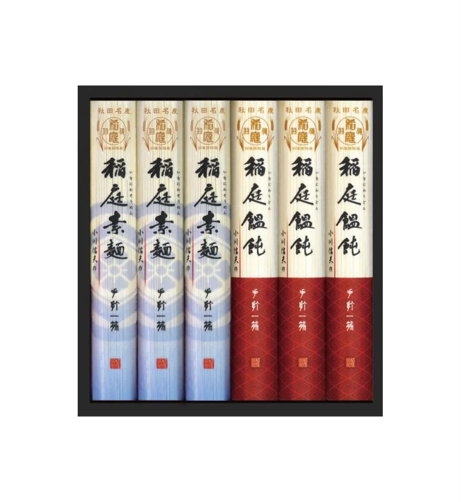
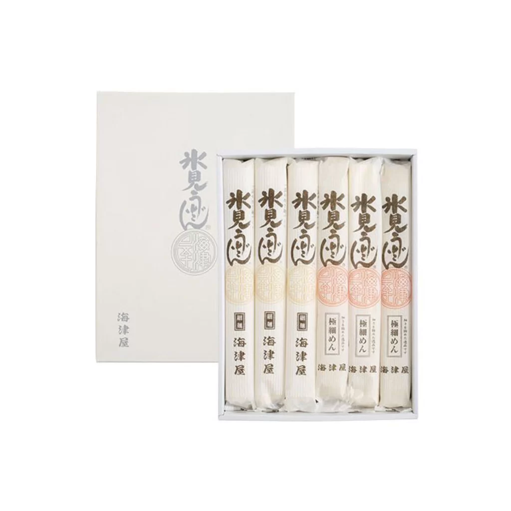
Six individually wrapped noodle packages stand upright inside a shallow white tray, positioned slightly to the right of a matching outer sleeve. The packaging features a cream-colored base with vertical brown calligraphy reading "水見之風" (Mizu no Kaze) and smaller text identifying the product as "海津屋" (Kaitsu-ya) and "梅細めん" (Ume Hosomen). A circular seal in muted orange-red appears on the three rightmost sticks, while the leftmost three display a fainter, monochromatic version of the same emblem. Soft, even lighting eliminates harsh shadows across the matte paper surfaces and reveals subtle texture variations between the wrapper types.
Visual hierarchy relies on the contrast between bold brush-stroke typography and delicate background patterns that suggest traditional Japanese textile motifs. The alternating seal colors create a rhythmic progression from left to right, guiding the eye across the set while distinguishing flavor or variety within a unified brand system. Designers studying this composition can access the full-resolution file to examine how minimal color shifts affect perceived product segmentation without disrupting overall cohesion.
Packaging engineers developing premium food lines will find this arrangement useful for analyzing how vertical orientation communicates elegance compared to horizontal stacking. Brand strategists working on Japanese-market expansions can reference the calligraphy placement and seal integration when adapting Western products for East Asian retail environments. Art directors planning e-commerce photography might study the slight offset between the box lid and interior tray as a technique for revealing contents while maintaining protective packaging aesthetics.